Sidebar and tab indicator
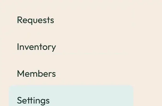
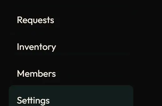
Live demo
Section titled “Live demo”The page below is the real demo.html from the kit. Use its “Toggle dark” button for the dark theme.
Current rule (v2.0.1, 2026-11-13): Demo navigation uses real href links. The labelled tablist has tab/panel relationships, one tab stop, Left/Right and Home/End selection. Initial indicator placement and resize are immediate; section changes retarget one transform transition. Background colours change immediately to keep animation compositor-only. Supersedes the retained implementation/timing claims below; see docs/current-rules.md#cr-motion-01 and motion-flow.
The current section is shown by one box that slides to the selected item, instead of each item repainting its own highlight. The same hook moves the tab underline. A resize skips the transition so a collapsing section never makes the indicator lag.
Open demo.html in a browser (it links ../../tokens/tokens.css) and use “Toggle dark” to check both themes.
| File | What it is |
|---|---|
sidebar.css |
The .sw-indicator box, the rules that drop the item’s own highlight once the indicator is placed, and the tab underline, verbatim from the app. |
demo.html |
A standalone page with the live animation in light and dark, replayable. |
react/ |
Copies of the real app files (see react/README.md for the imports to replace). |
previews/ |
Animated WebP and GIF previews, light and dark (regenerated by scripts/make-previews.mjs). |
Where the app uses it
Section titled “Where the app uses it”- Staff and member sidebar:
components/shell/Sidebar.tsx,SidebarItem.tsx,SidebarSection.tsx(the “More” group uses the collapse family). - Tabs with an underline:
.desk-tab-activeand.sw-tab-indicatorin staff panels. - Hook:
lib/motion/useSlideIndicator.ts.
Moving one box shows where you came from and where you are now; repainting a list item does not. It is also the cheapest possible animation: one transform.
Timing, easing and distance
Section titled “Timing, easing and distance”Current rule (v2.0.1, 2026-11-13): The retained table/snippet below records the original app copy. Use the current executable files and the complete flow recipe for decision 399; see current rules.
| Property | Value |
|---|---|
transform |
--sw-dur-base 180 ms, --sw-ease-standard |
| Size | set directly (width and height are never transitioned) |
| Resize | transition: none for that update |
Trigger
Section titled “Trigger”A change of the current item or tab (the hook key). The container gets data-slide once the indicator is placed; the indicator hides when nothing matches.
Reduced motion
Section titled “Reduced motion”The token duration is 0, so the box jumps to the new item; the current item is still marked by aria-current.
Dark theme
Section titled “Dark theme”Colours come from tokens (--color-accent-soft fill, --color-accent-ink underline).
Do and don’t
Section titled “Do and don’t”- Do transition only
transformand set the size directly. - Do keep
aria-current="page"on the real item. - Do not animate the sidebar on route changes (see route-transition).
- Do not repaint each item’s highlight separately.
Copy-paste usage
Section titled “Copy-paste usage”Current rule (v2.0.1, 2026-11-13): The retained table/snippet below records the original app copy. Use the current executable files and the complete flow recipe for decision 399; see current rules.
<nav id="nav" style="position:relative"> <div class="sw-indicator" id="bar"></div> <a class="sw-slide-item" aria-current="page">Requests</a><a class="sw-slide-item">Inventory</a></nav>Call the placement function from demo.html (a plain-JS port of useSlideIndicator) whenever the current item changes and on resize.
Every other animation in the product, and the rules behind them: ../../docs/motion.md. Index of the kit: ../README.md.
Flow contract (decision 399)
Section titled “Flow contract (decision 399)”Demo navigation uses real href links. The labelled tablist has tab/panel relationships, one tab stop, Left/Right and Home/End selection. Initial indicator placement and resize are immediate; section changes retarget one transform transition. Background colours change immediately to keep animation compositor-only.
Complete rules, sequencing, keyboard and verification. The demo includes real static posters and explicit image Play/Pause controls.
Local token steps for batch 1B
Section titled “Local token steps for batch 1B”These aliases are local additions; global tokens are unchanged. Promote through the token batch when adopted.
| Local custom property | Definition |
|---|---|
--sw-collapse-exit |
calc(var(--sw-dur-base) * .75) |
Source
Section titled “Source”Copied from motion/sidebar/ on every build: the stylesheet, demo.html, react/ copies of the app files and the previews/.