Skip to content

Brand guidelines

The brand guidelines are the source of truth for the logo, colour, type, icons and voice. Everything else on this site follows them.

There are two books. Version 2 is part of Space Works Design System v2.0: it keeps everything from v1 that is still true and adds light and dark, motion and the product. Where the two differ, v2 wins. Version 1 is kept unchanged for reference.

All 50 pages. Select a page to open it at full size (1440 × 1000). The book is built from HTML in brand/guidelines-v2/, with every colour, contrast ratio and loader frame taken from the shipped tokens and CSS.

Brand guidelines v2 · 50 pages. Expand a chapter to load its thumbnails. Every full-size original is retained.

Identity system · pages 01
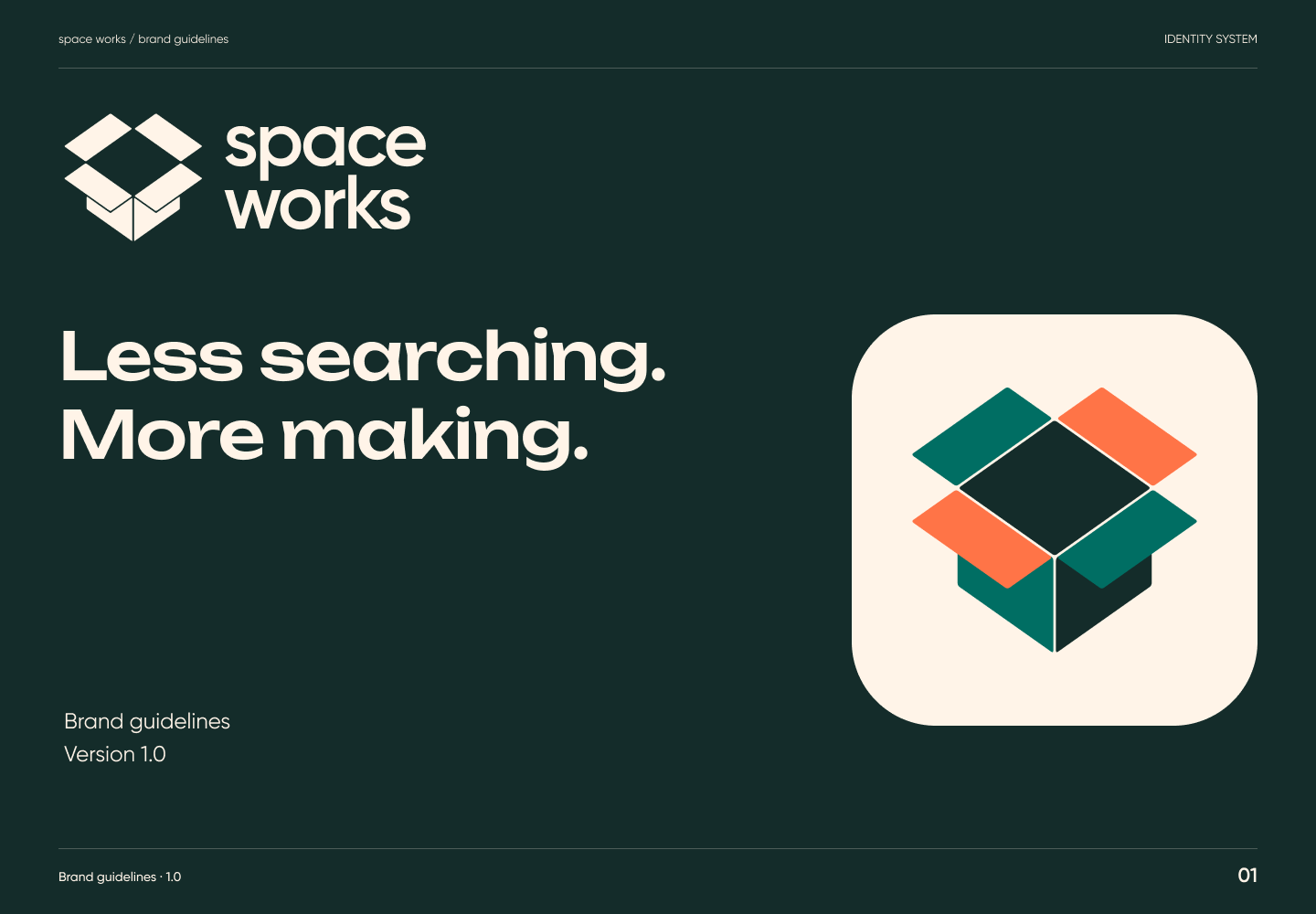
Brand guidelines v2 page 01: Less searching. More making.Page 01Less searching. More making.Full-size PNG · 105.7 kB · 1440 × 1000
Read page 01 as text

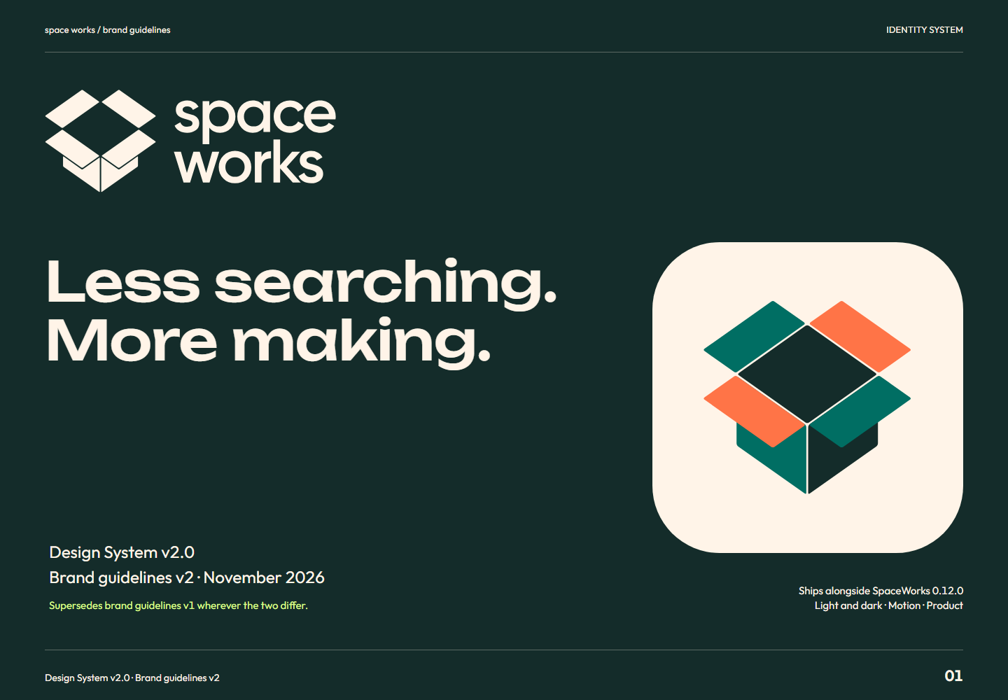
Less searching. More making. Design System v2.0 Brand guidelines v2 · November 2026 Supersedes brand guidelines v1 wherever the two differ. Ships alongside SpaceWorks 0.12.0 Light and dark · Motion · Product

Related semantic guidance
Contents · pages 02
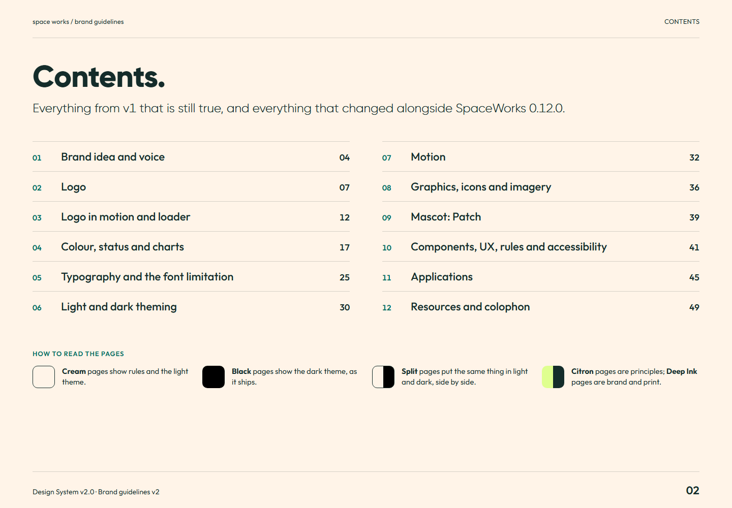
Brand guidelines v2 page 02: Everything from v1 that is still true, and everything that changed alongside SpaceWorks 0.12.0.Page 02Contents.Full-size PNG · 89.0 kB · 1440 × 1000
Read page 02 as text

Contents. Everything from v1 that is still true, and everything that changed alongside SpaceWorks 0.12.0. How to read the pages Cream pages show rules and the light theme. Black pages show the dark theme, as it ships. Split pages put the same thing in light and dark, side by side. Citron pages are principles; Deep Ink pages are brand and print.

Related semantic guidance
What's new in v2 · pages 03
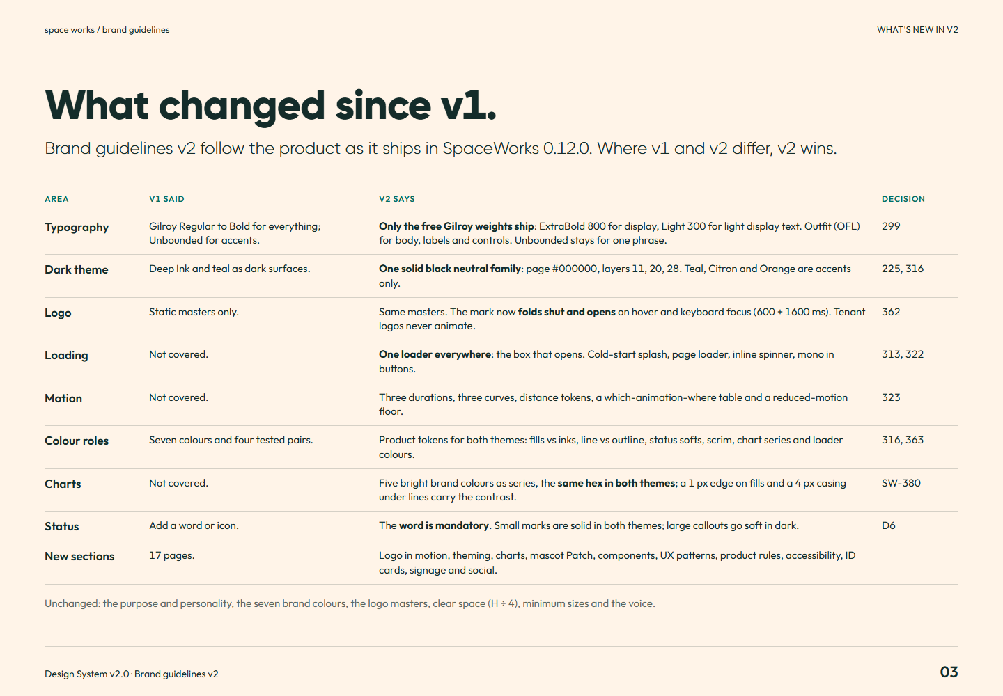
Brand guidelines v2 page 03: Brand guidelines v2 follow the product as it ships in SpaceWorks 0.12.0. Where v1 and v2 differ, v2 wins.Page 03What changed since v1.Full-size PNG · 149.5 kB · 1440 × 1000
Read page 03 as text

What changed since v1. Brand guidelines v2 follow the product as it ships in SpaceWorks 0.12.0. Where v1 and v2 differ, v2 wins. Area v1 said v2 says Decision Typography Gilroy Regular to Bold for everything; Unbounded for accents. Only the free Gilroy weights ship : ExtraBold 800 for display, Light 300 for light display text. Outfit (OFL) for body, labels and controls. Unbounded stays for one phrase. 299 Dark theme Deep Ink and teal as dark surfaces. One solid black neutral family : page #000000 , layers 11, 20, 28. Teal, Citron and Orange are accents only. 225, 316 Logo Static masters only. Same masters. The mark now folds shut and opens on hover and keyboard focus (600 + 1600 ms). Tenant logos never animate. 362 Loading Not covered. One loader everywhere : the box that opens. Cold-start splash, page loader, inline spinner, mono in buttons. 313, 322 Motion Not covered. Three durations, three curves, distance tokens, a which-animation-where table and a reduced-motion floor. 323 Colour roles Seven colours and four tested pairs. Product tokens for both themes: fills vs inks, line vs outline , status softs, scrim, chart series and loader colours. 316, 363 Charts Not covered. Five bright brand colours as series, the same hex in both themes ; a 1 px edge on fills and a 4 px casing under lines carry the contrast. SW-380 Status Add a word or icon. The word is mandatory . Small marks are solid in both themes; large callouts go soft in dark. D6 New sections 17 pages. Logo in motion, theming, charts, mascot Patch, components, UX patterns, product rules, accessibility, ID cards, signage and social. Unchanged: the purpose and personality, the seven brand colours, the logo masters, clear space (H ÷ 4), minimum sizes and the voice.

Related semantic guidance
01 / Brand · pages 04, 05, 06
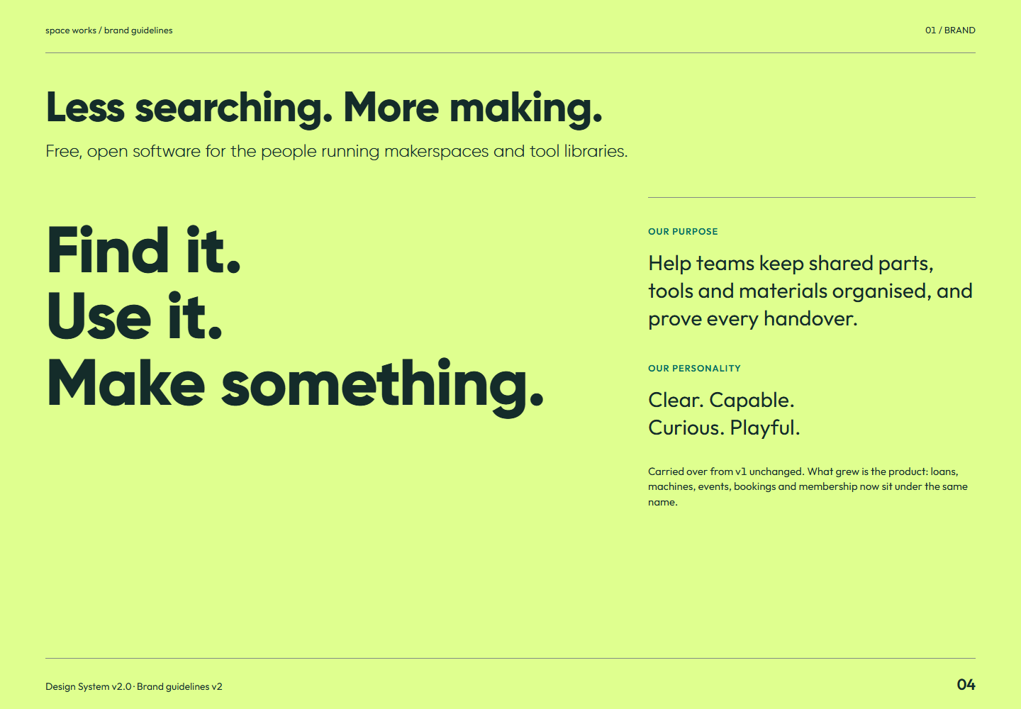
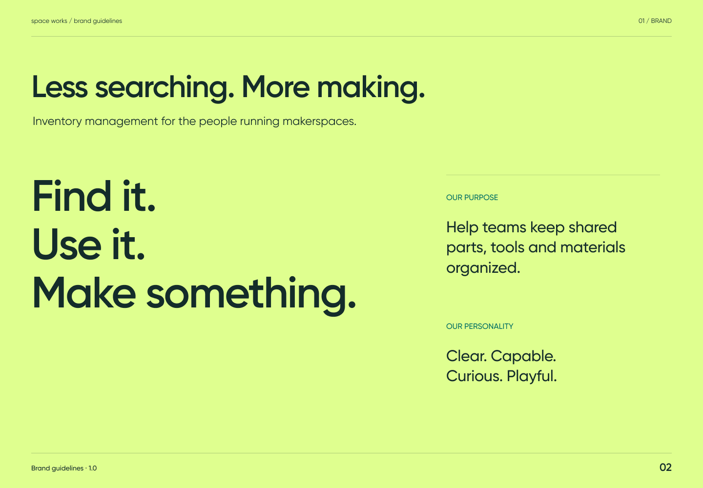
Brand guidelines v2 page 04: Free, open software for the people running makerspaces and tool libraries.Page 04Less searching. More making.Full-size PNG · 95.0 kB · 1440 × 1000
Read page 04 as text

Less searching. More making. Free, open software for the people running makerspaces and tool libraries. Find it. Use it. Make something. Our purpose Help teams keep shared parts, tools and materials organised, and prove every handover. Our personality Clear. Capable. Curious. Playful. Carried over from v1 unchanged. What grew is the product: loans, machines, events, bookings and membership now sit under the same name.

Related semantic guidance
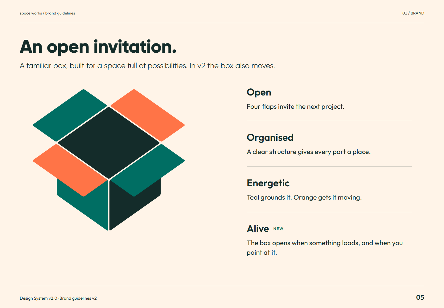
Brand guidelines v2 page 05: A familiar box, built for a space full of possibilities. In v2 the box also moves.Page 05An open invitation.Full-size PNG · 91.2 kB · 1440 × 1000
Read page 05 as text

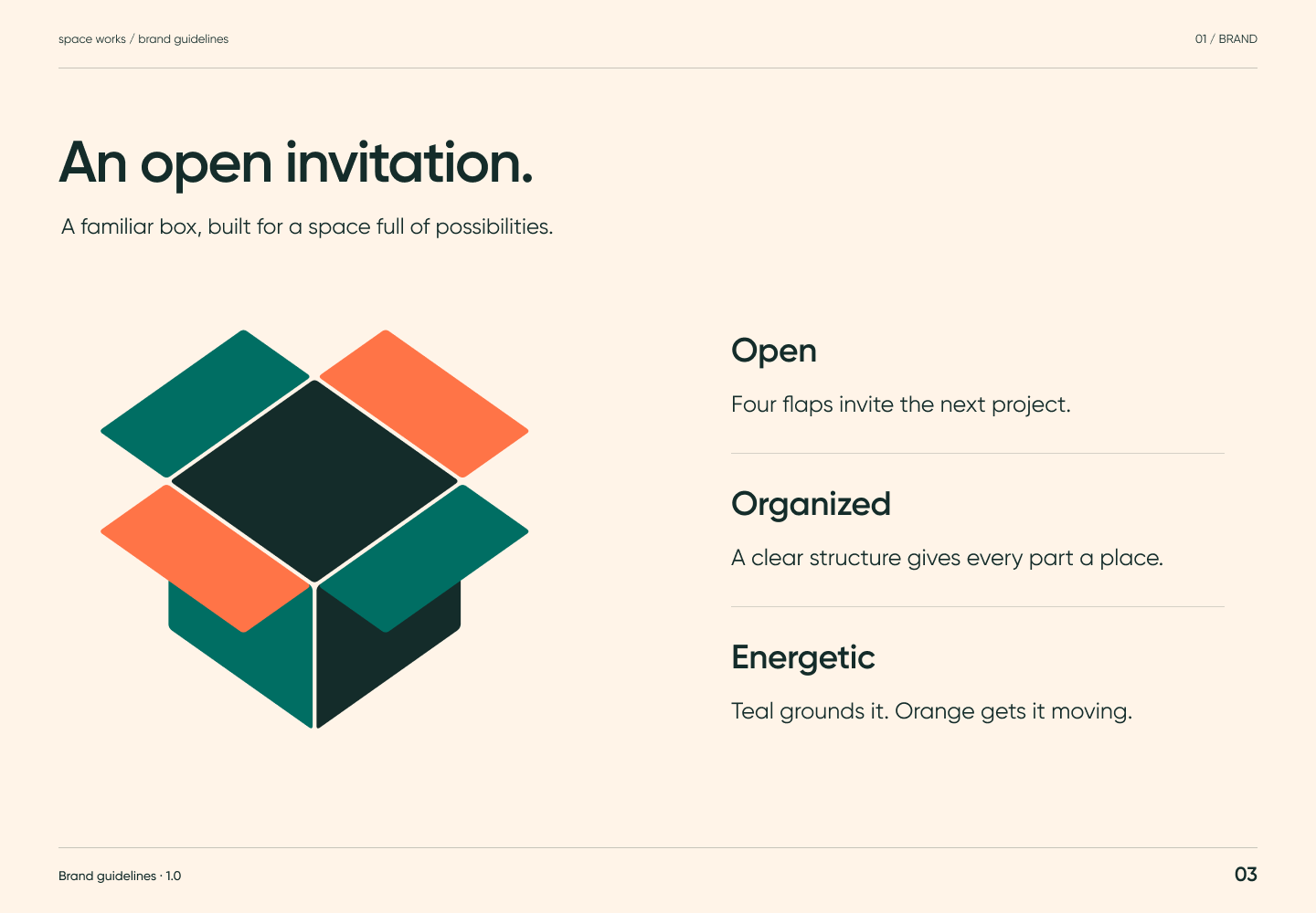
An open invitation. A familiar box, built for a space full of possibilities. In v2 the box also moves. Open Four flaps invite the next project. Organised A clear structure gives every part a place. Energetic Teal grounds it. Orange gets it moving. Alive New The box opens when something loads, and when you point at it.

Related semantic guidance
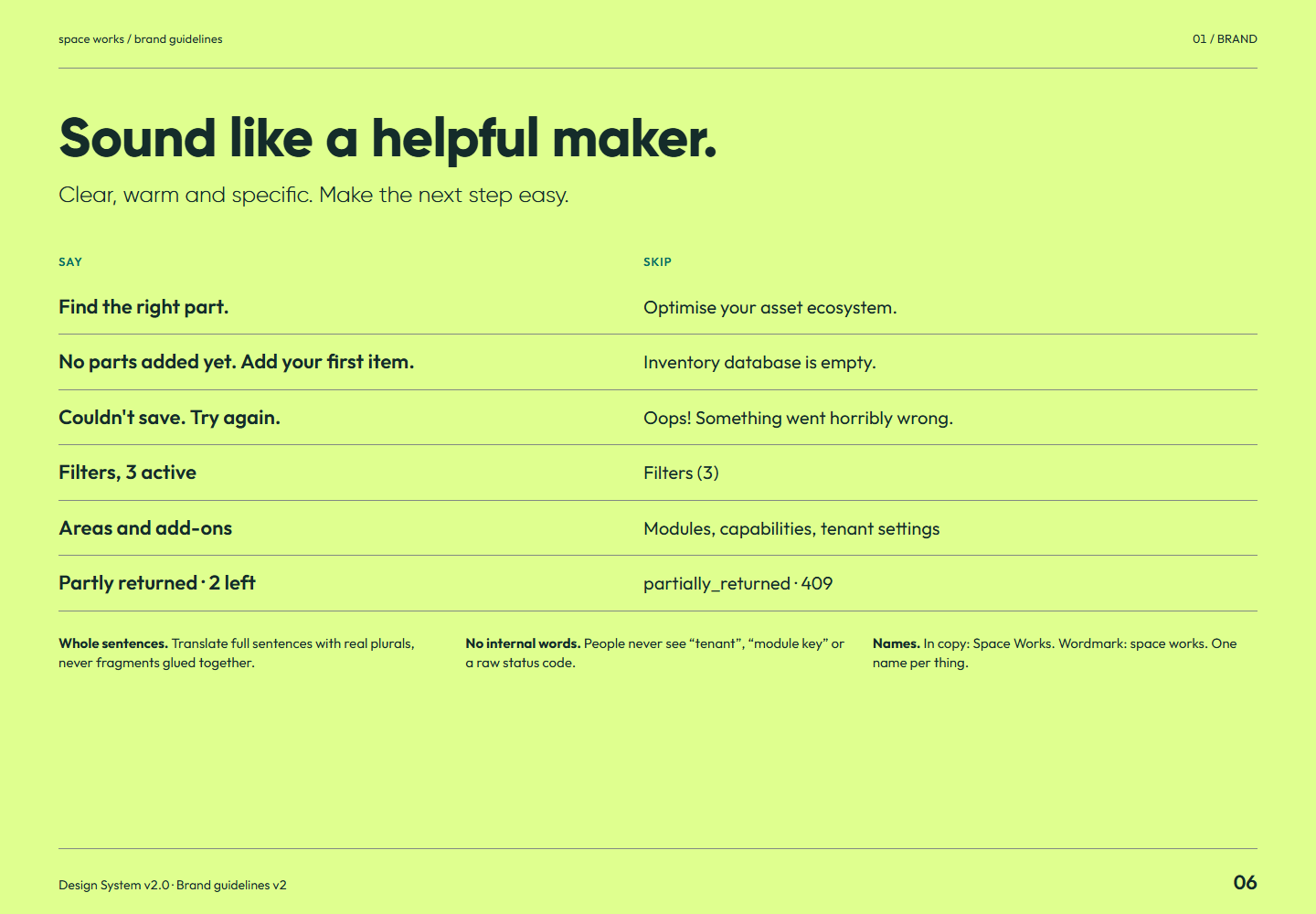
Brand guidelines v2 page 06: Clear, warm and specific. Make the next step easy.Page 06Sound like a helpful maker.Full-size PNG · 90.0 kB · 1440 × 1000
Read page 06 as text

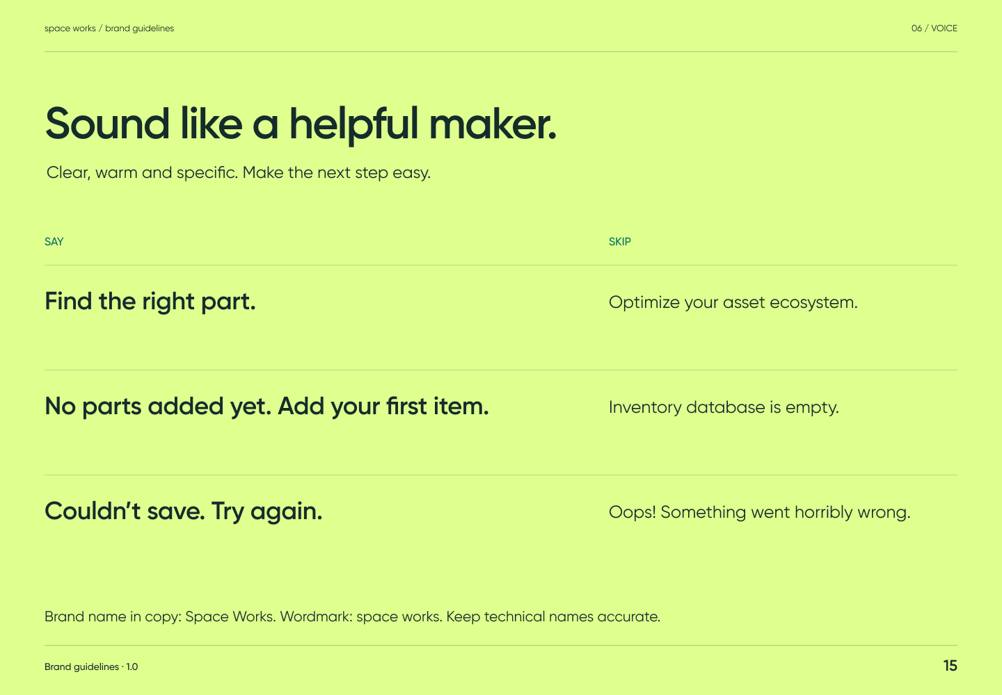
Sound like a helpful maker. Clear, warm and specific. Make the next step easy. Say Skip Find the right part. Optimise your asset ecosystem. No parts added yet. Add your first item. Inventory database is empty. Couldn't save. Try again. Oops! Something went horribly wrong. Filters, 3 active Filters (3) Areas and add-ons Modules, capabilities, tenant settings Partly returned · 2 left partially_returned · 409 Whole sentences. Translate full sentences with real plurals, never fragments glued together. No internal words. People never see “tenant”, “module key” or a raw status code. Names. In copy: Space Works. Wordmark: space works. One name per thing.

Related semantic guidance
02 / Logo · pages 07, 08, 09, 10, 11
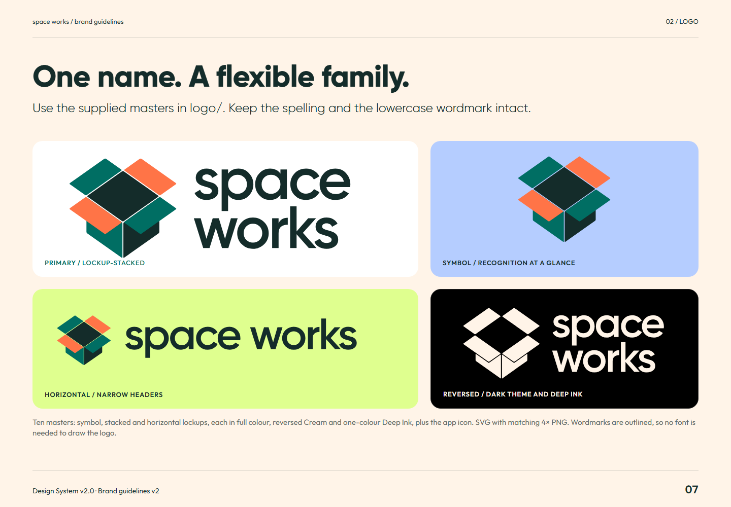
Brand guidelines v2 page 07: Use the supplied masters in logo/ . Keep the spelling and the lowercase wordmark intact.Page 07One name. A flexible family.Full-size PNG · 139.6 kB · 1440 × 1000
Read page 07 as text

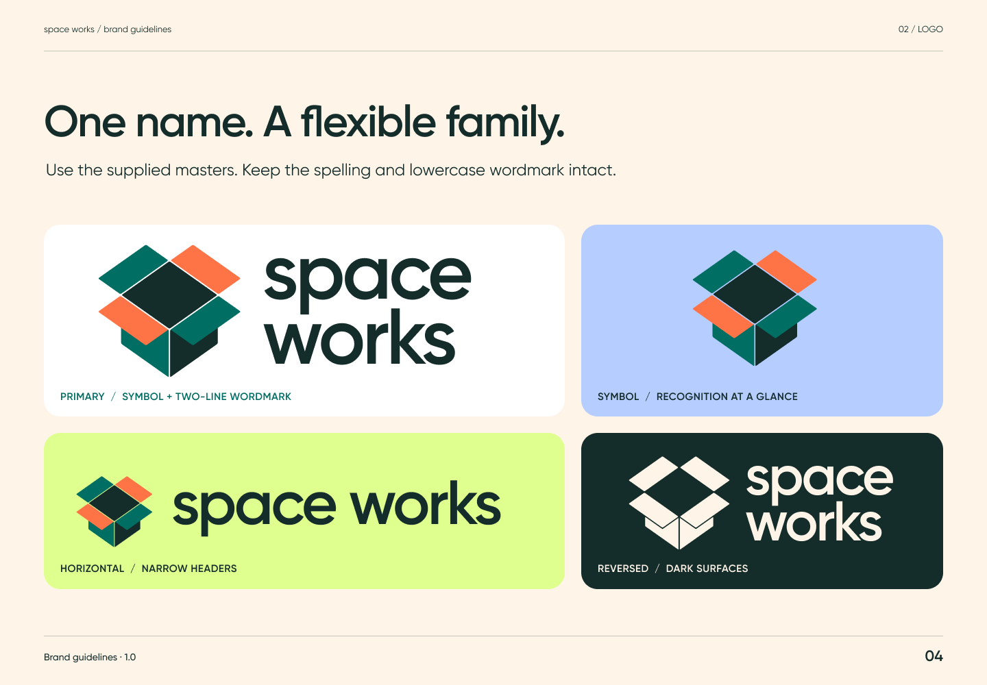
One name. A flexible family. Use the supplied masters in logo/ . Keep the spelling and the lowercase wordmark intact. Primary / lockup-stacked Symbol / recognition at a glance Horizontal / narrow headers Reversed / dark theme and Deep Ink Ten masters: symbol, stacked and horizontal lockups, each in full colour, reversed Cream and one-colour Deep Ink, plus the app icon. SVG with matching 4× PNG. Wordmarks are outlined, so no font is needed to draw the logo.

Related semantic guidance
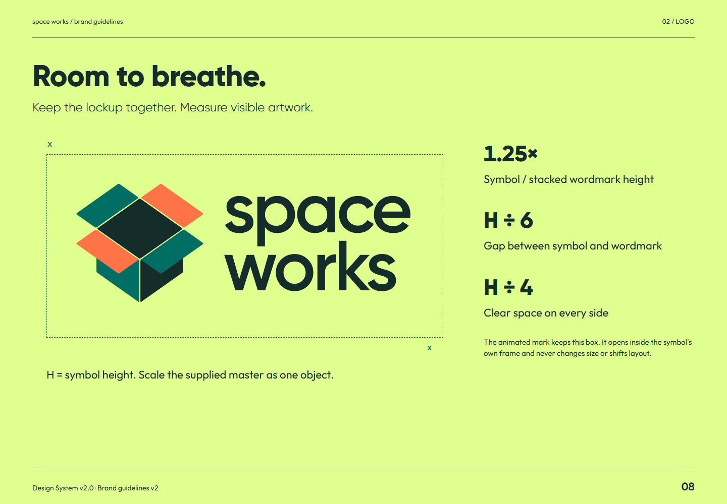
Brand guidelines v2 page 08: Keep the lockup together. Measure visible artwork.Page 08Room to breathe.Full-size PNG · 103.7 kB · 1440 × 1000
Read page 08 as text

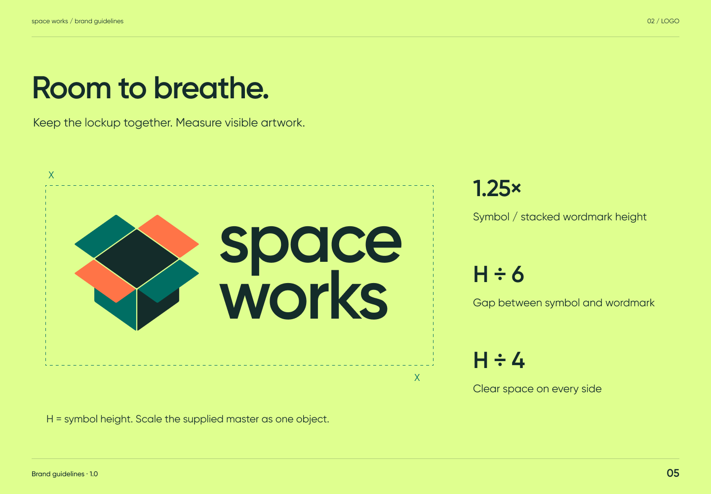
Room to breathe. Keep the lockup together. Measure visible artwork. X X H = symbol height. Scale the supplied master as one object. 1.25× Symbol / stacked wordmark height H ÷ 6 Gap between symbol and wordmark H ÷ 4 Clear space on every side The animated mark keeps this box. It opens inside the symbol's own frame and never changes size or shifts layout.

Related semantic guidance
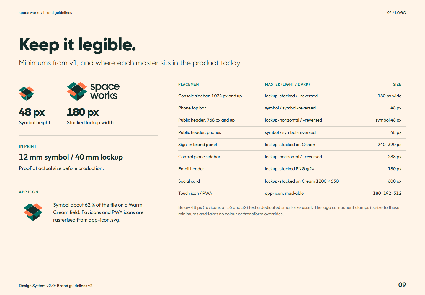
Brand guidelines v2 page 09: Minimums from v1, and where each master sits in the product today.Page 09Keep it legible.Full-size PNG · 132.0 kB · 1440 × 1000
Read page 09 as text

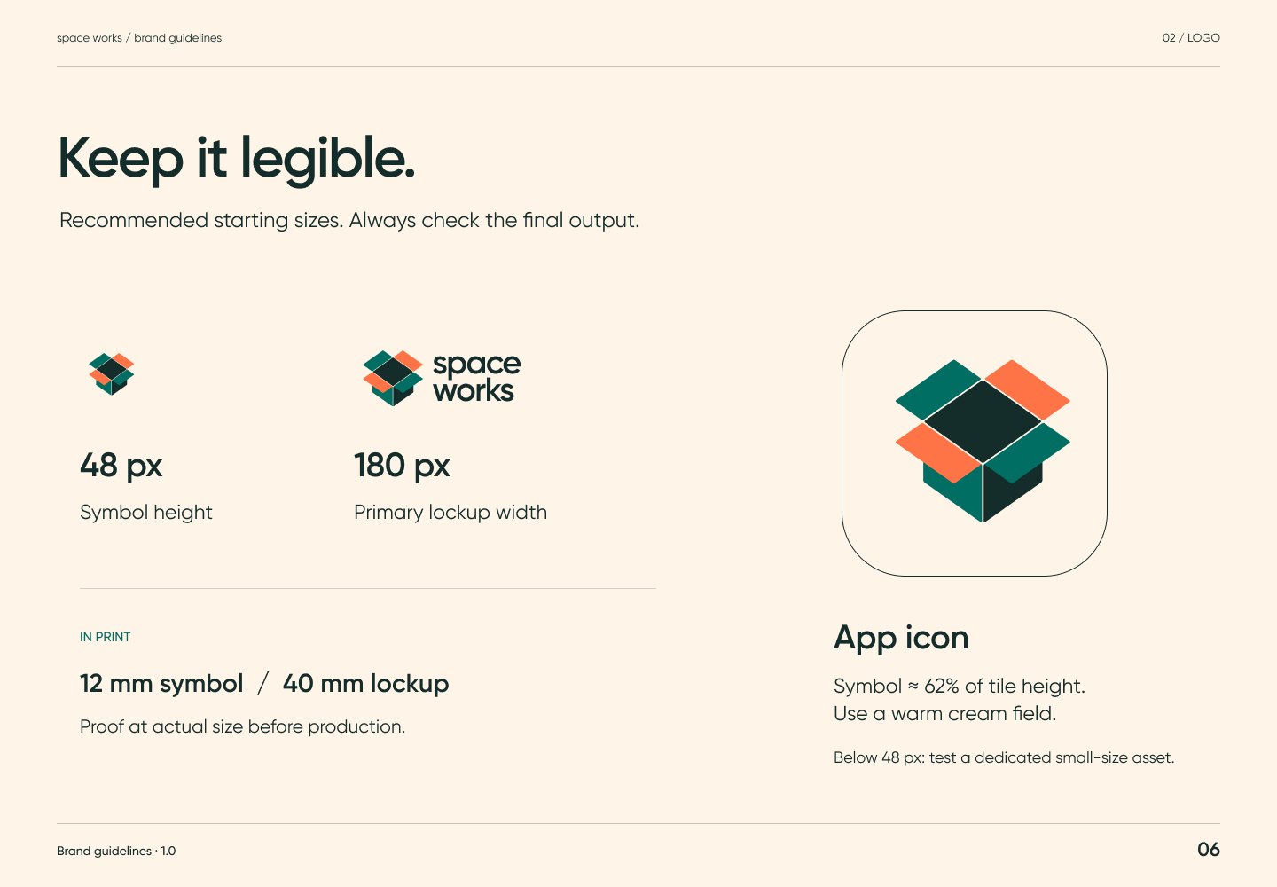
Keep it legible. Minimums from v1, and where each master sits in the product today. 48 px Symbol height 180 px Stacked lockup width In print 12 mm symbol / 40 mm lockup Proof at actual size before production. App icon Symbol about 62 % of the tile on a Warm Cream field. Favicons and PWA icons are rasterised from app-icon.svg . Placement Master (light / dark) Size Console sidebar, 1024 px and up lockup-stacked / -reversed 180 px wide Phone top bar symbol / symbol-reversed 48 px Public header, 768 px and up lockup-horizontal / -reversed symbol 48 px Public header, phones symbol / symbol-reversed 48 px Sign-in brand panel lockup-stacked on Cream 240–320 px Control plane sidebar lockup-horizontal / -reversed 288 px Email header lockup-stacked PNG @2× 180 px Social card lockup-stacked on Cream 1200 × 630 600 px Touch icon / PWA app-icon, maskable 180 · 192 · 512 Below 48 px (favicons at 16 and 32) test a dedicated small-size asset. The logo component clamps its size to these minimums and takes no colour or transform overrides.

Related semantic guidance
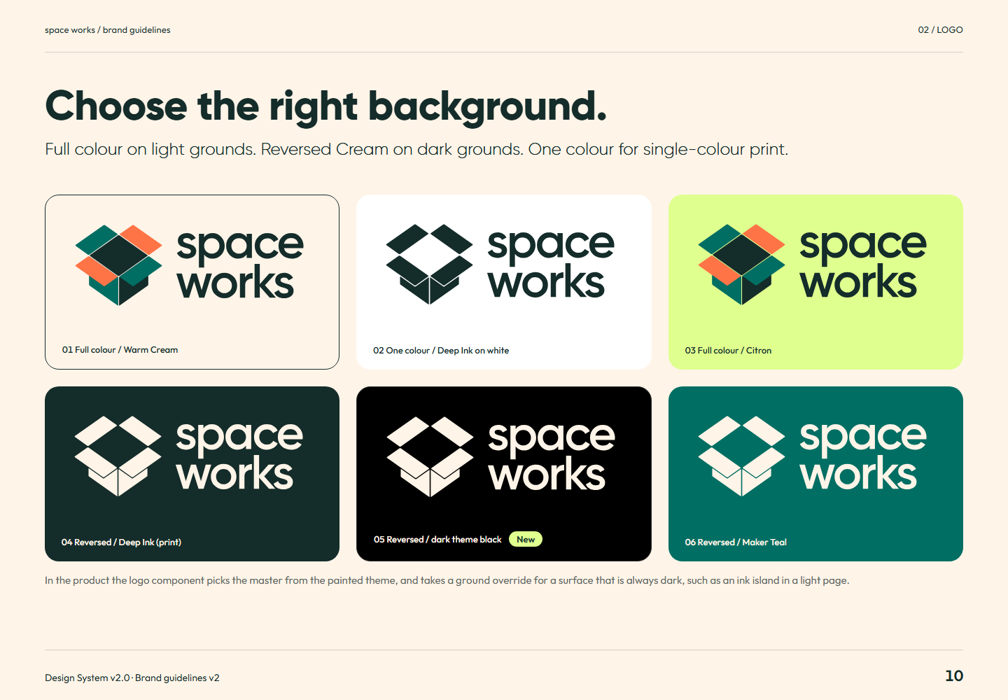
Brand guidelines v2 page 10: Full colour on light grounds. Reversed Cream on dark grounds. One colour for single-colour print.Page 10Choose the right background.Full-size PNG · 160.4 kB · 1440 × 1000
Read page 10 as text

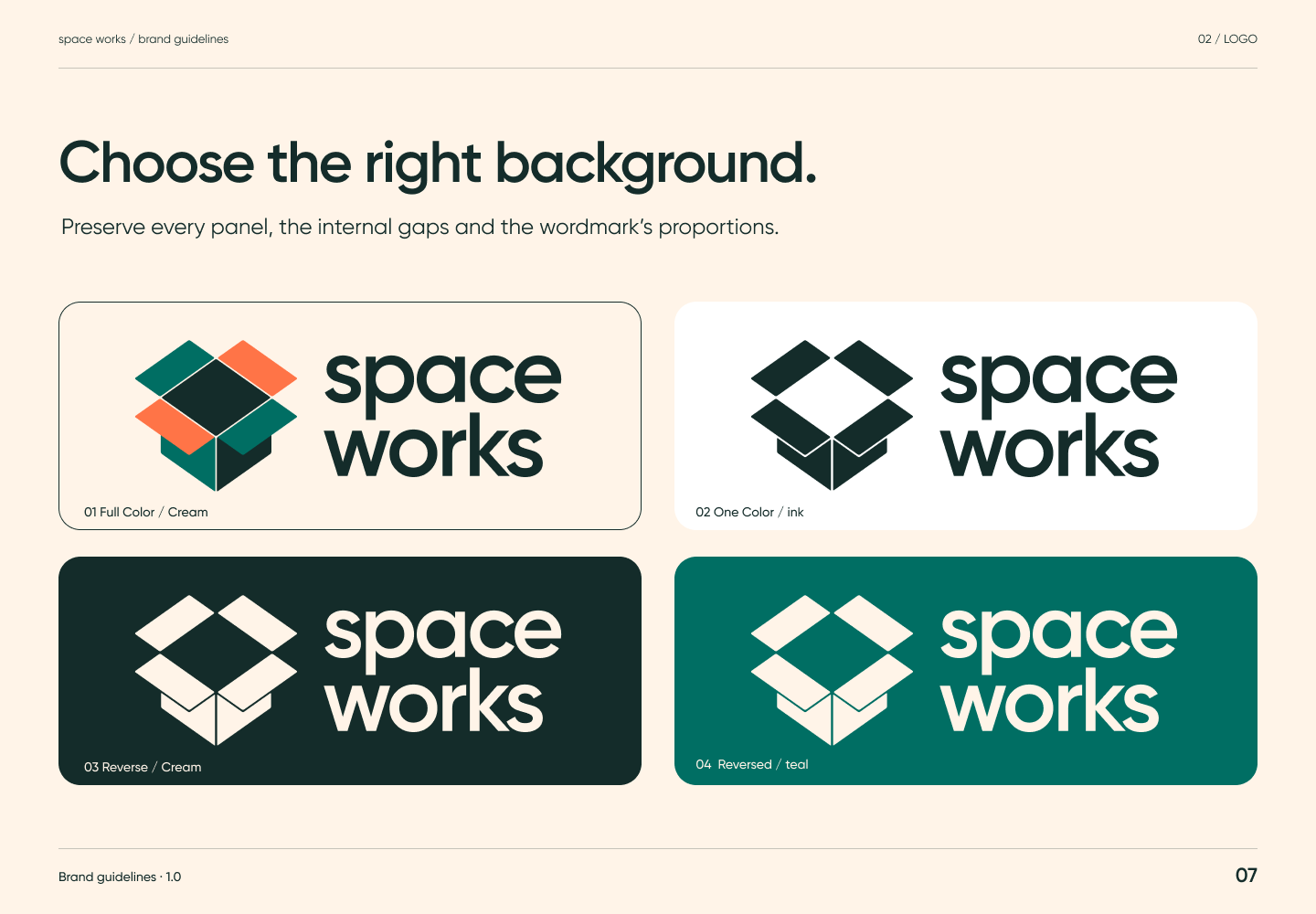
Choose the right background. Full colour on light grounds. Reversed Cream on dark grounds. One colour for single-colour print. 01 Full colour / Warm Cream 02 One colour / Deep Ink on white 03 Full colour / Citron 04 Reversed / Deep Ink (print) 05 Reversed / dark theme black New 06 Reversed / Maker Teal In the product the logo component picks the master from the painted theme, and takes a ground override for a surface that is always dark, such as an ink island in a light page.

Related semantic guidance
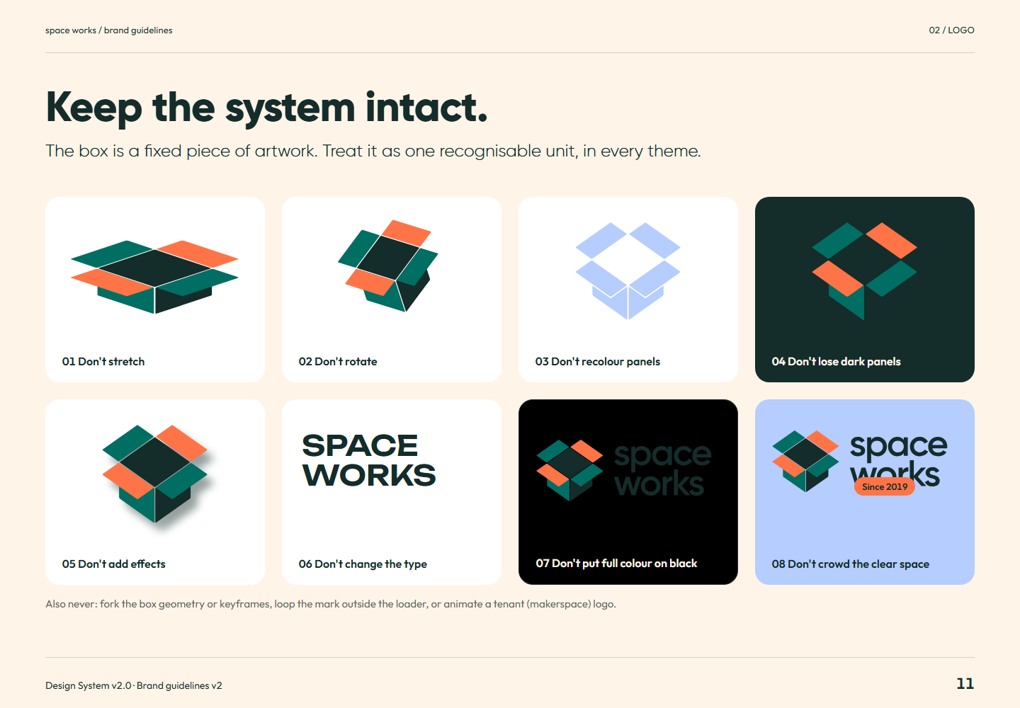
Brand guidelines v2 page 11: The box is a fixed piece of artwork. Treat it as one recognisable unit, in every theme.Page 11Keep the system intact.Full-size PNG · 134.3 kB · 1440 × 1000
Read page 11 as text

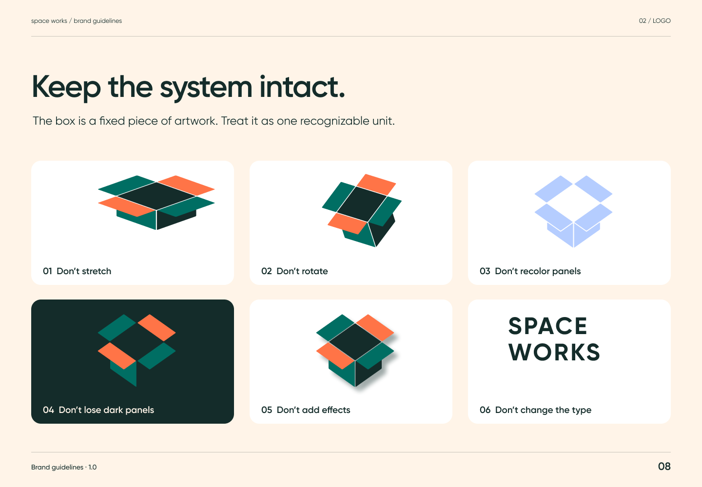
Keep the system intact. The box is a fixed piece of artwork. Treat it as one recognisable unit, in every theme. 01 Don't stretch 02 Don't rotate 03 Don't recolour panels 04 Don't lose dark panels 05 Don't add effects Space Works 06 Don't change the type 07 Don't put full colour on black Since 2019 08 Don't crowd the clear space Also never: fork the box geometry or keyframes, loop the mark outside the loader, or animate a tenant (makerspace) logo.

Related semantic guidance
03 / Logo in motion · pages 12, 13, 14, 15, 16
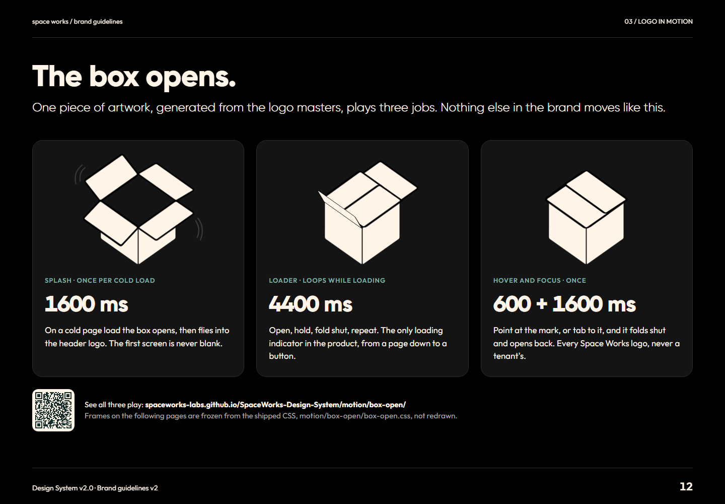
Brand guidelines v2 page 12: One piece of artwork, generated from the logo masters, plays three jobs. Nothing else in the brand moves like this.Page 12The box opens.Full-size PNG · 132.2 kB · 1440 × 1000
Read page 12 as text

The box opens. One piece of artwork, generated from the logo masters, plays three jobs. Nothing else in the brand moves like this. Splash · once per cold load 1600 ms On a cold page load the box opens, then flies into the header logo. The first screen is never blank. Loader · loops while loading 4400 ms Open, hold, fold shut, repeat. The only loading indicator in the product, from a page down to a button. Hover and focus · once 600 + 1600 ms Point at the mark, or tab to it, and it folds shut and opens back. Every Space Works logo, never a tenant's. See all three play: spaceworks-labs.github.io/SpaceWorks-Design-System/motion/box-open/ Frames on the following pages are frozen from the shipped CSS, motion/box-open/box-open.css , not redrawn.

Related semantic guidance
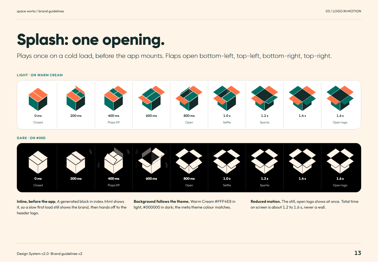
Brand guidelines v2 page 13: Plays once on a cold load, before the app mounts. Flaps open bottom-left, top-left, bottom-right, top-right.Page 13Splash: one opening.Full-size PNG · 163.9 kB · 1440 × 1000
Read page 13 as text

Splash: one opening. Plays once on a cold load, before the app mounts. Flaps open bottom-left, top-left, bottom-right, top-right. Light · on Warm Cream Dark · on #000 Inline, before the app. A generated block in index.html shows it, so a slow first load still shows the brand, then hands off to the header logo. Background follows the theme. Warm Cream in light, in dark; the meta theme colour matches. Reduced motion. The still, open logo shows at once. Total time on screen is about 1.2 to 1.6 s, never a wall.

Related semantic guidance
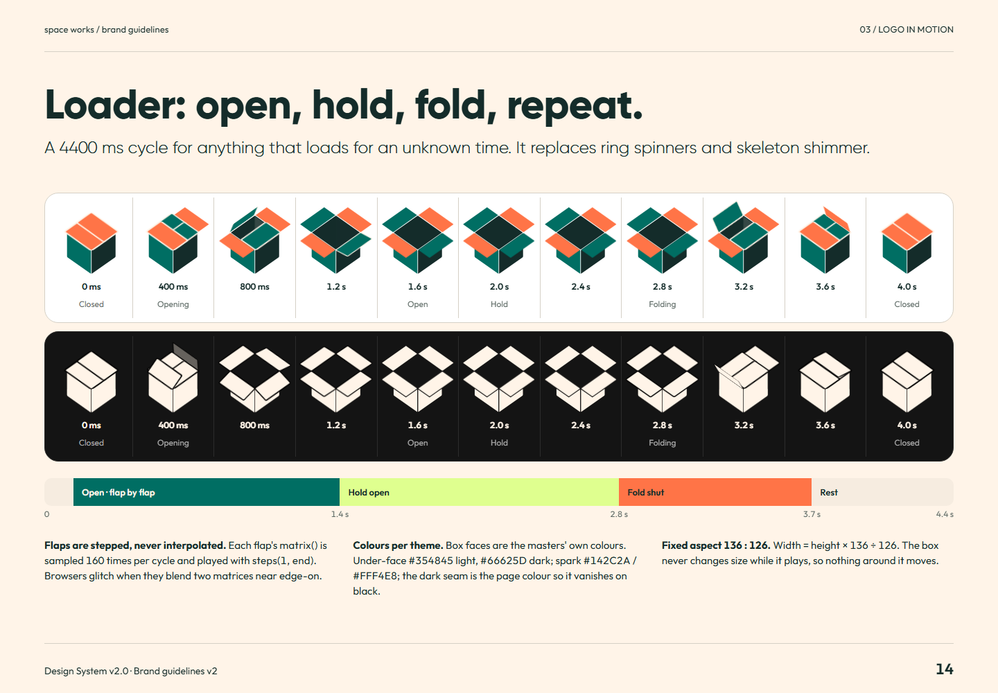
Brand guidelines v2 page 14: A 4400 ms cycle for anything that loads for an unknown time. It replaces ring spinners and skeleton shimmer.Page 14Loader: open, hold, fold, repeat.Full-size PNG · 172.0 kB · 1440 × 1000
Read page 14 as text

Loader: open, hold, fold, repeat. A 4400 ms cycle for anything that loads for an unknown time. It replaces ring spinners and skeleton shimmer. Open · flap by flap Hold open Fold shut Rest 0 1.4 s 2.8 s 3.7 s 4.4 s Flaps are stepped, never interpolated. Each flap's matrix() is sampled 160 times per cycle and played with steps(1, end) . Browsers glitch when they blend two matrices near edge-on. Colours per theme. Box faces are the masters' own colours. Under-face light, dark; spark / ; the dark seam is the page colour so it vanishes on black. Fixed aspect 136 : 126. Width = height × 136 ÷ 126. The box never changes size while it plays, so nothing around it moves.

Related semantic guidance
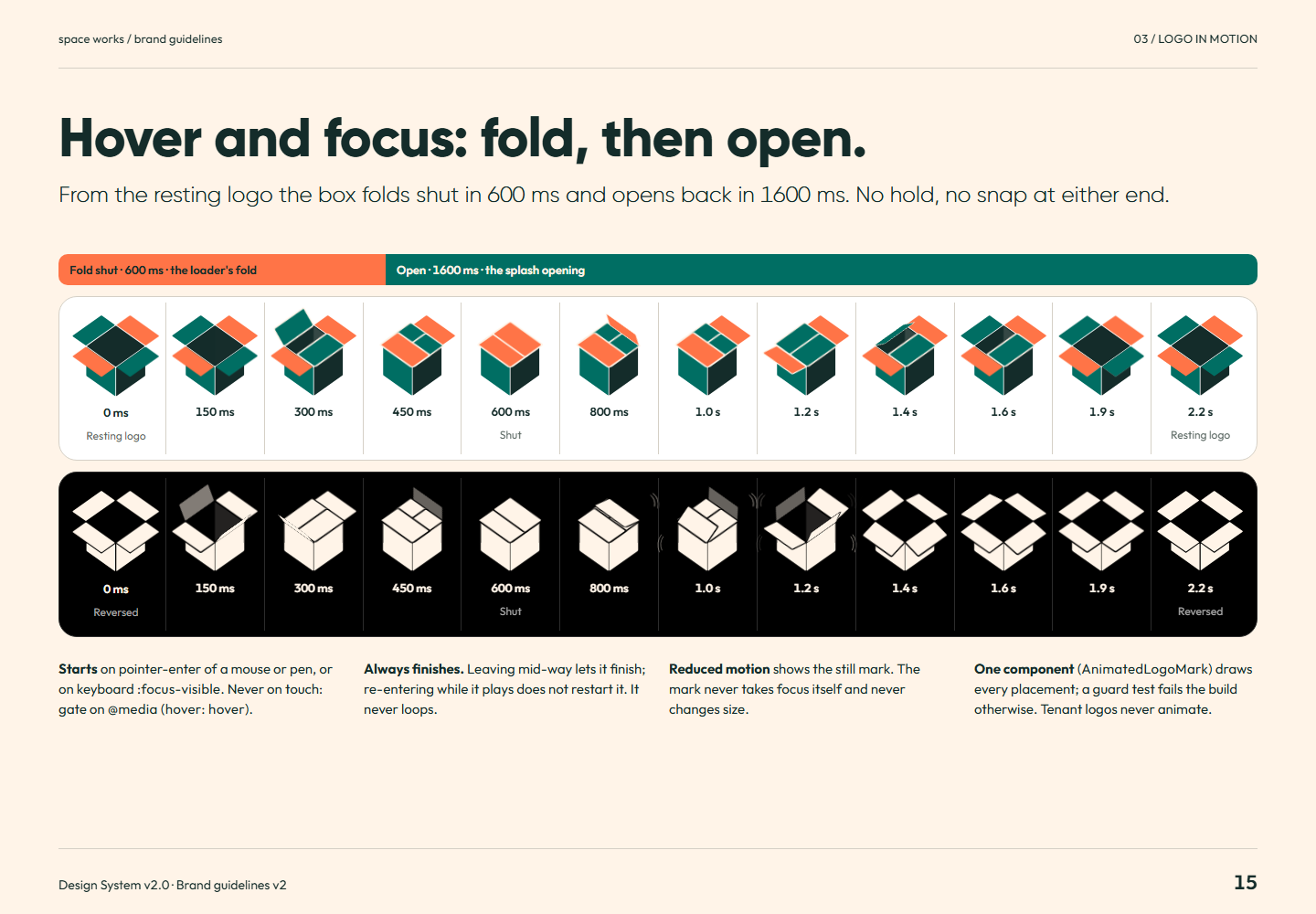
Brand guidelines v2 page 15: From the resting logo the box folds shut in 600 ms and opens back in 1600 ms. No hold, no snap at either end.Page 15Hover and focus: fold, then open.Full-size PNG · 186.6 kB · 1440 × 1000
Read page 15 as text

Hover and focus: fold, then open. From the resting logo the box folds shut in 600 ms and opens back in 1600 ms. No hold, no snap at either end. Fold shut · 600 ms · the loader's fold Open · 1600 ms · the splash opening Starts on pointer-enter of a mouse or pen, or on keyboard :focus-visible . Never on touch: gate on @media (hover: hover) . Always finishes. Leaving mid-way lets it finish; re-entering while it plays does not restart it. It never loops. Reduced motion shows the still mark. The mark never takes focus itself and never changes size. One component ( AnimatedLogoMark ) draws every placement; a guard test fails the build otherwise. Tenant logos never animate.

Related semantic guidance
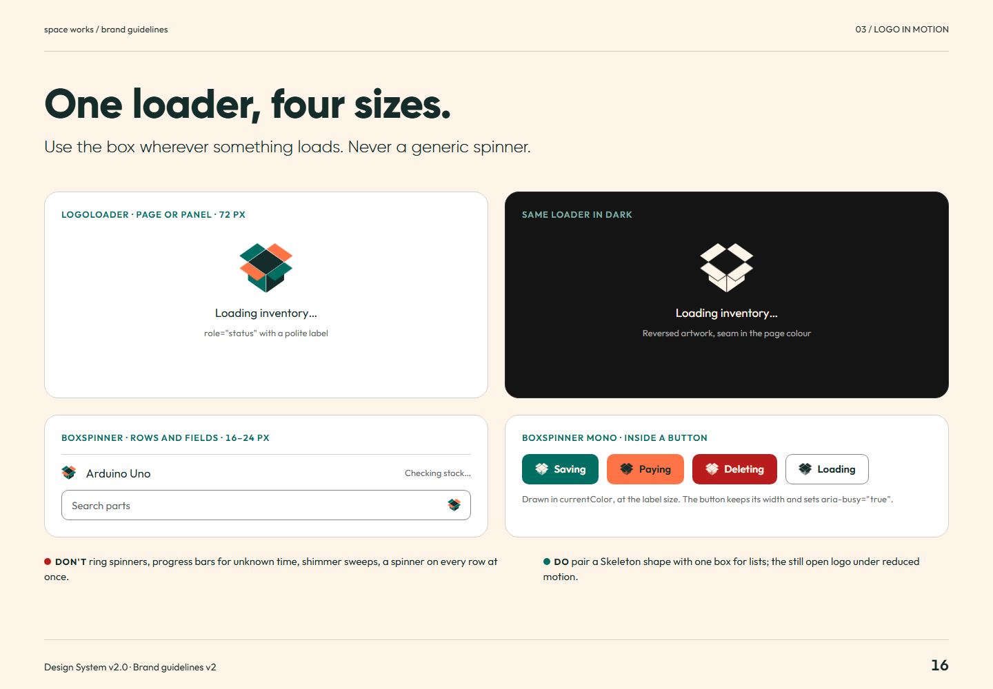
Brand guidelines v2 page 16: Use the box wherever something loads. Never a generic spinner.Page 16One loader, four sizes.Full-size PNG · 101.5 kB · 1440 × 1000
Read page 16 as text

One loader, four sizes. Use the box wherever something loads. Never a generic spinner. LogoLoader · page or panel · 72 px Loading inventory… role="status" with a polite label Same loader in dark Loading inventory… Reversed artwork, seam in the page colour BoxSpinner · rows and fields · 16–24 px Arduino Uno Checking stock… Search parts BoxSpinner mono · inside a button Saving Paying Deleting Loading Drawn in currentColor , at the label size. The button keeps its width and sets aria-busy="true" . Don't ring spinners, progress bars for unknown time, shimmer sweeps, a spinner on every row at once. Do pair a Skeleton shape with one box for lists; the still open logo under reduced motion.

Related semantic guidance
04 / Colour · pages 17, 18, 19, 20, 21, 22, 23, 24
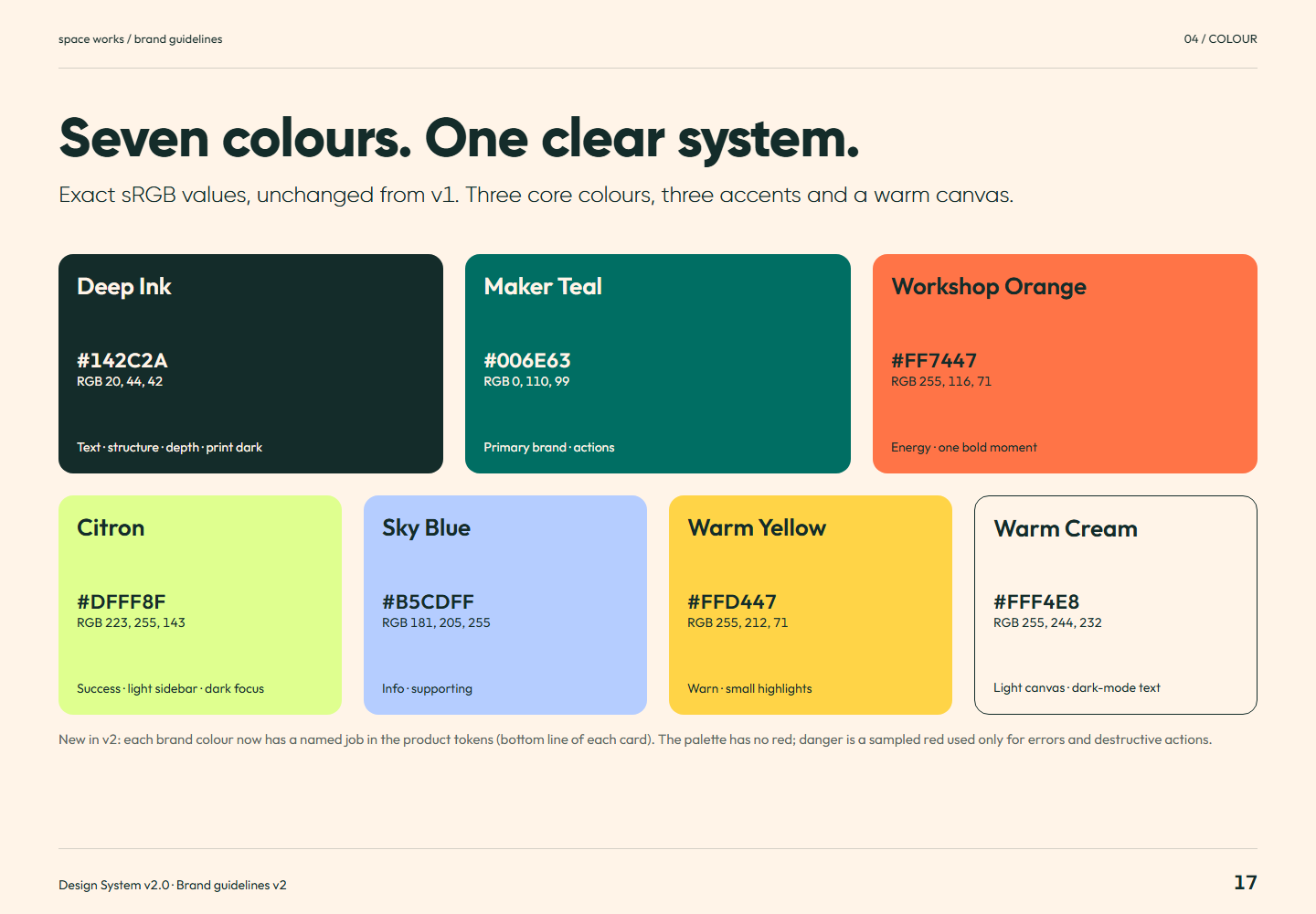
Brand guidelines v2 page 17: Exact sRGB values, unchanged from v1. Three core colours, three accents and a warm canvas.Page 17Seven colours. One clear system.Full-size PNG · 110.9 kB · 1440 × 1000
Read page 17 as text

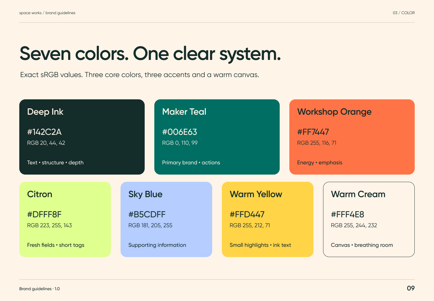
Seven colours. One clear system. Exact sRGB values, unchanged from v1. Three core colours, three accents and a warm canvas. Deep Ink RGB 20, 44, 42 Text · structure · depth · print dark Maker Teal RGB 0, 110, 99 Primary brand · actions Workshop Orange RGB 255, 116, 71 Energy · one bold moment Citron RGB 223, 255, 143 Success · light sidebar · dark focus Sky Blue RGB 181, 205, 255 Info · supporting Warm Yellow RGB 255, 212, 71 Warn · small highlights Warm Cream RGB 255, 244, 232 Light canvas · dark-mode text New in v2: each brand colour now has a named job in the product tokens (bottom line of each card). The palette has no red; danger is a sampled red used only for errors and destructive actions.

Related semantic guidance
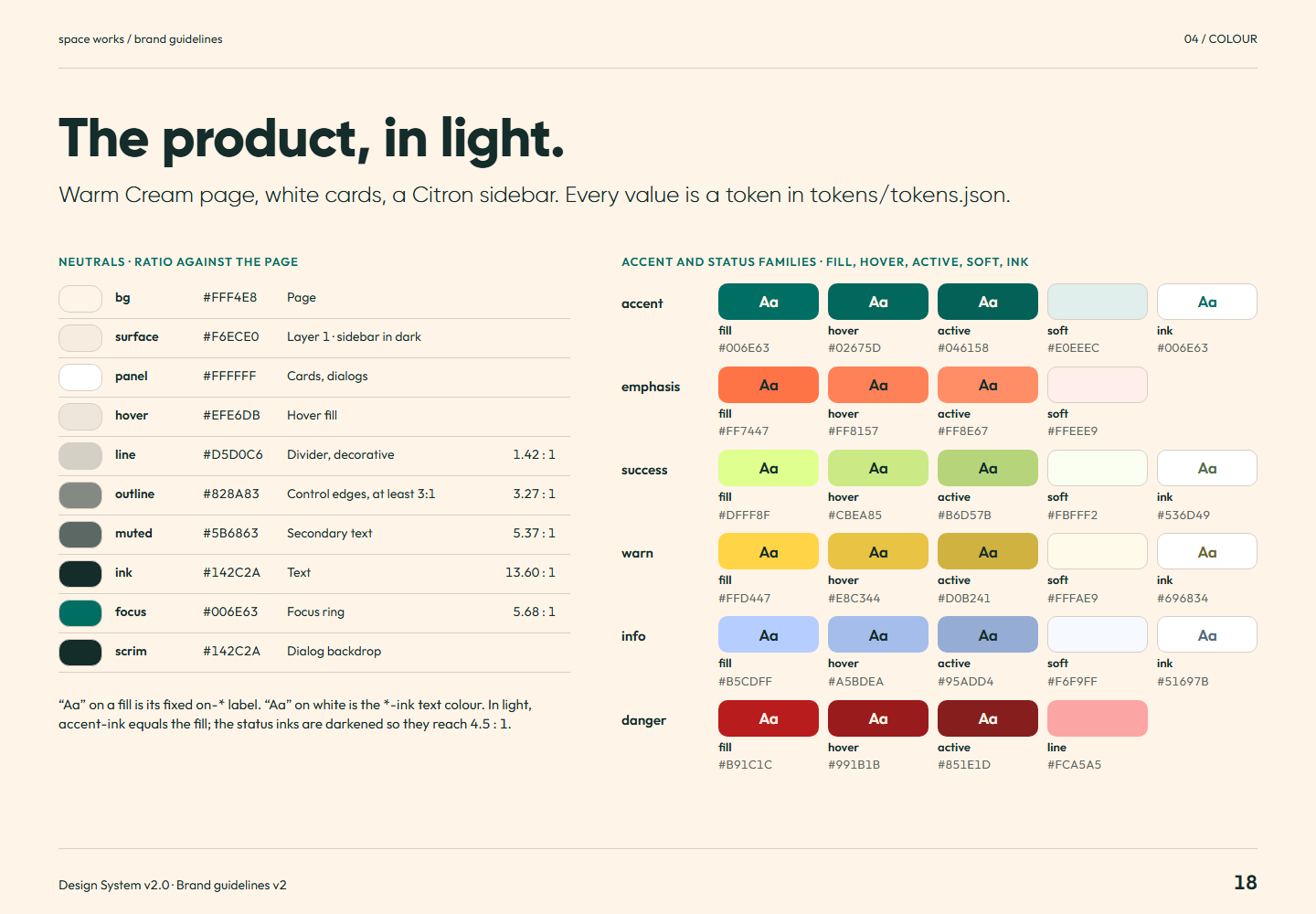
Brand guidelines v2 page 18: Warm Cream page, white cards, a Citron sidebar. Every value is a token in tokens/tokens.json .Page 18The product, in light.Full-size PNG · 142.9 kB · 1440 × 1000
Read page 18 as text

The product, in light. Warm Cream page, white cards, a Citron sidebar. Every value is a token in tokens/tokens.json . Neutrals · ratio against the page “Aa” on a fill is its fixed on-* label. “Aa” on white is the *-ink text colour. In light, accent-ink equals the fill; the status inks are darkened so they reach 4.5 : 1. Accent and status families · fill, hover, active, soft, ink

Related semantic guidance
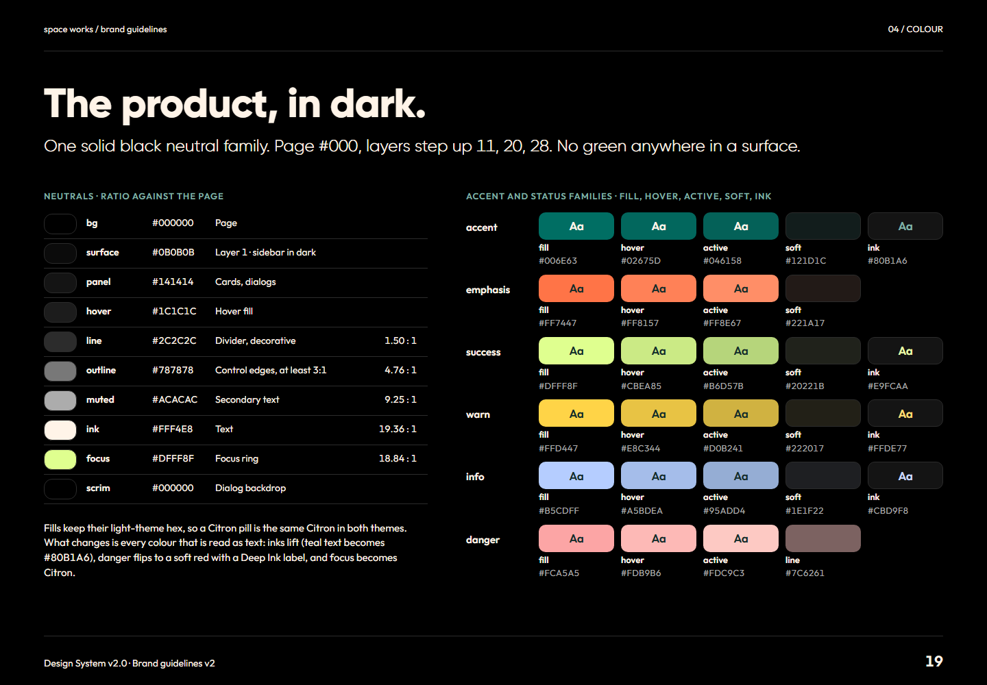
Brand guidelines v2 page 19: One solid black neutral family. Page #000 , layers step up 11, 20, 28. No green anywhere in a surface.Page 19The product, in dark.Full-size PNG · 148.4 kB · 1440 × 1000
Read page 19 as text

The product, in dark. One solid black neutral family. Page #000 , layers step up 11, 20, 28. No green anywhere in a surface. Neutrals · ratio against the page Fills keep their light-theme hex, so a Citron pill is the same Citron in both themes. What changes is every colour that is read as text: inks lift (teal text becomes ), danger flips to a soft red with a Deep Ink label, and focus becomes Citron. Accent and status families · fill, hover, active, soft, ink

Related semantic guidance
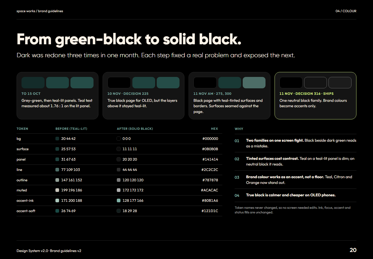
Brand guidelines v2 page 20: Dark was redone three times in one month. Each step fixed a real problem and exposed the next.Page 20From green-black to solid black.Full-size PNG · 132.1 kB · 1440 × 1000
Read page 20 as text

From green-black to solid black. Dark was redone three times in one month. Each step fixed a real problem and exposed the next. To 15 Oct Grey-green, then teal-lit panels. Teal text measured about 1.76 : 1 on the lit panel. 10 Nov · decision 225 True black page for OLED, but the layers above it stayed teal-lit. 11 Nov am · 275, 300 Black page with teal-tinted surfaces and borders. Surfaces seamed against the page. 11 Nov · decision 316 · ships One neutral black family. Brand colours become accents only. Token Before (teal-lit) After (solid black) Hex bg 20 44 42 0 0 0 surface 25 57 53 11 11 11 panel 31 67 63 20 20 20 line 77 109 103 44 44 44 outline 147 161 152 120 120 120 muted 199 196 186 172 172 172 accent-ink 171 200 188 128 177 166 accent-soft 26 74 69 18 29 28 Why 01 Two families on one screen fight. Black beside dark green reads as a mistake. 02 Tinted surfaces cost contrast. Teal on a teal-lit panel is dim; on neutral black it reads. 03 Brand colour works as an accent, not a floor. Teal, Citron and Orange now stand out. 04 True black is calmer and cheaper on OLED phones. Token names never changed, so no screen needed edits. Ink, focus, accent and status fills are unchanged.

Related semantic guidance
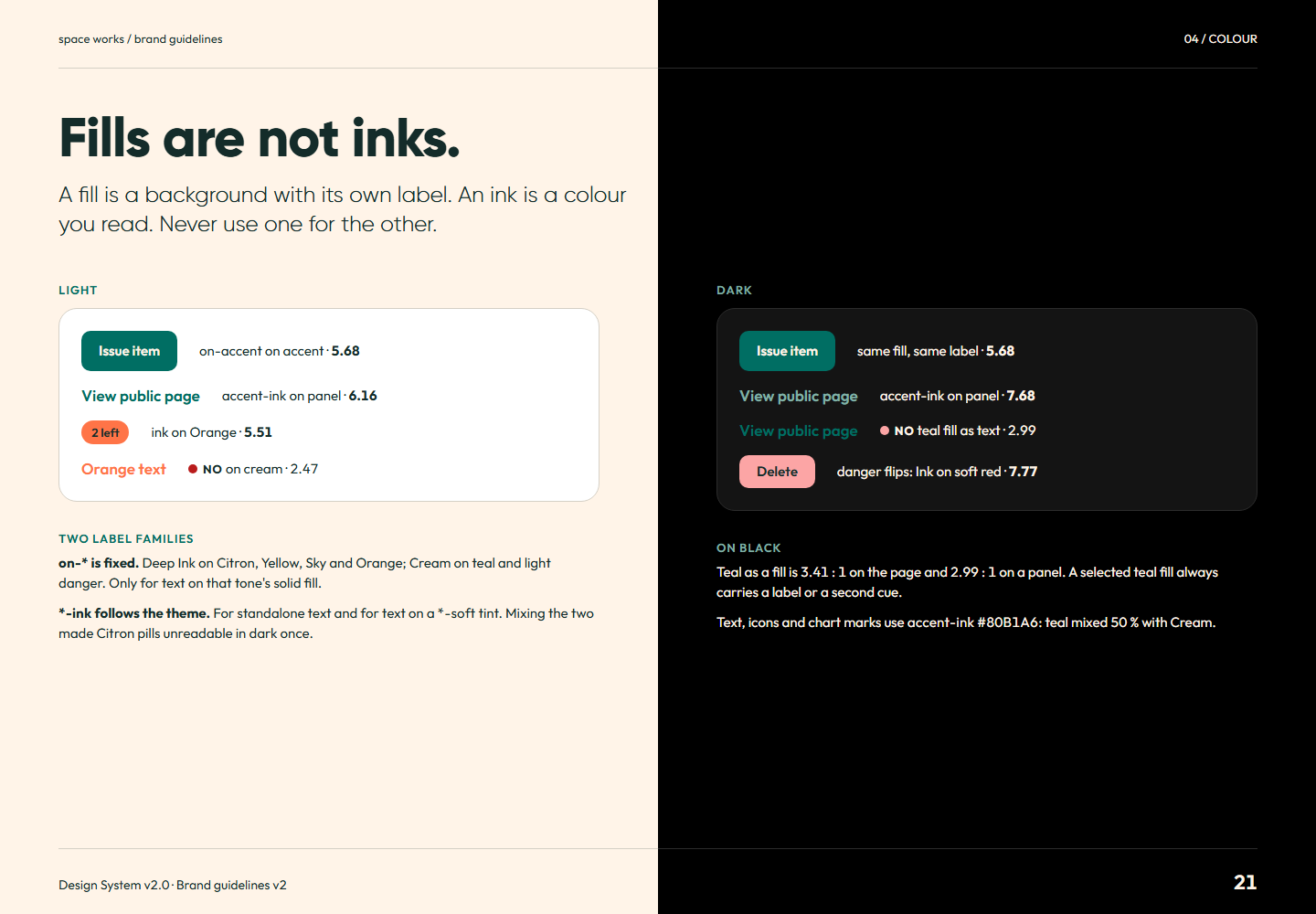
Brand guidelines v2 page 21: A fill is a background with its own label. An ink is a colour you read. Never use one for the other.Page 21Fills are not inks.Full-size PNG · 107.4 kB · 1440 × 1000
Read page 21 as text

Fills are not inks. A fill is a background with its own label. An ink is a colour you read. Never use one for the other. Light Issue item on-accent on accent · View public page accent-ink on panel · 2 left ink on Orange · Orange text No on cream · Two label families on-* is fixed. Deep Ink on Citron, Yellow, Sky and Orange; Cream on teal and light danger. Only for text on that tone's solid fill. *-ink follows the theme. For standalone text and for text on a *-soft tint. Mixing the two made Citron pills unreadable in dark once. Dark Issue item same fill, same label · View public page accent-ink on panel · View public page No teal fill as text · Delete danger flips: Ink on soft red · On black Teal as a fill is : 1 on the page and : 1 on a panel. A selected teal fill always carries a label or a second cue. Text, icons and chart marks use accent-ink : teal mixed 50 % with Cream.

Related semantic guidance
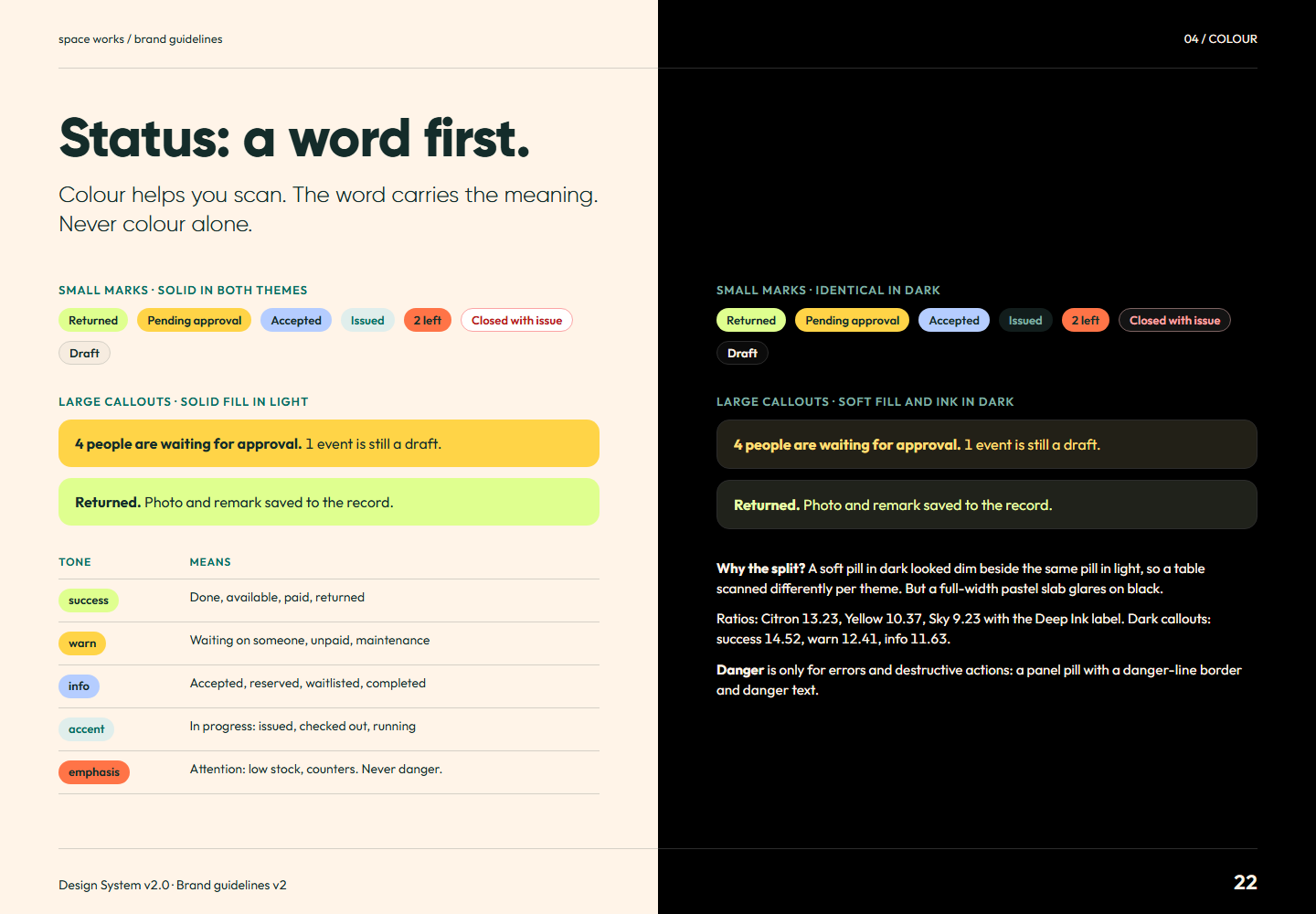
Brand guidelines v2 page 22: Colour helps you scan. The word carries the meaning. Never colour alone.Page 22Status: a word first.Full-size PNG · 138.5 kB · 1440 × 1000
Read page 22 as text

Status: a word first. Colour helps you scan. The word carries the meaning. Never colour alone. Small marks · solid in both themes Returned Pending approval Accepted Issued 2 left Closed with issue Draft Large callouts · solid fill in light 4 people are waiting for approval. 1 event is still a draft. Returned. Photo and remark saved to the record. Tone Means success Done, available, paid, returned warn Waiting on someone, unpaid, maintenance info Accepted, reserved, waitlisted, completed accent In progress: issued, checked out, running emphasis Attention: low stock, counters. Never danger. Small marks · identical in dark Returned Pending approval Accepted Issued 2 left Closed with issue Draft Large callouts · soft fill and ink in dark 4 people are waiting for approval. 1 event is still a draft. Returned. Photo and remark saved to the record. Why the split? A soft pill in dark looked dim beside the same pill in light, so a table scanned differently per theme. But a full-width pastel slab glares on black. Ratios: Citron , Yellow , Sky with the Deep Ink label. Dark callouts: success , warn , info . Danger is only for errors and destructive actions: a panel pill with a danger-line border and danger text.

Related semantic guidance
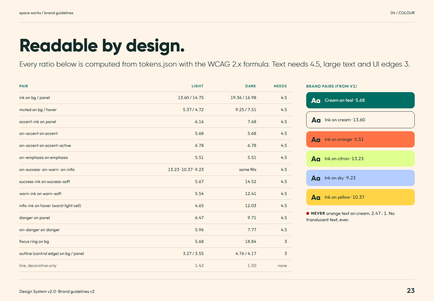
Brand guidelines v2 page 23: Every ratio below is computed from tokens.json with the WCAG 2.x formula. Text needs 4.5, large text and UI edges 3.Page 23Readable by design.Full-size PNG · 114.7 kB · 1440 × 1000
Read page 23 as text

Readable by design. Every ratio below is computed from tokens.json with the WCAG 2.x formula. Text needs 4.5, large text and UI edges 3. Pair Light Dark Needs ink on bg / panel / / 4.5 muted on bg / hover / / 4.5 accent-ink on panel 4.5 on-accent on accent 4.5 on-accent on accent-active 4.5 on-emphasis on emphasis 4.5 on-success · on-warn · on-info · · same fills 4.5 success-ink on success-soft 4.5 warn-ink on warn-soft 4.5 info-ink on hover (worst light cell) 4.5 danger on panel 4.5 on-danger on danger 4.5 focus ring on bg 3 outline (control edge) on bg / panel / / 3 line, decorative only none Brand pairs (from v1) Aa Cream on teal · Aa Ink on cream · Aa Ink on orange · Aa Ink on citron · Aa Ink on sky · Aa Ink on yellow · Never orange text on cream: : 1. No translucent text, ever.

Related semantic guidance
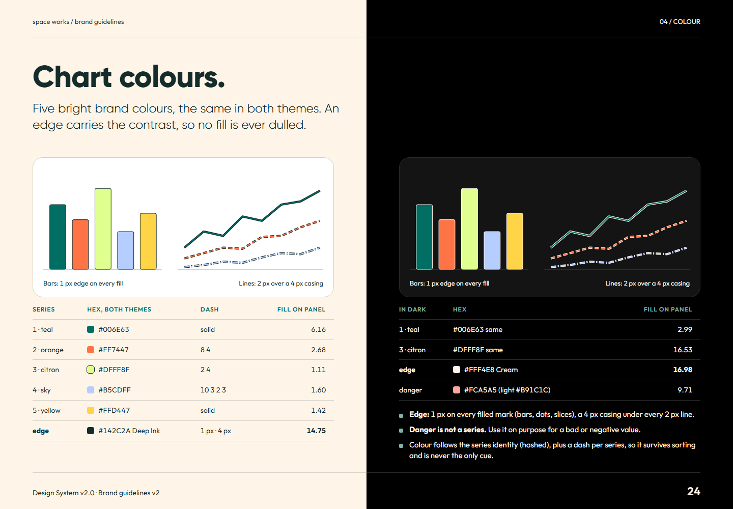
Brand guidelines v2 page 24: Five bright brand colours, the same in both themes. An edge carries the contrast, so no fill is ever dulled.Page 24Chart colours.Full-size PNG · 129.2 kB · 1440 × 1000
Read page 24 as text

Chart colours. Five bright brand colours, the same in both themes. An edge carries the contrast, so no fill is ever dulled. Series Hex, both themes Dash fill on panel 1 · teal solid 2 · orange 8 4 3 · citron 2 4 4 · sky 10 3 2 3 5 · yellow solid edge Deep Ink 1 px · 4 px In dark Hex fill on panel 1 · teal same 3 · citron same edge Cream danger (light ) Edge: 1 px on every filled mark (bars, dots, slices), a 4 px casing under every 2 px line. Danger is not a series. Use it on purpose for a bad or negative value. Colour follows the series identity (hashed), plus a dash per series, so it survives sorting and is never the only cue.

Related semantic guidance
05 / Typography · pages 25, 26, 27, 28, 29
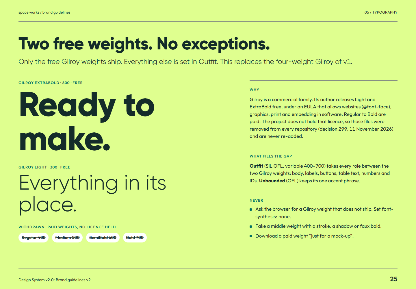
Brand guidelines v2 page 25: Only the free Gilroy weights ship. Everything else is set in Outfit. This replaces the four-weight Gilroy of v1.Page 25Two free weights. No exceptions.Full-size PNG · 153.8 kB · 1440 × 1000
Read page 25 as text

Two free weights. No exceptions. Only the free Gilroy weights ship. Everything else is set in Outfit. This replaces the four-weight Gilroy of v1. Gilroy ExtraBold · 800 · free Ready to make. Gilroy Light · 300 · free Everything in its place. Withdrawn · paid weights, no licence held Regular 400 Medium 500 SemiBold 600 Bold 700 Why Gilroy is a commercial family. Its author releases Light and ExtraBold free, under an EULA that allows websites ( @font-face ), graphics, print and embedding in software. Regular to Bold are paid. The project does not hold that licence, so those files were removed from every repository (decision 299, 11 November 2026) and are never re-added. What fills the gap Outfit (SIL OFL, variable 400–700) takes every role between the two Gilroy weights: body, labels, buttons, table text, numbers and IDs. Unbounded (OFL) keeps its one accent phrase. Never Ask the browser for a Gilroy weight that does not ship. Set font-synthesis: none . Fake a middle weight with a stroke, a shadow or faux bold. Download a paid weight “just for a mock-up”.

Related semantic guidance
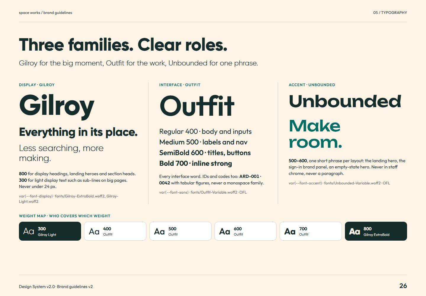
Brand guidelines v2 page 26: Gilroy for the big moment, Outfit for the work, Unbounded for one phrase.Page 26Three families. Clear roles.Full-size PNG · 154.4 kB · 1440 × 1000
Read page 26 as text

Three families. Clear roles. Gilroy for the big moment, Outfit for the work, Unbounded for one phrase. Display · Gilroy Gilroy Everything in its place. Less searching, more making. 800 for display headings, landing heroes and section heads. 300 for light display text such as sub-lines on big pages. Never under 24 px. var(--font-display) · fonts/Gilroy-ExtraBold.woff2, Gilroy-Light.woff2 Interface · Outfit Outfit Regular 400 · body and inputs Medium 500 · labels and nav SemiBold 600 · titles, buttons Bold 700 · inline strong Every interface word. IDs and codes too: ARD-001 · 0042 with tabular figures, never a monospace family. var(--font-sans) · fonts/Outfit-Variable.woff2 · OFL Accent · Unbounded Unbounded Make room. 500–600 , one short phrase per layout: the landing hero, the sign-in brand panel, an empty-state hero. Never in staff chrome, never a paragraph. var(--font-accent) · fonts/Unbounded-Variable.woff2 · OFL Weight map · who covers which weight Aa 300 Gilroy Light Aa 400 Outfit Aa 500 Outfit Aa 600 Outfit Aa 700 Outfit Aa 800 Gilroy ExtraBold

Related semantic guidance
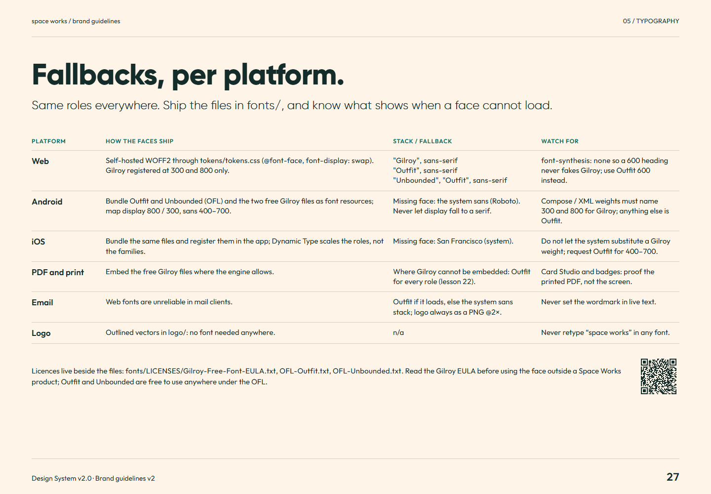
Brand guidelines v2 page 27: Same roles everywhere. Ship the files in fonts/ , and know what shows when a face cannot load.Page 27Fallbacks, per platform.Full-size PNG · 138.1 kB · 1440 × 1000
Read page 27 as text

Fallbacks, per platform. Same roles everywhere. Ship the files in fonts/ , and know what shows when a face cannot load. Platform How the faces ship Stack / fallback Watch for Web Self-hosted WOFF2 through tokens/tokens.css ( @font-face , font-display: swap ). Gilroy registered at 300 and 800 only. "Gilroy", sans-serif "Outfit", sans-serif "Unbounded", "Outfit", sans-serif font-synthesis: none so a 600 heading never fakes Gilroy; use Outfit 600 instead. Android Bundle Outfit and Unbounded (OFL) and the two free Gilroy files as font resources; map display 800 / 300, sans 400–700. Missing face: the system sans (Roboto). Never let display fall to a serif. Compose / XML weights must name 300 and 800 for Gilroy; anything else is Outfit. iOS Bundle the same files and register them in the app; Dynamic Type scales the roles, not the families. Missing face: San Francisco (system). Do not let the system substitute a Gilroy weight; request Outfit for 400–700. PDF and print Embed the free Gilroy files where the engine allows. Where Gilroy cannot be embedded: Outfit for every role (lesson 22). Card Studio and badges: proof the printed PDF, not the screen. Email Web fonts are unreliable in mail clients. Outfit if it loads, else the system sans stack; logo always as a PNG @2×. Never set the wordmark in live text. Logo Outlined vectors in logo/ : no font needed anywhere. n/a Never retype “space works” in any font. Licences live beside the files: fonts/LICENSES/Gilroy-Free-Font-EULA.txt , OFL-Outfit.txt , OFL-Unbounded.txt . Read the Gilroy EULA before using the face outside a Space Works product; Outfit and Unbounded are free to use anywhere under the OFL.

Related semantic guidance
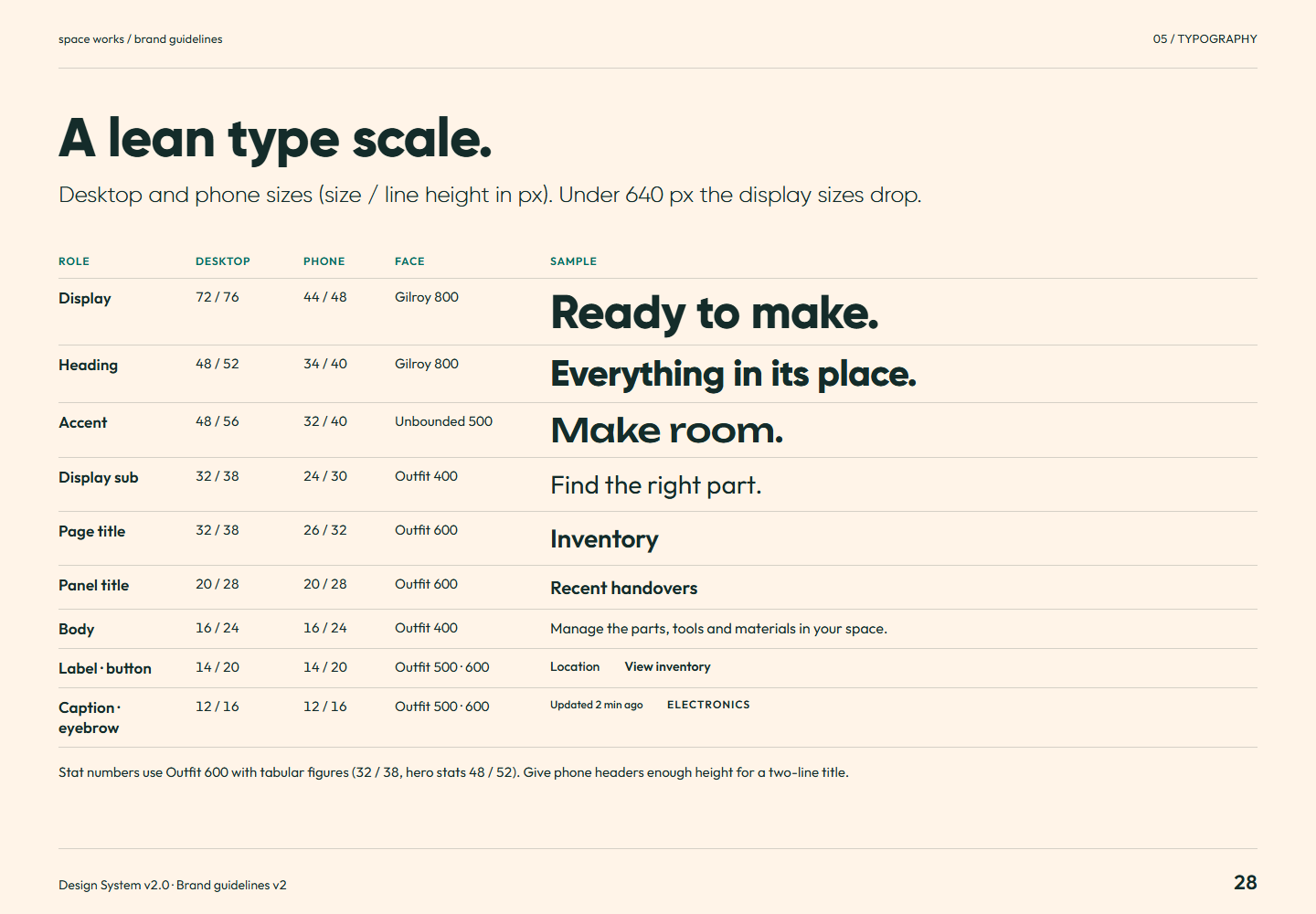
Brand guidelines v2 page 28: Desktop and phone sizes (size / line height in px). Under 640 px the display sizes drop.Page 28A lean type scale.Full-size PNG · 115.1 kB · 1440 × 1000
Read page 28 as text

A lean type scale. Desktop and phone sizes (size / line height in px). Under 640 px the display sizes drop. Role Desktop Phone Face Sample Display 72 / 76 44 / 48 Gilroy 800 Ready to make. Heading 48 / 52 34 / 40 Gilroy 800 Everything in its place. Accent 48 / 56 32 / 40 Unbounded 500 Make room. Display sub 32 / 38 24 / 30 Outfit 400 Find the right part. Page title 32 / 38 26 / 32 Outfit 600 Inventory Panel title 20 / 28 20 / 28 Outfit 600 Recent handovers Body 16 / 24 16 / 24 Outfit 400 Manage the parts, tools and materials in your space. Label · button 14 / 20 14 / 20 Outfit 500 · 600 Location View inventory Caption · eyebrow 12 / 16 12 / 16 Outfit 500 · 600 Updated 2 min ago Electronics Stat numbers use Outfit 600 with tabular figures (32 / 38, hero stats 48 / 52). Give phone headers enough height for a two-line title.

Related semantic guidance
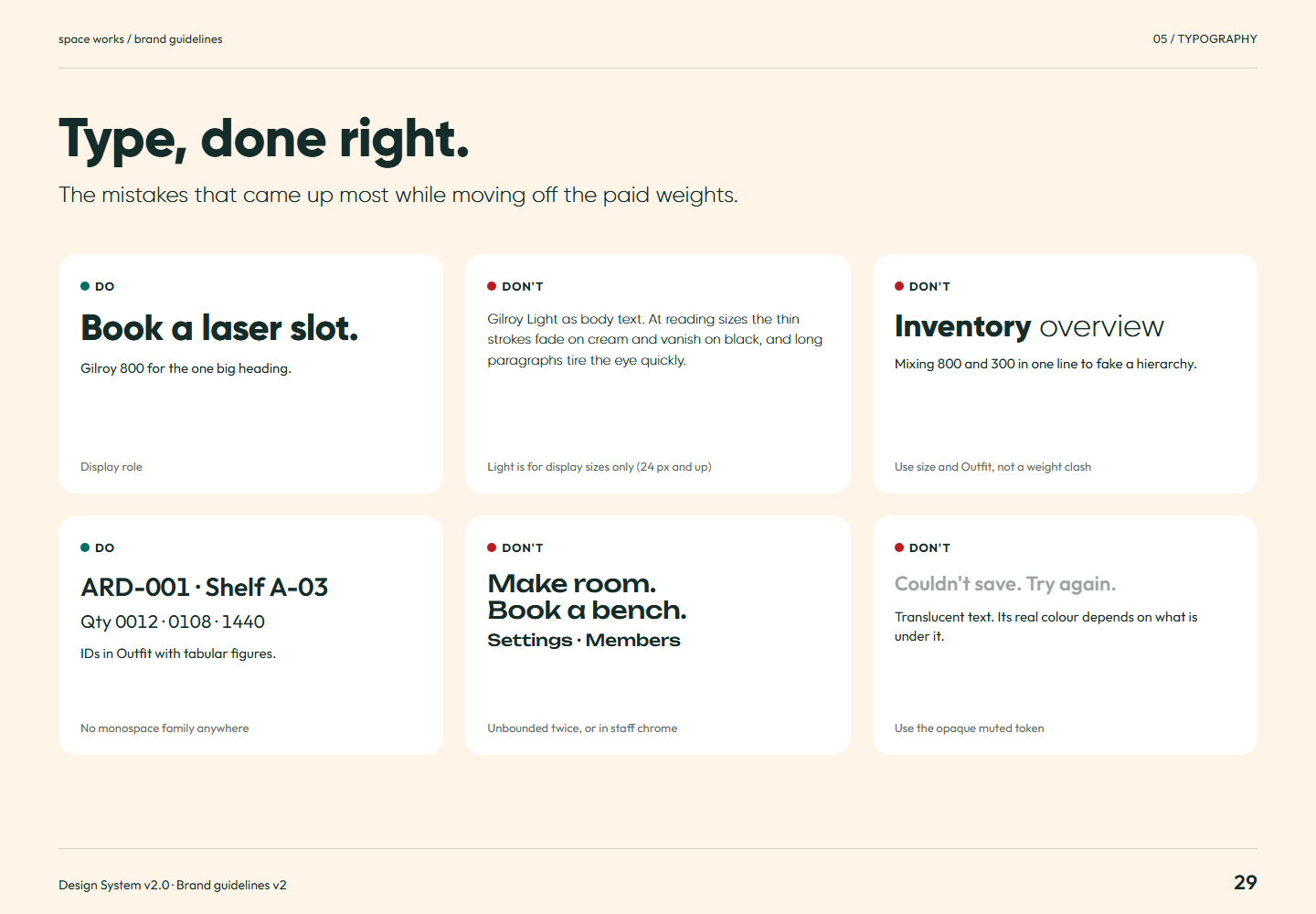
Brand guidelines v2 page 29: The mistakes that came up most while moving off the paid weights.Page 29Type, done right.Full-size PNG · 107.4 kB · 1440 × 1000
Read page 29 as text

Type, done right. The mistakes that came up most while moving off the paid weights. Do Book a laser slot. Gilroy 800 for the one big heading. Display role Don't Gilroy Light as body text. At reading sizes the thin strokes fade on cream and vanish on black, and long paragraphs tire the eye quickly. Light is for display sizes only (24 px and up) Don't Inventory overview Mixing 800 and 300 in one line to fake a hierarchy. Use size and Outfit, not a weight clash Do ARD-001 · Shelf A-03 Qty 0012 · 0108 · 1440 IDs in Outfit with tabular figures. No monospace family anywhere Don't Make room. Book a bench. Settings · Members Unbounded twice, or in staff chrome Don't Couldn't save. Try again. Translucent text. Its real colour depends on what is under it. Use the opaque muted token

Related semantic guidance
06 / Light and dark · pages 30, 31
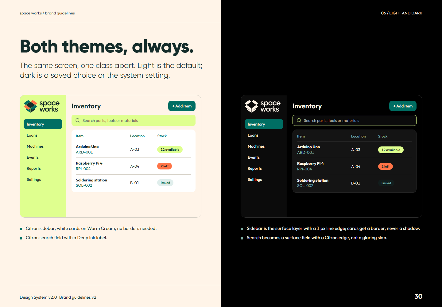
Brand guidelines v2 page 30: The same screen, one class apart. Light is the default; dark is a saved choice or the system setting.Page 30Both themes, always.Full-size PNG · 121.2 kB · 1440 × 1000
Read page 30 as text

Both themes, always. The same screen, one class apart. Light is the default; dark is a saved choice or the system setting. Inventory Loans Machines Events Reports Settings Inventory + Add item Search parts, tools or materials Item Location Stock Arduino Uno ARD-001 A-03 12 available Raspberry Pi 4 RPI-004 A-04 2 left Soldering station SOL-002 B-01 Issued Citron sidebar, white cards on Warm Cream, no borders needed. Citron search field with a Deep Ink label. Inventory Loans Machines Events Reports Settings Inventory + Add item Search parts, tools or materials Item Location Stock Arduino Uno ARD-001 A-03 12 available Raspberry Pi 4 RPI-004 A-04 2 left Soldering station SOL-002 B-01 Issued Sidebar is the surface layer with a 1 px line edge; cards get a border, never a shadow. Search becomes a surface field with a Citron edge, not a glaring slab.

Related semantic guidance
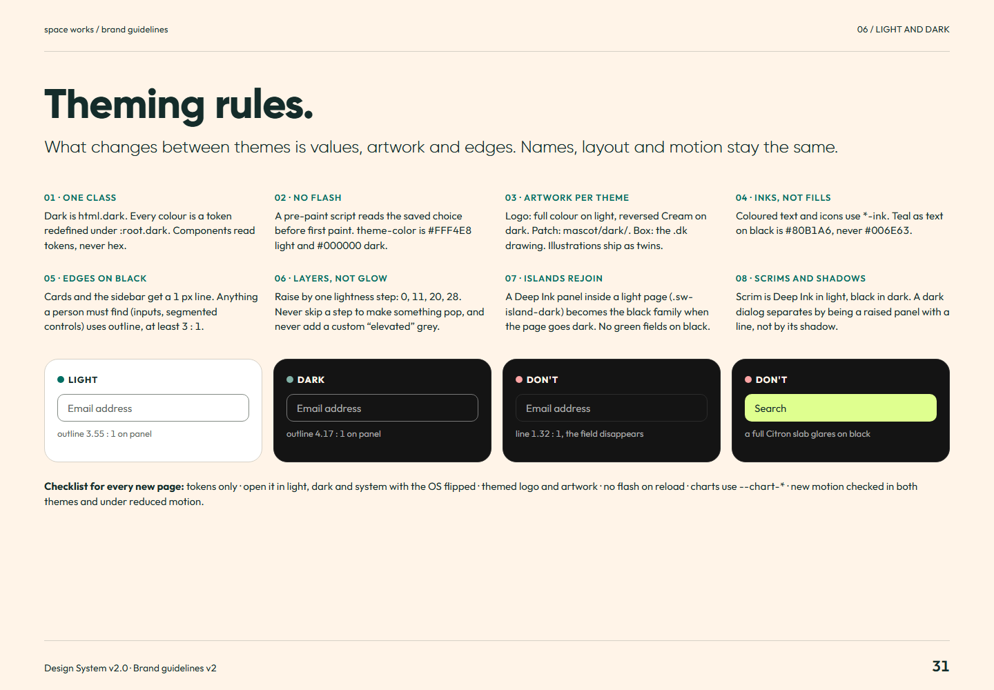
Brand guidelines v2 page 31: What changes between themes is values, artwork and edges. Names, layout and motion stay the same.Page 31Theming rules.Full-size PNG · 124.6 kB · 1440 × 1000
Read page 31 as text

Theming rules. What changes between themes is values, artwork and edges. Names, layout and motion stay the same. 01 · One class Dark is html.dark . Every colour is a token redefined under :root.dark . Components read tokens, never hex. 02 · No flash A pre-paint script reads the saved choice before first paint. theme-color is light and dark. 03 · Artwork per theme Logo: full colour on light, reversed Cream on dark. Patch: mascot/dark/ . Box: the .dk drawing. Illustrations ship as twins. 04 · Inks, not fills Coloured text and icons use *-ink . Teal as text on black is , never . 05 · Edges on black Cards and the sidebar get a 1 px line . Anything a person must find (inputs, segmented controls) uses outline , at least 3 : 1. 06 · Layers, not glow Raise by one lightness step: 0, 11, 20, 28. Never skip a step to make something pop, and never add a custom “elevated” grey. 07 · Islands rejoin A Deep Ink panel inside a light page ( .sw-island-dark ) becomes the black family when the page goes dark. No green fields on black. 08 · Scrims and shadows Scrim is Deep Ink in light, black in dark. A dark dialog separates by being a raised panel with a line, not by its shadow. Light Email address outline : 1 on panel Dark Email address outline : 1 on panel Don't Email address line : 1, the field disappears Don't Search a full Citron slab glares on black Checklist for every new page: tokens only · open it in light, dark and system with the OS flipped · themed logo and artwork · no flash on reload · charts use --chart-* · new motion checked in both themes and under reduced motion.

Related semantic guidance
07 / Motion · pages 32, 33, 34, 35
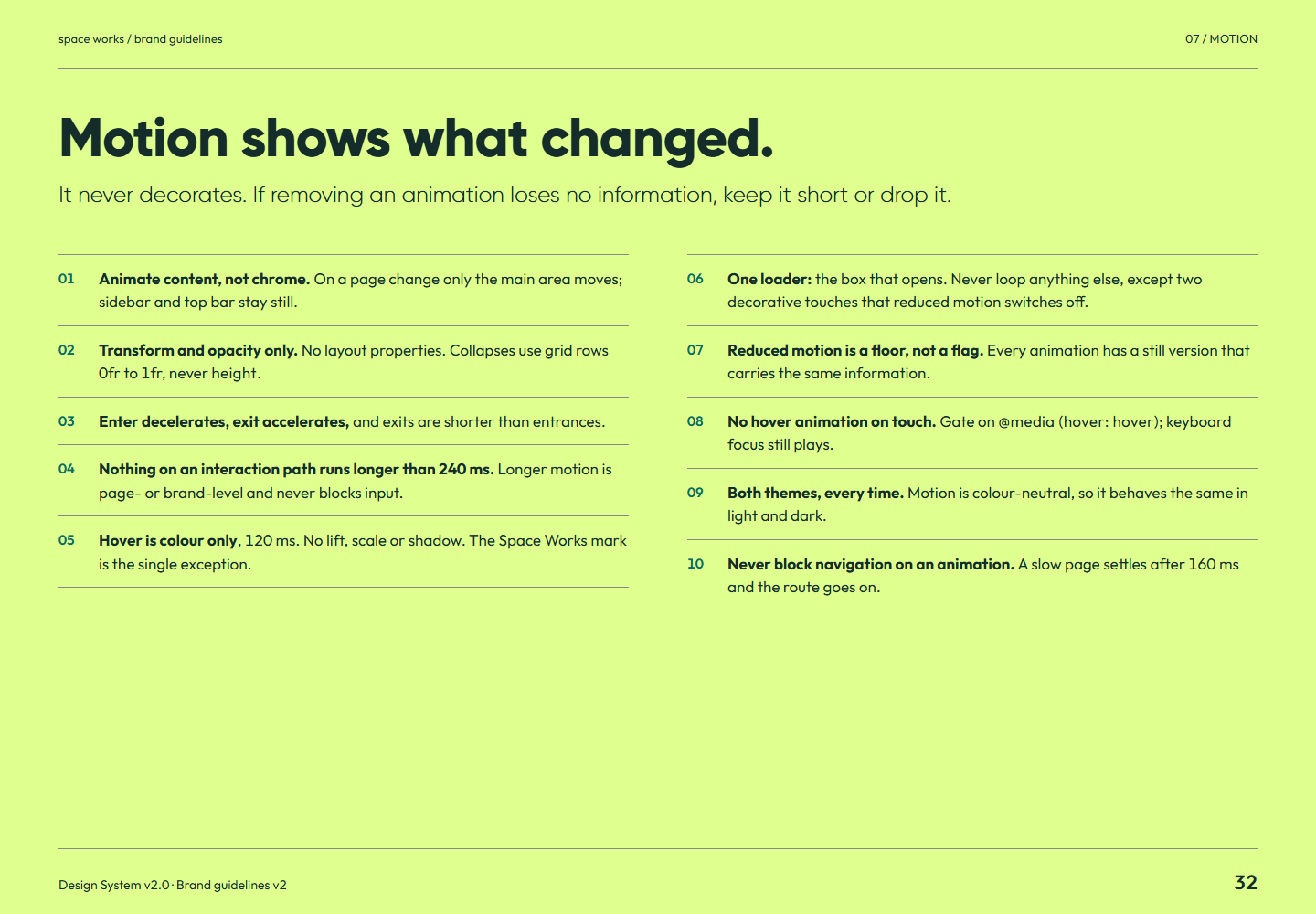
Brand guidelines v2 page 32: It never decorates. If removing an animation loses no information, keep it short or drop it.Page 32Motion shows what changed.Full-size PNG · 120.6 kB · 1440 × 1000
Read page 32 as text

Motion shows what changed. It never decorates. If removing an animation loses no information, keep it short or drop it. 01 Animate content, not chrome. On a page change only the main area moves; sidebar and top bar stay still. 02 Transform and opacity only. No layout properties. Collapses use grid rows 0fr to 1fr, never height . 03 Enter decelerates, exit accelerates, and exits are shorter than entrances. 04 Nothing on an interaction path runs longer than 240 ms. Longer motion is page- or brand-level and never blocks input. 05 Hover is colour only , 120 ms. No lift, scale or shadow. The Space Works mark is the single exception. 06 One loader: the box that opens. Never loop anything else, except two decorative touches that reduced motion switches off. 07 Reduced motion is a floor, not a flag. Every animation has a still version that carries the same information. 08 No hover animation on touch. Gate on @media (hover: hover) ; keyboard focus still plays. 09 Both themes, every time. Motion is colour-neutral, so it behaves the same in light and dark. 10 Never block navigation on an animation. A slow page settles after 160 ms and the route goes on.

Related semantic guidance
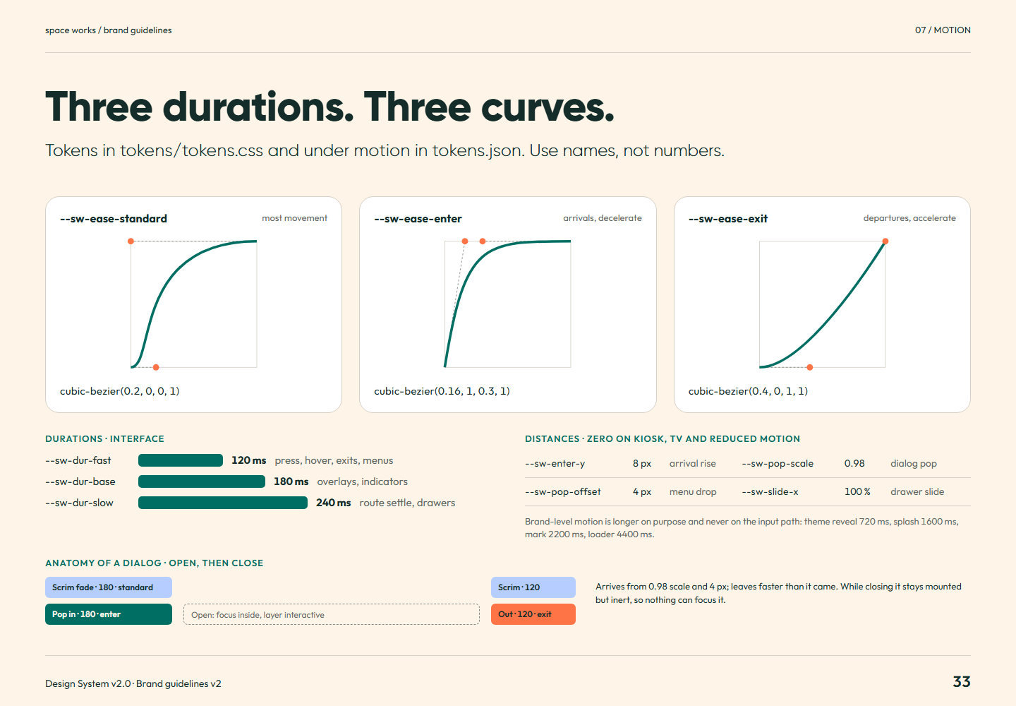
Brand guidelines v2 page 33: Tokens in tokens/tokens.css and under motion in tokens.json . Use names, not numbers.Page 33Three durations. Three curves.Full-size PNG · 123.5 kB · 1440 × 1000
Read page 33 as text

Three durations. Three curves. Tokens in tokens/tokens.css and under motion in tokens.json . Use names, not numbers. --sw-ease-standard most movement cubic-bezier(0.2, 0, 0, 1) --sw-ease-enter arrivals, decelerate cubic-bezier(0.16, 1, 0.3, 1) --sw-ease-exit departures, accelerate cubic-bezier(0.4, 0, 1, 1) Durations · interface --sw-dur-fast 120 ms press, hover, exits, menus --sw-dur-base 180 ms overlays, indicators --sw-dur-slow 240 ms route settle, drawers Distances · zero on kiosk, TV and reduced motion --sw-enter-y 8 px arrival rise --sw-pop-scale 0.98 dialog pop --sw-pop-offset 4 px menu drop --sw-slide-x 100 % drawer slide Brand-level motion is longer on purpose and never on the input path: theme reveal 720 ms, splash 1600 ms, mark 2200 ms, loader 4400 ms. Anatomy of a dialog · open, then close Scrim fade · 180 · standard Pop in · 180 · enter Open: focus inside, layer interactive Out · 120 · exit Scrim · 120 Arrives from 0.98 scale and 4 px; leaves faster than it came. While closing it stays mounted but inert, so nothing can focus it.

Related semantic guidance
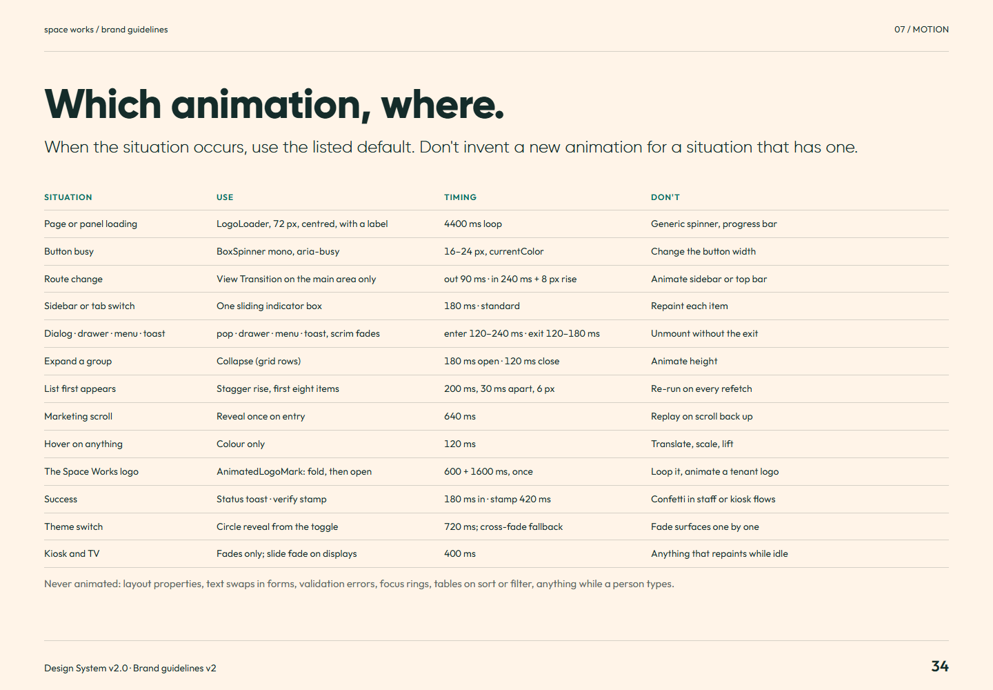
Brand guidelines v2 page 34: When the situation occurs, use the listed default. Don't invent a new animation for a situation that has one.Page 34Which animation, where.Full-size PNG · 121.6 kB · 1440 × 1000
Read page 34 as text

Which animation, where. When the situation occurs, use the listed default. Don't invent a new animation for a situation that has one. Situation Use Timing Don't Page or panel loading LogoLoader, 72 px, centred, with a label 4400 ms loop Generic spinner, progress bar Button busy BoxSpinner mono, aria-busy 16–24 px, currentColor Change the button width Route change View Transition on the main area only out 90 ms · in 240 ms + 8 px rise Animate sidebar or top bar Sidebar or tab switch One sliding indicator box 180 ms · standard Repaint each item Dialog · drawer · menu · toast pop · drawer · menu · toast, scrim fades enter 120–240 ms · exit 120–180 ms Unmount without the exit Expand a group Collapse (grid rows) 180 ms open · 120 ms close Animate height List first appears Stagger rise, first eight items 200 ms, 30 ms apart, 6 px Re-run on every refetch Marketing scroll Reveal once on entry 640 ms Replay on scroll back up Hover on anything Colour only 120 ms Translate, scale, lift The Space Works logo AnimatedLogoMark: fold, then open 600 + 1600 ms, once Loop it, animate a tenant logo Success Status toast · verify stamp 180 ms in · stamp 420 ms Confetti in staff or kiosk flows Theme switch Circle reveal from the toggle 720 ms; cross-fade fallback Fade surfaces one by one Kiosk and TV Fades only; slide fade on displays 400 ms Anything that repaints while idle Never animated: layout properties, text swaps in forms, validation errors, focus rings, tables on sort or filter, anything while a person types.

Related semantic guidance
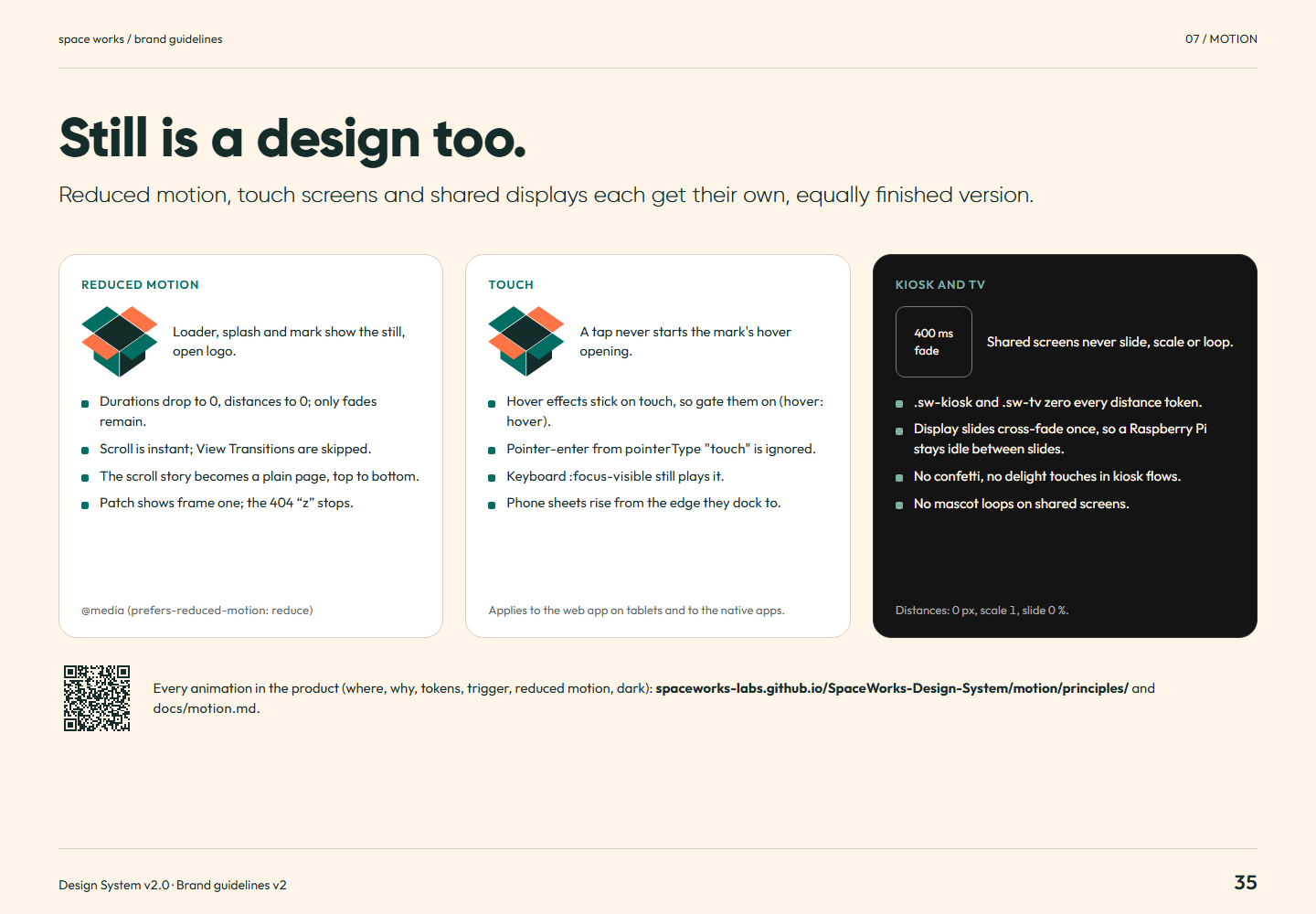
Brand guidelines v2 page 35: Reduced motion, touch screens and shared displays each get their own, equally finished version.Page 35Still is a design too.Full-size PNG · 125.5 kB · 1440 × 1000
Read page 35 as text

Still is a design too. Reduced motion, touch screens and shared displays each get their own, equally finished version. Reduced motion Loader, splash and mark show the still, open logo. Durations drop to 0, distances to 0; only fades remain. Scroll is instant; View Transitions are skipped. The scroll story becomes a plain page, top to bottom. Patch shows frame one; the 404 “z” stops. @media (prefers-reduced-motion: reduce) Touch A tap never starts the mark's hover opening. Hover effects stick on touch, so gate them on (hover: hover) . Pointer-enter from pointerType "touch" is ignored. Keyboard :focus-visible still plays it. Phone sheets rise from the edge they dock to. Applies to the web app on tablets and to the native apps. Kiosk and TV 400 ms fade Shared screens never slide, scale or loop. .sw-kiosk and .sw-tv zero every distance token. Display slides cross-fade once, so a Raspberry Pi stays idle between slides. No confetti, no delight touches in kiosk flows. No mascot loops on shared screens. Distances: 0 px, scale 1, slide 0 %. Every animation in the product (where, why, tokens, trigger, reduced motion, dark): spaceworks-labs.github.io/SpaceWorks-Design-System/motion/principles/ and docs/motion.md .

Related semantic guidance
08 / Graphic system · pages 36, 37, 38
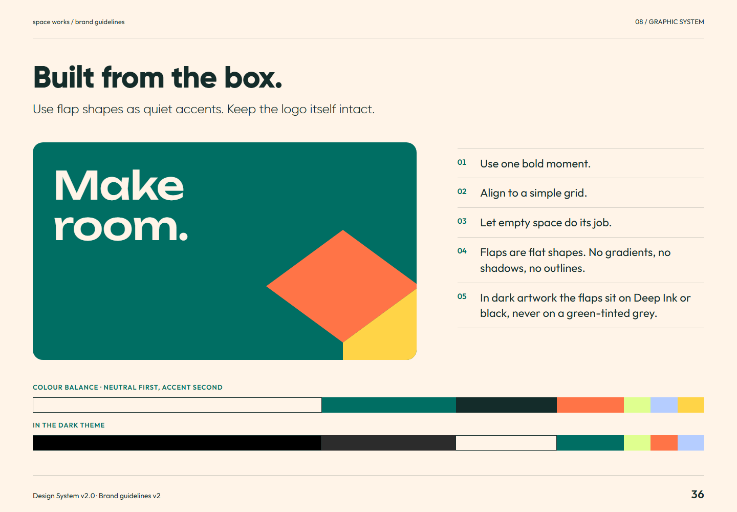
Brand guidelines v2 page 36: Use flap shapes as quiet accents. Keep the logo itself intact.Page 36Built from the box.Full-size PNG · 86.2 kB · 1440 × 1000
Read page 36 as text

Built from the box. Use flap shapes as quiet accents. Keep the logo itself intact. Make room. 01 Use one bold moment. 02 Align to a simple grid. 03 Let empty space do its job. 04 Flaps are flat shapes. No gradients, no shadows, no outlines. 05 In dark artwork the flaps sit on Deep Ink or black, never on a green-tinted grey. Colour balance · neutral first, accent second In the dark theme

Related semantic guidance
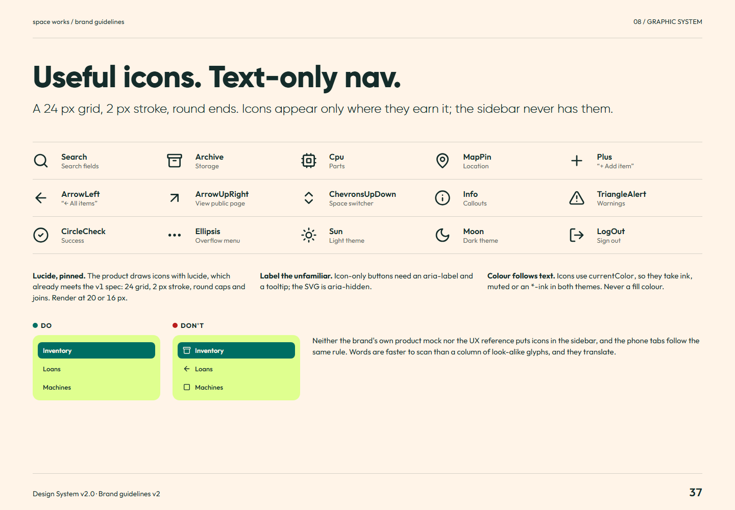
Brand guidelines v2 page 37: A 24 px grid, 2 px stroke, round ends. Icons appear only where they earn it; the sidebar never has them.Page 37Useful icons. Text-only nav.Full-size PNG · 115.2 kB · 1440 × 1000
Read page 37 as text

Useful icons. Text-only nav. A 24 px grid, 2 px stroke, round ends. Icons appear only where they earn it; the sidebar never has them. Search Search fields Archive Storage Cpu Parts MapPin Location Plus “+ Add item” ArrowLeft “← All items” ArrowUpRight View public page ChevronsUpDown Space switcher Info Callouts TriangleAlert Warnings CircleCheck Success Ellipsis Overflow menu Sun Light theme Moon Dark theme LogOut Sign out Lucide, pinned. The product draws icons with lucide, which already meets the v1 spec: 24 grid, 2 px stroke, round caps and joins. Render at 20 or 16 px. Label the unfamiliar. Icon-only buttons need an aria-label and a tooltip; the SVG is aria-hidden . Colour follows text. Icons use currentColor , so they take ink , muted or an *-ink in both themes. Never a fill colour. Do Inventory Loans Machines Don't Inventory Loans Machines Neither the brand's own product mock nor the UX reference puts icons in the sidebar, and the phone tabs follow the same rule. Words are faster to scan than a column of look-alike glyphs, and they translate.

Related semantic guidance
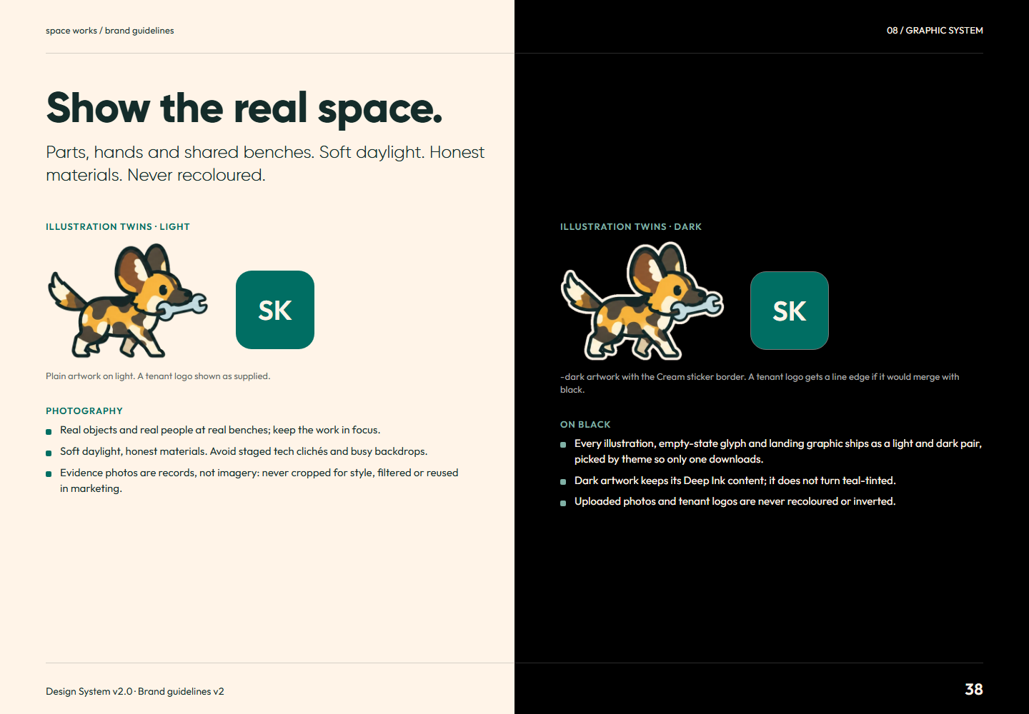
Brand guidelines v2 page 38: Parts, hands and shared benches. Soft daylight. Honest materials. Never recoloured.Page 38Show the real space.Full-size PNG · 179.2 kB · 1440 × 1000
Read page 38 as text

Show the real space. Parts, hands and shared benches. Soft daylight. Honest materials. Never recoloured. Illustration twins · light SK Plain artwork on light. A tenant logo shown as supplied. Photography Real objects and real people at real benches; keep the work in focus. Soft daylight, honest materials. Avoid staged tech clichés and busy backdrops. Evidence photos are records, not imagery: never cropped for style, filtered or reused in marketing. Illustration twins · dark SK -dark artwork with the Cream sticker border. A tenant logo gets a line edge if it would merge with black. On black Every illustration, empty-state glyph and landing graphic ships as a light and dark pair, picked by theme so only one downloads. Dark artwork keeps its Deep Ink content; it does not turn teal-tinted. Uploaded photos and tenant logos are never recoloured or inverted.

Related semantic guidance
09 / Mascot · pages 39, 40
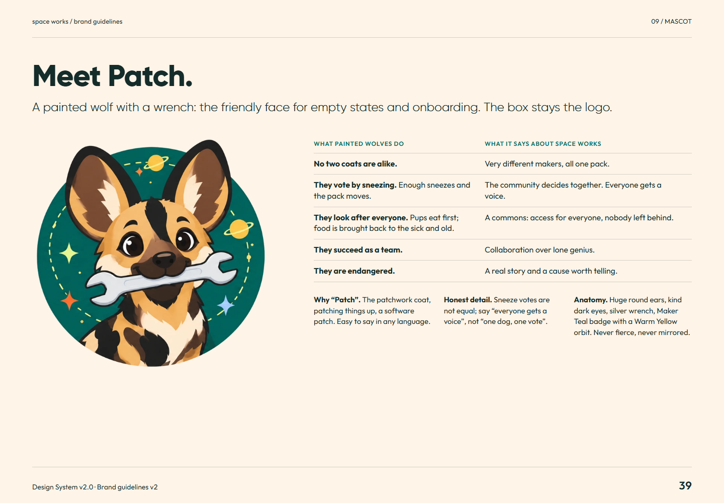
Brand guidelines v2 page 39: A painted wolf with a wrench: the friendly face for empty states and onboarding. The box stays the logo.Page 39Meet Patch.Full-size PNG · 302.9 kB · 1440 × 1000
Read page 39 as text

Meet Patch. A painted wolf with a wrench: the friendly face for empty states and onboarding. The box stays the logo. What painted wolves do What it says about Space Works No two coats are alike. Very different makers, all one pack. They vote by sneezing. Enough sneezes and the pack moves. The community decides together. Everyone gets a voice. They look after everyone. Pups eat first; food is brought back to the sick and old. A commons: access for everyone, nobody left behind. They succeed as a team. Collaboration over lone genius. They are endangered. A real story and a cause worth telling. Why “Patch”. The patchwork coat, patching things up, a software patch. Easy to say in any language. Honest detail. Sneeze votes are not equal; say “everyone gets a voice”, not “one dog, one vote”. Anatomy. Huge round ears, kind dark eyes, silver wrench, Maker Teal badge with a Warm Yellow orbit. Never fierce, never mirrored.

Related semantic guidance
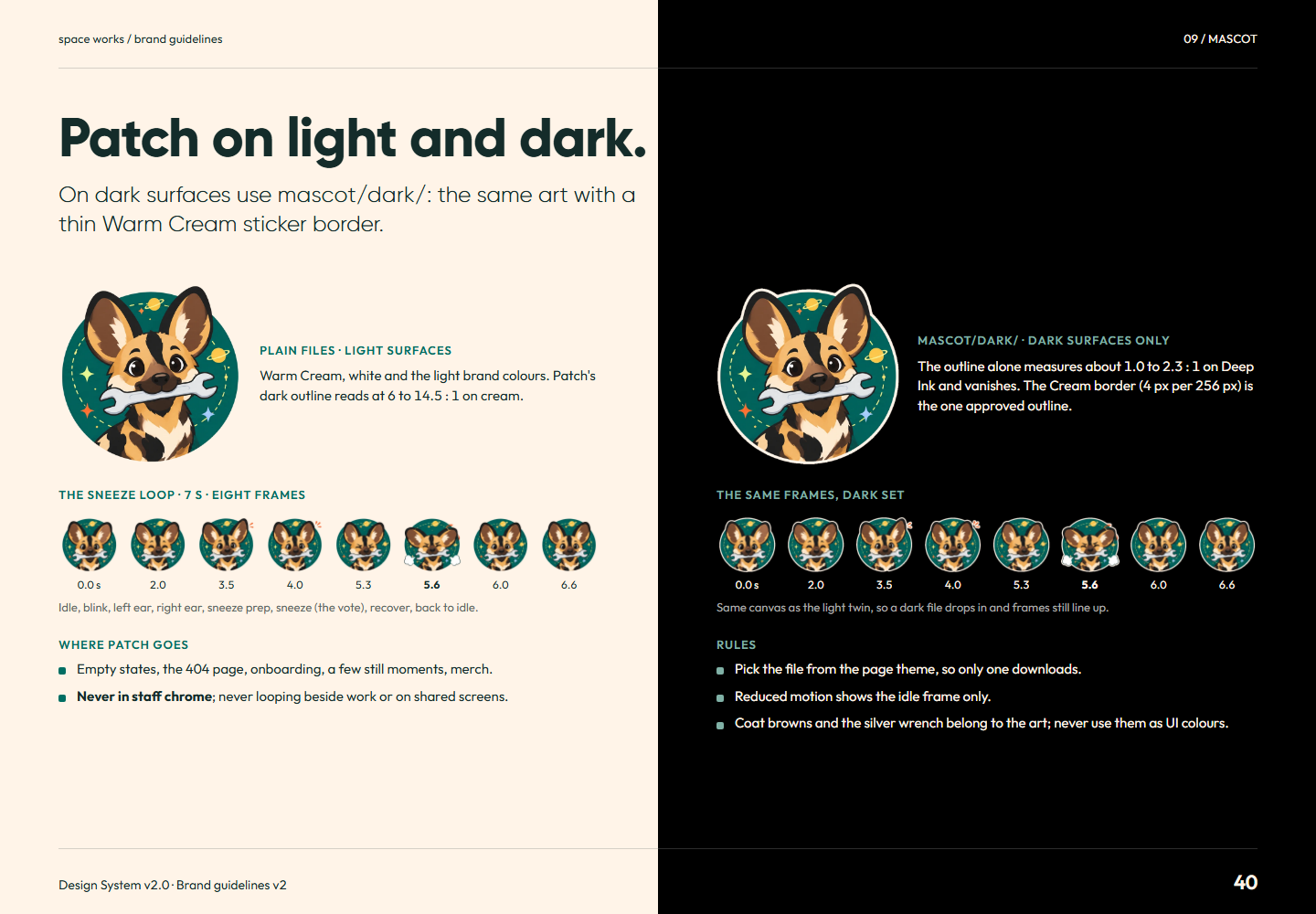
Brand guidelines v2 page 40: On dark surfaces use mascot/dark/ : the same art with a thin Warm Cream sticker border.Page 40Patch on light and dark.Full-size PNG · 297.9 kB · 1440 × 1000
Read page 40 as text

Patch on light and dark. On dark surfaces use mascot/dark/ : the same art with a thin Warm Cream sticker border. Plain files · light surfaces Warm Cream, white and the light brand colours. Patch's dark outline reads at 6 to 14.5 : 1 on cream. The sneeze loop · 7 s · eight frames 0.0 s 2.0 3.5 4.0 5.3 5.6 6.0 6.6 Idle, blink, left ear, right ear, sneeze prep, sneeze (the vote), recover, back to idle. Where Patch goes Empty states, the 404 page, onboarding, a few still moments, merch. Never in staff chrome ; never looping beside work or on shared screens. mascot/dark/ · dark surfaces only The outline alone measures about 1.0 to 2.3 : 1 on Deep Ink and vanishes. The Cream border (4 px per 256 px) is the one approved outline. The same frames, dark set 0.0 s 2.0 3.5 4.0 5.3 5.6 6.0 6.6 Same canvas as the light twin, so a dark file drops in and frames still line up. Rules Pick the file from the page theme, so only one downloads. Reduced motion shows the idle frame only. Coat browns and the silver wrench belong to the art; never use them as UI colours.

Related semantic guidance
10 / Product · pages 41, 42, 43, 44
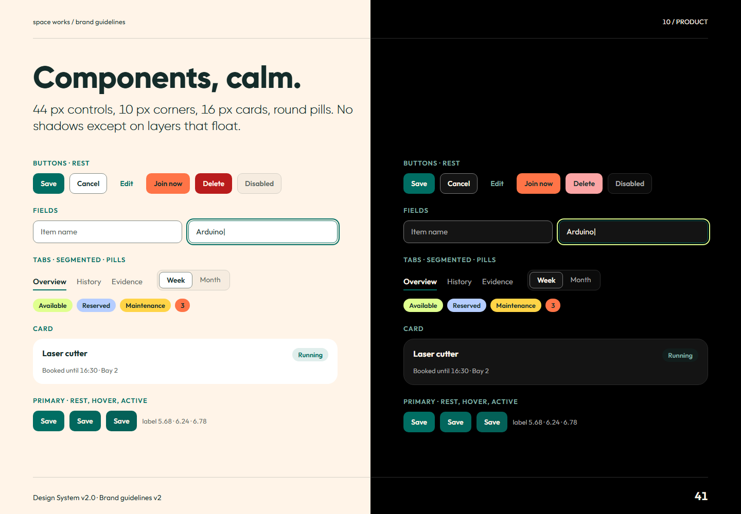
Brand guidelines v2 page 41: 44 px controls, 10 px corners, 16 px cards, round pills. No shadows except on layers that float.Page 41Components, calm.Full-size PNG · 111.5 kB · 1440 × 1000
Read page 41 as text

Components, calm. 44 px controls, 10 px corners, 16 px cards, round pills. No shadows except on layers that float. Buttons · rest Save Cancel Edit Join now Delete Disabled Fields Item name Arduino| Tabs · segmented · pills Overview History Evidence Week Month Available Reserved Maintenance 3 Card Laser cutter Running Booked until 16:30 · Bay 2 Primary · rest, hover, active Save Save Save label · · Buttons · rest Save Cancel Edit Join now Delete Disabled Fields Item name Arduino| Tabs · segmented · pills Overview History Evidence Week Month Available Reserved Maintenance 3 Card Laser cutter Running Booked until 16:30 · Bay 2 Primary · rest, hover, active Save Save Save label · ·

Related semantic guidance
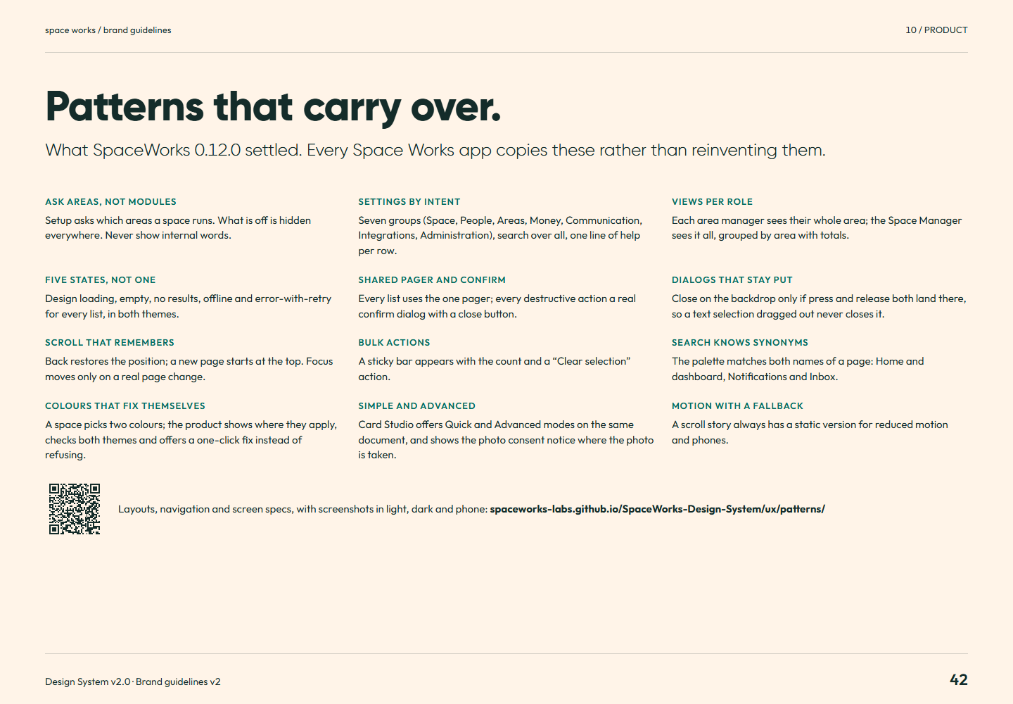
Brand guidelines v2 page 42: What SpaceWorks 0.12.0 settled. Every Space Works app copies these rather than reinventing them.Page 42Patterns that carry over.Full-size PNG · 135.6 kB · 1440 × 1000
Read page 42 as text

Patterns that carry over. What SpaceWorks 0.12.0 settled. Every Space Works app copies these rather than reinventing them. Ask areas, not modules Setup asks which areas a space runs. What is off is hidden everywhere. Never show internal words. Settings by intent Seven groups (Space, People, Areas, Money, Communication, Integrations, Administration), search over all, one line of help per row. Views per role Each area manager sees their whole area; the Space Manager sees it all, grouped by area with totals. Five states, not one Design loading, empty, no results, offline and error-with-retry for every list, in both themes. Shared pager and confirm Every list uses the one pager; every destructive action a real confirm dialog with a close button. Dialogs that stay put Close on the backdrop only if press and release both land there, so a text selection dragged out never closes it. Scroll that remembers Back restores the position; a new page starts at the top. Focus moves only on a real page change. Bulk actions A sticky bar appears with the count and a “Clear selection” action. Search knows synonyms The palette matches both names of a page: Home and dashboard, Notifications and Inbox. Colours that fix themselves A space picks two colours; the product shows where they apply, checks both themes and offers a one-click fix instead of refusing. Simple and advanced Card Studio offers Quick and Advanced modes on the same document, and shows the photo consent notice where the photo is taken. Motion with a fallback A scroll story always has a static version for reduced motion and phones. Layouts, navigation and screen specs, with screenshots in light, dark and phone: spaceworks-labs.github.io/SpaceWorks-Design-System/ux/patterns/

Related semantic guidance
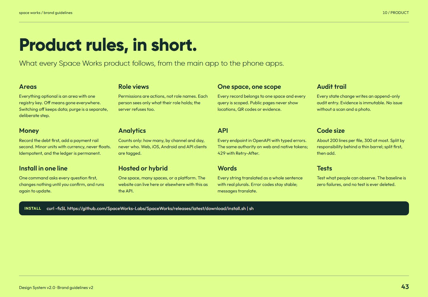
Brand guidelines v2 page 43: What every Space Works product follows, from the main app to the phone apps.Page 43Product rules, in short.Full-size PNG · 130.0 kB · 1440 × 1000
Read page 43 as text

Product rules, in short. What every Space Works product follows, from the main app to the phone apps. Areas Everything optional is an area with one registry key. Off means gone everywhere. Switching off keeps data; purge is a separate, deliberate step. Role views Permissions are actions, not role names. Each person sees only what their role holds; the server refuses too. One space, one scope Every record belongs to one space and every query is scoped. Public pages never show locations, QR codes or evidence. Audit trail Every state change writes an append-only audit entry. Evidence is immutable. No issue without a scan and a photo. Money Record the debt first, add a payment rail second. Minor units with currency, never floats. Idempotent, and the ledger is permanent. Analytics Counts only: how many, by channel and day, never who. Web, iOS, Android and API clients are tagged. API Every endpoint in OpenAPI with typed errors. The same authority on web and native tokens; 429 with Retry-After. Code size About 200 lines per file, 300 at most. Split by responsibility behind a thin barrel; split first, then add. Install in one line One command asks every question first, changes nothing until you confirm, and runs again to update. Hosted or hybrid One space, many spaces, or a platform. The website can live here or elsewhere with this as the API. Words Every string translated as a whole sentence with real plurals. Error codes stay stable; messages translate. Tests Test what people can observe. The baseline is zero failures, and no test is ever deleted. Install curl -fsSL https://github.com/SpaceWorks-Labs/SpaceWorks/releases/latest/download/install.sh | sh

Related semantic guidance
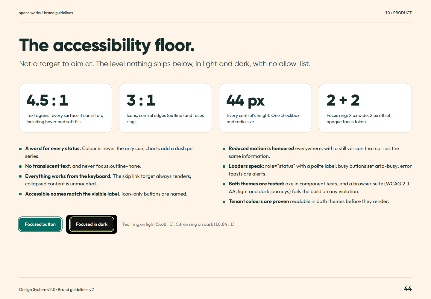
Brand guidelines v2 page 44: Not a target to aim at. The level nothing ships below, in light and dark, with no allow-list.Page 44The accessibility floor.Full-size PNG · 125.0 kB · 1440 × 1000
Read page 44 as text

The accessibility floor. Not a target to aim at. The level nothing ships below, in light and dark, with no allow-list. 4.5 : 1 Text against every surface it can sit on, including hover and soft fills. 3 : 1 Icons, control edges ( outline ) and focus rings. 44 px Every control's height. One checkbox and radio size. 2 + 2 Focus ring: 2 px wide, 2 px offset, opaque focus token. A word for every status. Colour is never the only cue; charts add a dash per series. No translucent text , and never focus:outline-none . Everything works from the keyboard. The skip link target always renders; collapsed content is unmounted. Accessible names match the visible label. Icon-only buttons are named. Reduced motion is honoured everywhere, with a still version that carries the same information. Loaders speak: role="status" with a polite label; busy buttons set aria-busy ; error toasts are alerts. Both themes are tested: axe in component tests, and a browser suite (WCAG 2.1 AA, light and dark journeys) fails the build on any violation. Tenant colours are proven readable in both themes before they render. Focused button Focused in dark Teal ring on light ( : 1), Citron ring on dark ( : 1).

Related semantic guidance
11 / Applications · pages 45, 46, 47, 48
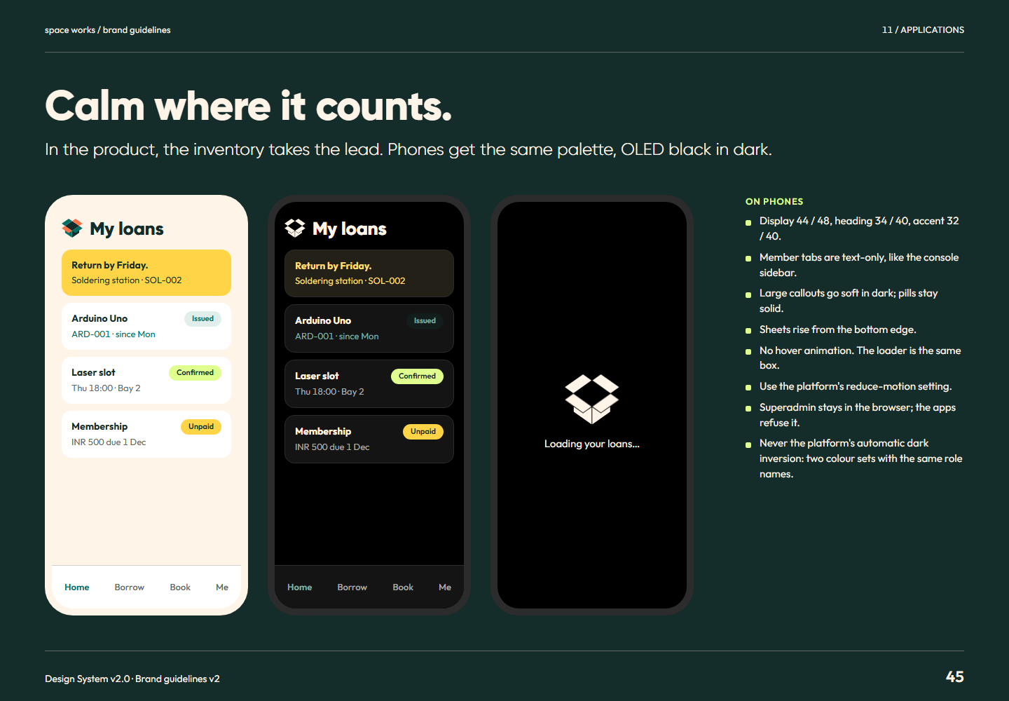
Brand guidelines v2 page 45: In the product, the inventory takes the lead. Phones get the same palette, OLED black in dark.Page 45Calm where it counts.Full-size PNG · 132.8 kB · 1440 × 1000
Read page 45 as text

Calm where it counts. In the product, the inventory takes the lead. Phones get the same palette, OLED black in dark. My loans Return by Friday. Soldering station · SOL-002 Arduino Uno Issued ARD-001 · since Mon Laser slot Confirmed Thu 18:00 · Bay 2 Membership Unpaid INR 500 due 1 Dec Home Borrow Book Me My loans Return by Friday. Soldering station · SOL-002 Arduino Uno Issued ARD-001 · since Mon Laser slot Confirmed Thu 18:00 · Bay 2 Membership Unpaid INR 500 due 1 Dec Home Borrow Book Me Loading your loans… On phones Display 44 / 48, heading 34 / 40, accent 32 / 40. Member tabs are text-only, like the console sidebar. Large callouts go soft in dark; pills stay solid. Sheets rise from the bottom edge. No hover animation. The loader is the same box. Use the platform's reduce-motion setting. Superadmin stays in the browser; the apps refuse it. Never the platform's automatic dark inversion: two colour sets with the same role names.

Related semantic guidance
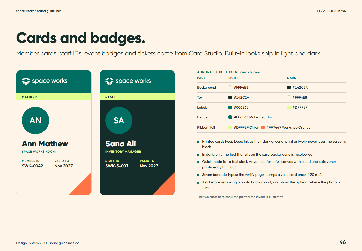
Brand guidelines v2 page 46: Member cards, staff IDs, event badges and tickets come from Card Studio. Built-in looks ship in light and dark.Page 46Cards and badges.Full-size PNG · 124.5 kB · 1440 × 1000
Read page 46 as text

Cards and badges. Member cards, staff IDs, event badges and tickets come from Card Studio. Built-in looks ship in light and dark. MEMBER AN Ann Mathew Space Works Kochi Member ID SWK-0042 Valid to Nov 2027 STAFF SA Sana Ali Inventory Manager Staff ID SWK-S-007 Valid to Nov 2027 Aurora look · tokens cards.aurora Part Light Dark Background Text Labels Header Maker Teal, both Ribbon · tail Citron · Workshop Orange Printed cards keep Deep Ink as their dark ground: print artwork never uses the screen's black. In dark, only the text that sits on the card background is recoloured. Quick mode for a fast start, Advanced for a full canvas with bleed and safe zone; print-ready PDF out. Seven barcode types; the verify page stamps a valid card once (420 ms). Ask before removing a photo background, and show the opt-out where the photo is taken. The two cards here show the palette; the layout is illustrative.

Related semantic guidance
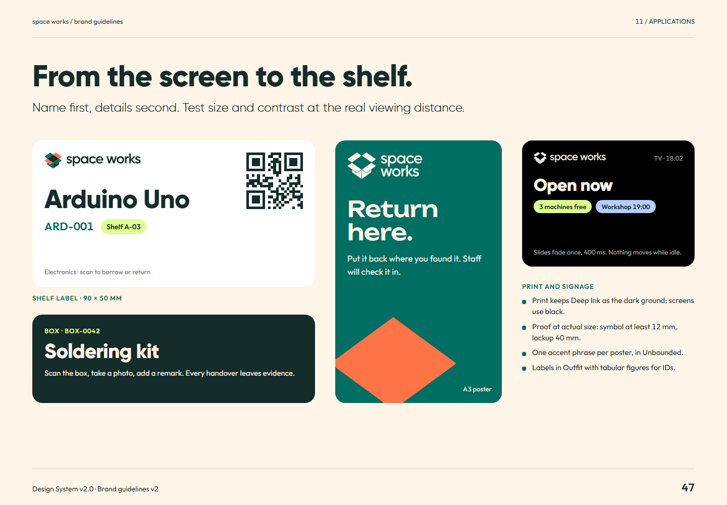
Brand guidelines v2 page 47: Name first, details second. Test size and contrast at the real viewing distance.Page 47From the screen to the shelf.Full-size PNG · 123.4 kB · 1440 × 1000
Read page 47 as text

From the screen to the shelf. Name first, details second. Test size and contrast at the real viewing distance. Arduino Uno ARD-001 Shelf A-03 Electronics · scan to borrow or return Shelf label · 90 × 50 mm Box · BOX-0042 Soldering kit Scan the box, take a photo, add a remark. Every handover leaves evidence. Return here. Put it back where you found it. Staff will check it in. A3 poster TV · 18:02 Open now 3 machines free Workshop 19:00 Slides fade once, 400 ms. Nothing moves while idle. Print and signage Print keeps Deep Ink as the dark ground; screens use black. Proof at actual size: symbol at least 12 mm, lockup 40 mm. One accent phrase per poster, in Unbounded. Labels in Outfit with tabular figures for IDs.

Related semantic guidance
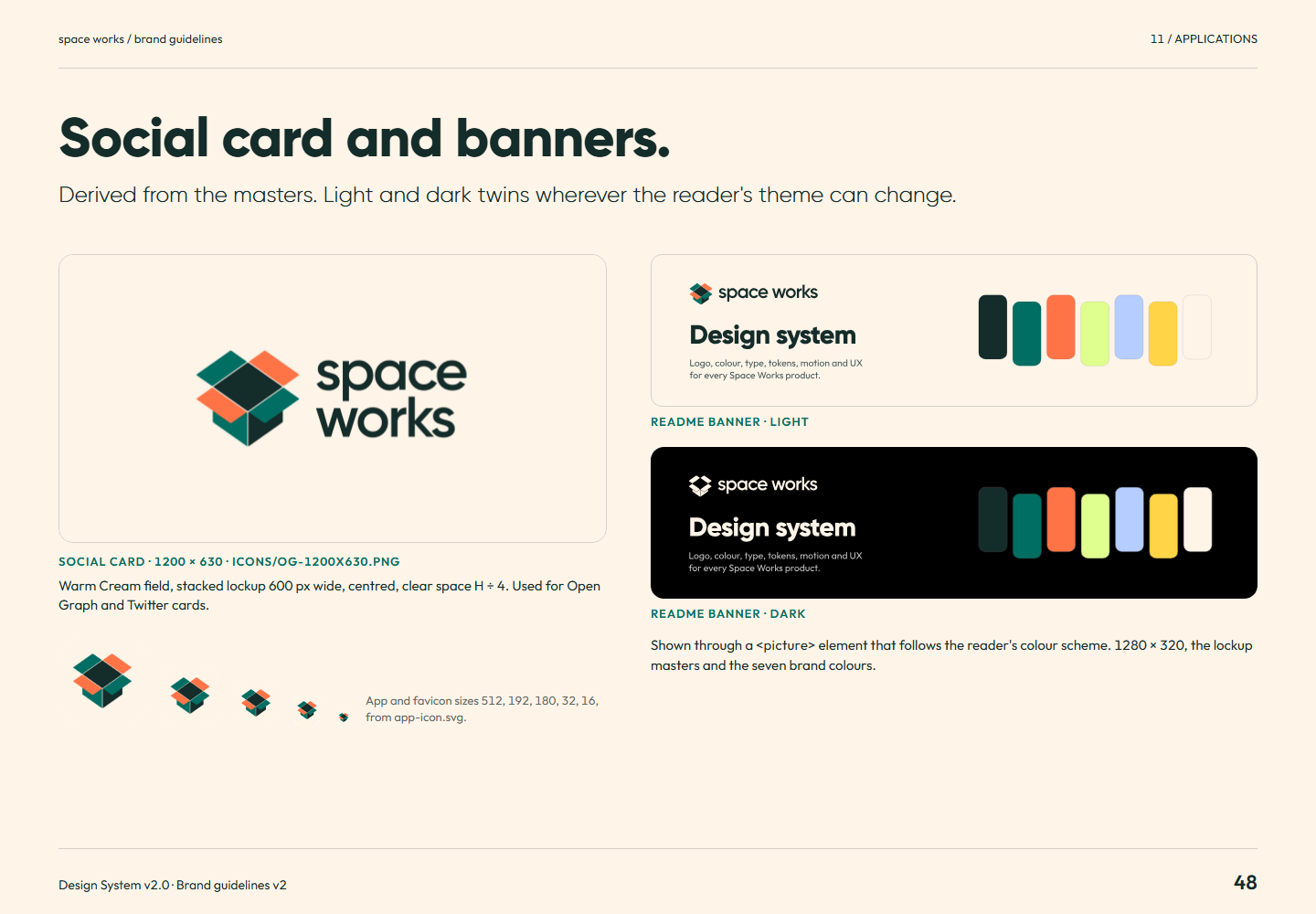
Brand guidelines v2 page 48: Derived from the masters. Light and dark twins wherever the reader's theme can change.Page 48Social card and banners.Full-size PNG · 136.1 kB · 1440 × 1000
Read page 48 as text

Social card and banners. Derived from the masters. Light and dark twins wherever the reader's theme can change. Social card · 1200 × 630 · icons/og-1200x630.png Warm Cream field, stacked lockup 600 px wide, centred, clear space H ÷ 4. Used for Open Graph and Twitter cards. App and favicon sizes 512, 192, 180, 32, 16, from app-icon.svg. README banner · light README banner · dark Shown through a <picture> element that follows the reader's colour scheme. 1280 × 320, the lockup masters and the seven brand colours.

Related semantic guidance
12 / Resources · pages 49
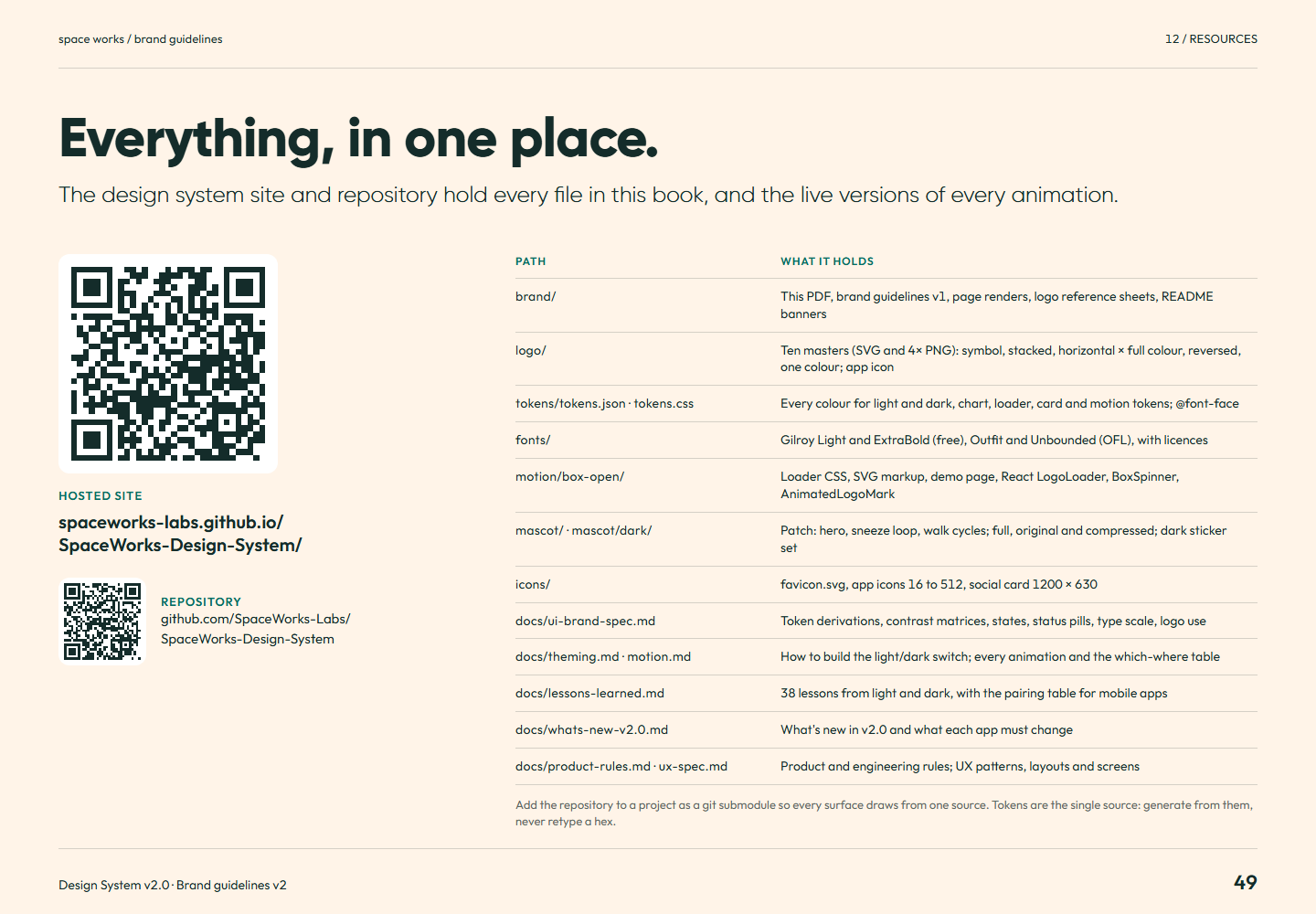
Brand guidelines v2 page 49: The design system site and repository hold every file in this book, and the live versions of every animation.Page 49Everything, in one place.Full-size PNG · 138.2 kB · 1440 × 1000
Read page 49 as text

Everything, in one place. The design system site and repository hold every file in this book, and the live versions of every animation. Hosted site spaceworks-labs.github.io/ SpaceWorks-Design-System/ Repository github.com/SpaceWorks-Labs/ SpaceWorks-Design-System Path What it holds brand/ This PDF, brand guidelines v1, page renders, logo reference sheets, README banners logo/ Ten masters (SVG and 4× PNG): symbol, stacked, horizontal × full colour, reversed, one colour; app icon tokens/tokens.json · tokens.css Every colour for light and dark, chart, loader, card and motion tokens; @font-face fonts/ Gilroy Light and ExtraBold (free), Outfit and Unbounded (OFL), with licences motion/box-open/ Loader CSS, SVG markup, demo page, React LogoLoader, BoxSpinner, AnimatedLogoMark mascot/ · mascot/dark/ Patch: hero, sneeze loop, walk cycles; full, original and compressed; dark sticker set icons/ favicon.svg, app icons 16 to 512, social card 1200 × 630 docs/ui-brand-spec.md Token derivations, contrast matrices, states, status pills, type scale, logo use docs/theming.md · motion.md How to build the light/dark switch; every animation and the which-where table docs/lessons-learned.md 38 lessons from light and dark, with the pairing table for mobile apps docs/whats-new-v2.0.md What's new in v2.0 and what each app must change docs/product-rules.md · ux-spec.md Product and engineering rules; UX patterns, layouts and screens Add the repository to a project as a git submodule so every surface draws from one source. Tokens are the single source: generate from them, never retype a hex.

Related semantic guidance
Colophon · pages 50
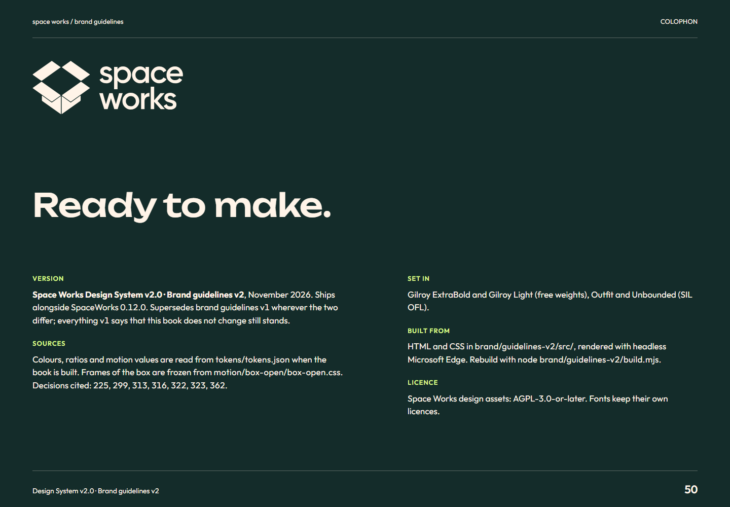
Brand guidelines v2 page 50: ColophonPage 50ColophonFull-size PNG · 106.3 kB · 1440 × 1000
Read page 50 as text

Ready to make. Version Space Works Design System v2.0 · Brand guidelines v2 , November 2026. Ships alongside SpaceWorks 0.12.0. Supersedes brand guidelines v1 wherever the two differ; everything v1 says that this book does not change still stands. Sources Colours, ratios and motion values are read from tokens/tokens.json when the book is built. Frames of the box are frozen from motion/box-open/box-open.css . Decisions cited: 225, 299, 313, 316, 322, 323, 362. Set in Gilroy ExtraBold and Gilroy Light (free weights), Outfit and Unbounded (SIL OFL). Built from HTML and CSS in brand/guidelines-v2/src/ , rendered with headless Microsoft Edge. Rebuild with node brand/guidelines-v2/build.mjs . Licence Space Works design assets: AGPL-3.0-or-later. Fonts keep their own licences.

Related semantic guidance

The PDF is the “Download the PDF” button above.

Select a page to open it at full size (1440 × 1000).

Brand guidelines v1 · historical · 17 pages. Expand a chapter to load its thumbnails. Every full-size original is retained.

Identity · pages 01
Brand idea and voice · pages 02, 03, 15
Brand guidelines page 03: The open box expresses four flaps and four possibilities: open, organized and energetic. Openness invites exploration; clear structure gives everything a place.Page 03An open invitation.Full-size PNG · 65.1 kB · 1440 × 1000
Read page 03 as text

The open box expresses four flaps and four possibilities: open, organized and energetic. Openness invites exploration; clear structure gives everything a place.

Related semantic guidance
Brand guidelines page 15: Use clear, warm, specific language: “Find the right part”, “No parts added yet. Add your first item”, and “Couldn’t save. Try again”. Avoid jargon, empty states without a next step and vague failures.Page 15Sound like a helpful maker.Full-size PNG · 66.4 kB · 1440 × 1000
Read page 15 as text

Use clear, warm, specific language: “Find the right part”, “No parts added yet. Add your first item”, and “Couldn’t save. Try again”. Avoid jargon, empty states without a next step and vague failures.

Related semantic guidance
Logo · pages 04, 05, 06, 07, 08
Brand guidelines page 05: Keep the logo unobstructed. H is the symbol height; clear space is H divided by 4. The stacked wordmark is 1.25 times H, with H divided by 6 between symbol and wordmark.Page 05Room to breathe.Full-size PNG · 74.6 kB · 1440 × 1000
Read page 05 as text

Keep the logo unobstructed. H is the symbol height; clear space is H divided by 4. The stacked wordmark is 1.25 times H, with H divided by 6 between symbol and wordmark.

Related semantic guidance
Brand guidelines page 06: Recommended digital sizes are 48 px symbol height and 180 px stacked lockup width. Print minimums are 12 mm for the symbol and 40 mm for the lockup. The app-icon symbol occupies about 62% of its tile.Page 06Keep it legible.Full-size PNG · 75.5 kB · 1440 × 1000
Read page 06 as text

Recommended digital sizes are 48 px symbol height and 180 px stacked lockup width. Print minimums are 12 mm for the symbol and 40 mm for the lockup. The app-icon symbol occupies about 62% of its tile.

Related semantic guidance
Colour · pages 09, 10
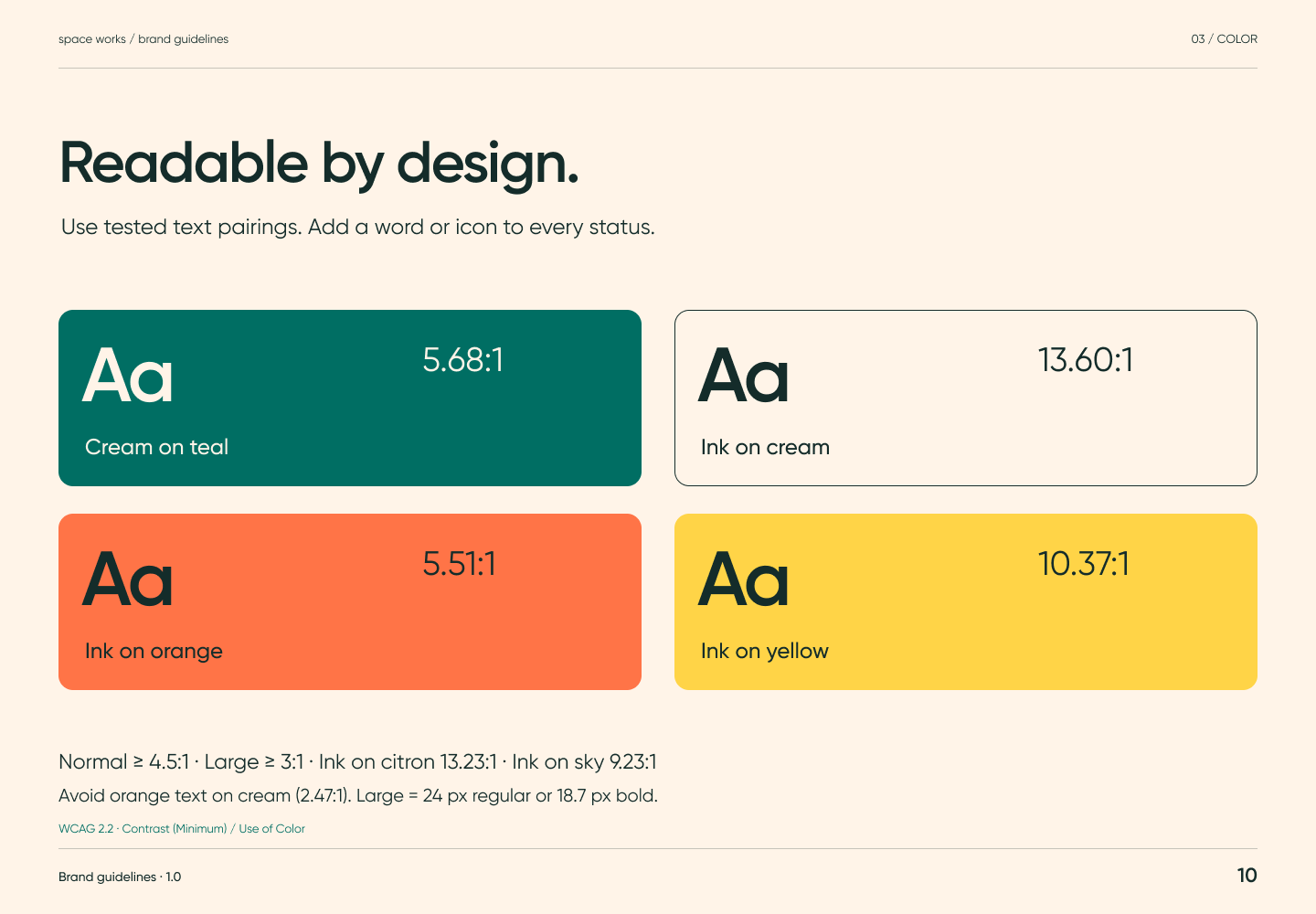
Brand guidelines page 10: Tested text pairs are cream on teal, ink on cream, ink on orange and ink on yellow. Normal text needs 4.5:1, large text 3:1. Avoid orange text on cream and add a word or icon to status.Page 10Readable by design.Full-size PNG · 68.9 kB · 1440 × 1000
Read page 10 as text

Tested text pairs are cream on teal, ink on cream, ink on orange and ink on yellow. Normal text needs 4.5:1, large text 3:1. Avoid orange text on cream and add a word or icon to status.

Related semantic guidance
Typography · pages 11, 12
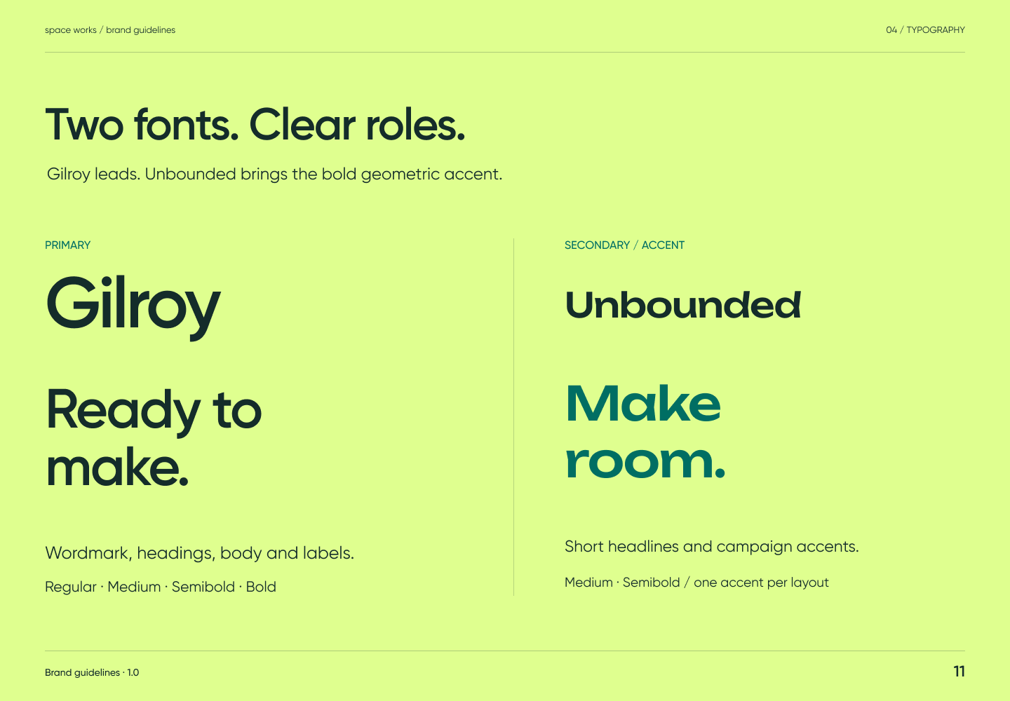
Brand guidelines page 11: Historical v1 assigns Gilroy to wordmark, headings, body and interface, with Unbounded reserved for one short accent phrase. Follow the current typography page for the shipping font and licensing rules.Page 11Two fonts. Clear roles.Full-size PNG · 72.8 kB · 1440 × 1000
Read page 11 as text

Historical v1 assigns Gilroy to wordmark, headings, body and interface, with Unbounded reserved for one short accent phrase. Follow the current typography page for the shipping font and licensing rules.

Related semantic guidance
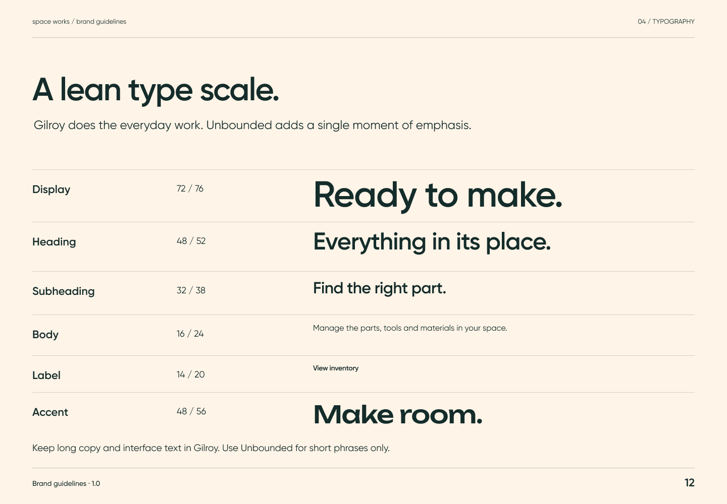
Brand guidelines page 12: Display, heading, subheading, body, label and accent examples establish a hierarchy. Gilroy does the everyday work; Unbounded adds a deliberate moment. Keep body copy readable.Page 12A lean type scale.Full-size PNG · 71.2 kB · 1440 × 1000
Read page 12 as text

Display, heading, subheading, body, label and accent examples establish a hierarchy. Gilroy does the everyday work; Unbounded adds a deliberate moment. Keep body copy readable.

Related semantic guidance
Graphics · pages 13, 14
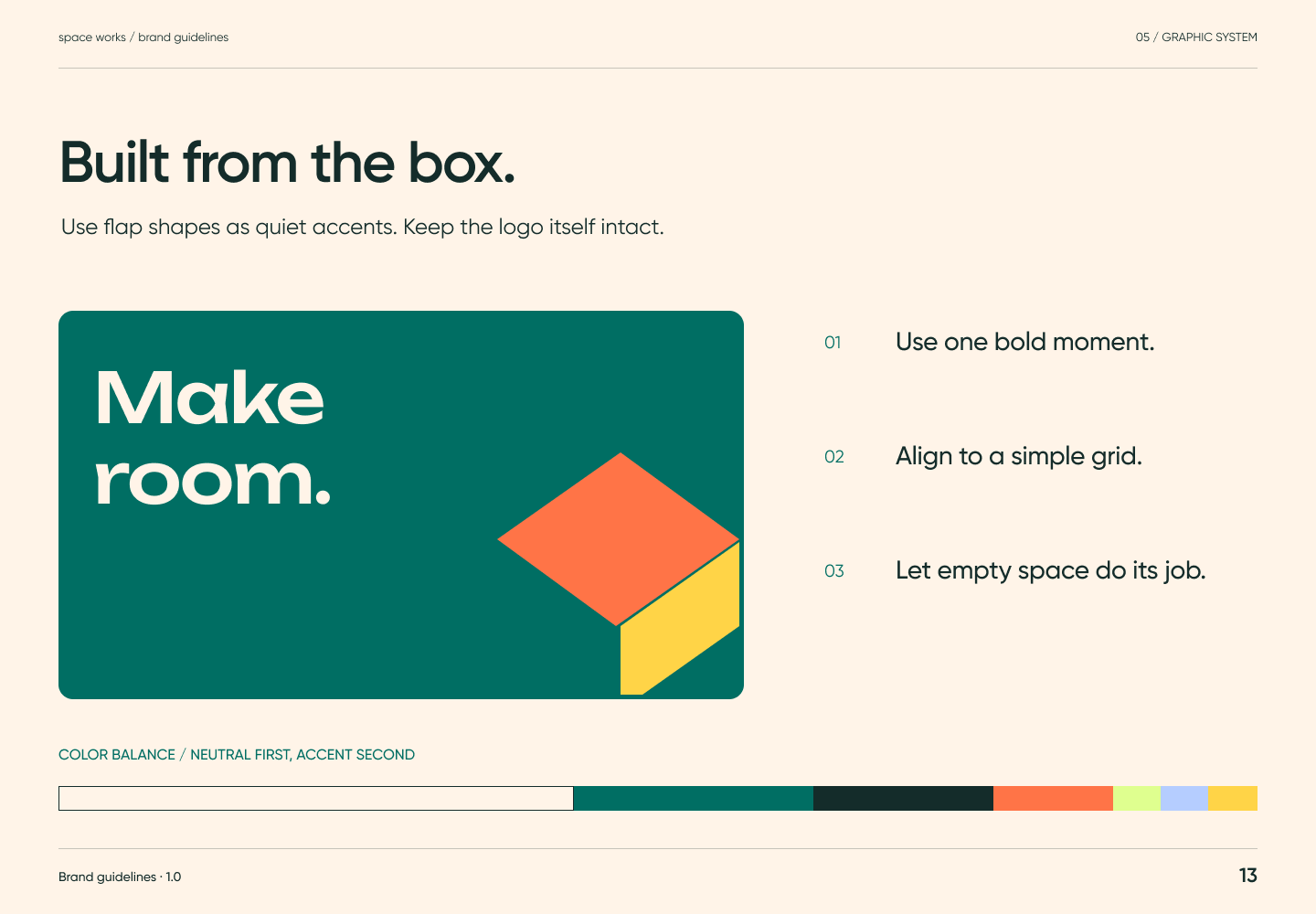
Brand guidelines page 13: Use flap shapes as quiet accents, align to a simple grid, use one bold moment and leave empty space. Cream and ink provide most of the field; brighter colours remain accents.Page 13Built from the box.Full-size PNG · 57.3 kB · 1440 × 1000
Read page 13 as text

Use flap shapes as quiet accents, align to a simple grid, use one bold moment and leave empty space. Cream and ink provide most of the field; brighter colours remain accents.

Related semantic guidance
Brand guidelines page 14: Use simple rounded line icons to help recognition. Show real parts, hands and shared benches with soft daylight and honest materials. Avoid staged stock-photo and busy backdrops.Page 14Useful details.Full-size PNG · 71.5 kB · 1440 × 1000
Read page 14 as text

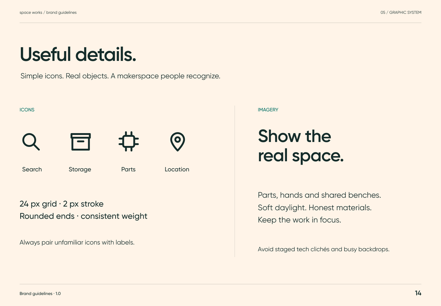
Use simple rounded line icons to help recognition. Show real parts, hands and shared benches with soft daylight and honest materials. Avoid staged stock-photo and busy backdrops.

Related semantic guidance
Applications · pages 16, 17
Brand guidelines page 16: The inventory example shows clear hierarchy, quiet surfaces, one primary action, a labelled search field and lists with status pills. It demonstrates how the brand supports a working product.Page 16Calm where it counts.Full-size PNG · 66.7 kB · 1440 × 1000
Read page 16 as text

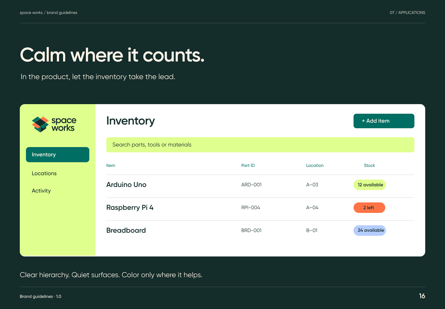
The inventory example shows clear hierarchy, quiet surfaces, one primary action, a labelled search field and lists with status pills. It demonstrates how the brand supports a working product.

Related semantic guidance
Brand guidelines page 17: Shelf labels carry the logo, then a large item name, then details such as category and short code. Keep placement consistent and test size and contrast at the intended viewing distance.Page 17A place for every part.Full-size PNG · 69.6 kB · 1440 × 1000
Read page 17 as text

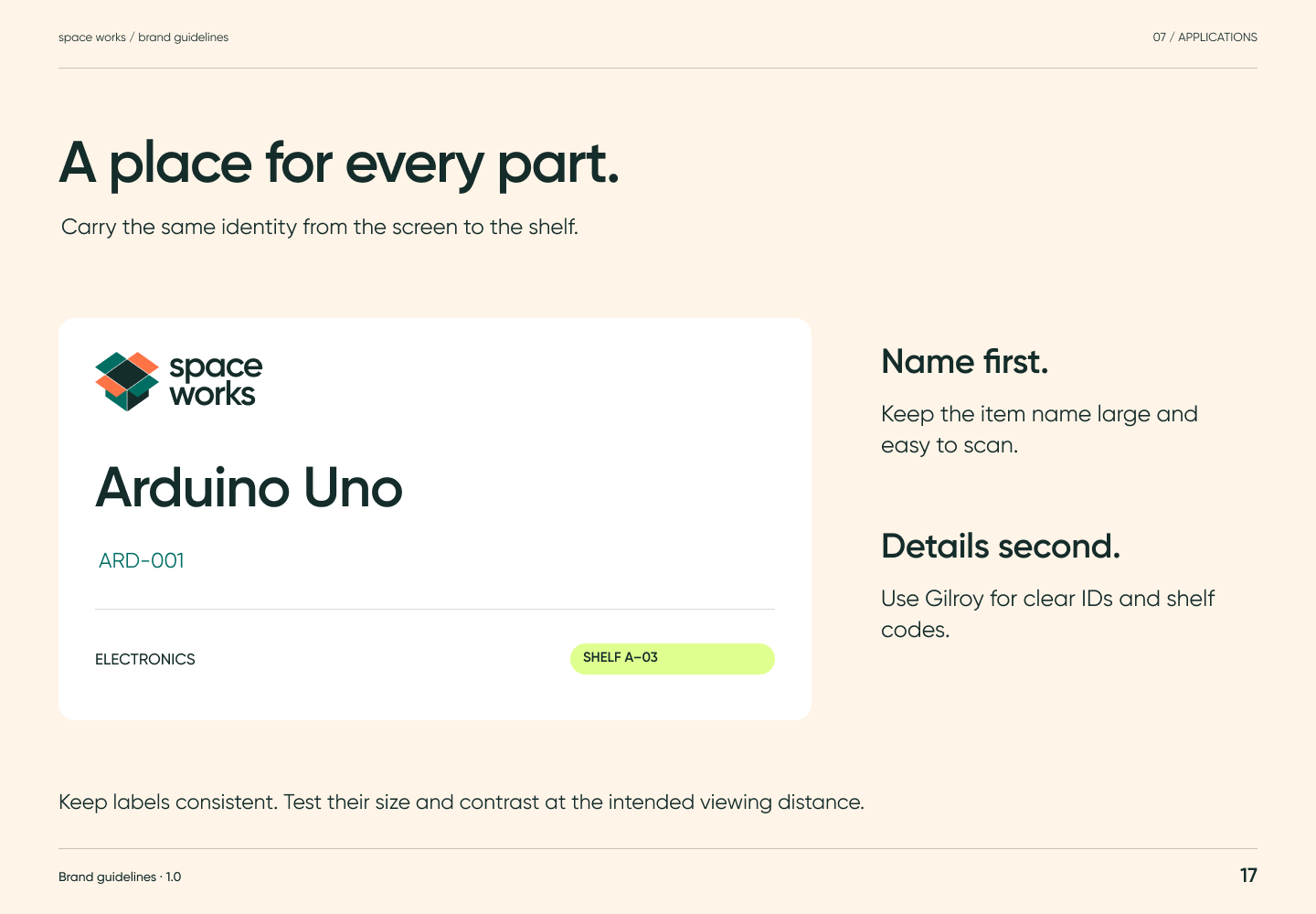
Shelf labels carry the logo, then a large item name, then details such as category and short code. Keep placement consistent and test size and contrast at the intended viewing distance.

Related semantic guidance

The pages were exported from the connected Figma file on 15 October 2026. SVG versions, with outlined text, are in brand/guidelines/svg/. The editable components stay in Figma; this export is not a .fig backup, and printed colour has not been proofed.