Collapse and disclosure chevrons
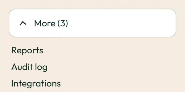
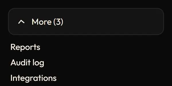

Live demo
Section titled “Live demo”The page below is the real demo.html from the kit. Use its “Toggle dark” button for the dark theme.
Current rule (v2.0.1, 2026-11-13): The decision-399 version reserves the content footprint and animates the inner opacity/transform, avoiding grid/height animation and layout shift. Closed content remains mounted but inert and aria-hidden. Toggle reversals retarget the same transition, with base enter and base × .75 exit. This supersedes the retained grid-row/unmount recipe below. Where compact document flow is required, change layout instantly with a native disclosure; do not tween layout. Supersedes the retained implementation/timing claims below; see docs/current-rules.md#cr-motion-01 and motion-flow.
Opening or closing a group animates its height through grid rows (1fr to 0fr, never height) with a fade, and its arrow turns with it. The inner padding and negative margin keep focus rings of edge items from being clipped.
Open demo.html in a browser (it links ../../tokens/tokens.css) and use “Toggle dark” to check both themes.
| File | What it is |
|---|---|
collapse.css |
The .sw-collapse grid-rows animation, verbatim, plus the chevron rotation rules the app writes as Tailwind classes (.sw-chevron* are the CSS equivalents). |
demo.html |
A standalone page with the live animation in light and dark, replayable. |
react/ |
Copies of the real app files (see react/README.md for the imports to replace). |
previews/ |
Animated WebP and GIF previews, light and dark (regenerated by scripts/make-previews.mjs). |
Where the app uses it
Section titled “Where the app uses it”components/ui/Collapse.tsx(used bycomponents/shell/SidebarSection.tsx“More” andcomponents/shell/Disclosure.tsx).- Chevrons:
SidebarSection.tsx(180 deg),components/ui/CollapsibleSection.tsxandcomponents/card-designer/InspectorSection.tsx(90 deg),features/hub/landing/FaqSection.tsx(plus to 45 deg),features/docs/docs.css(sw-doc-nav-chevron).
Opening a group keeps its neighbours in view and shows what moved; the turning arrow reports the state before the content finishes moving. Closing is faster than opening.
Timing, easing and distance
Section titled “Timing, easing and distance”Current rule (v2.0.1, 2026-11-13): The retained table/snippet below records the original app copy. Use the current executable files and the complete flow recipe for decision 399; see current rules.
| Part | Value |
|---|---|
| Open | grid rows 0fr to 1fr and opacity, --sw-dur-base 180 ms, --sw-ease-standard |
| Close | to 0fr and opacity 0, --sw-dur-fast 120 ms, --sw-ease-exit, forwards |
| Chevrons | transform 180 ms (sidebar, sections), 200 ms (FAQ plus), 160 ms (docs nav) |
Trigger
Section titled “Trigger”The open prop or aria-expanded toggles data-state=“open|closed”; usePresence` keeps the region mounted for the 120 ms exit and makes it inert, so collapsed content is never reachable by Tab.
Reduced motion
Section titled “Reduced motion”The collapse animation is inside no-preference, so the region opens and closes at once; chevrons jump to their final angle.
Dark theme
Section titled “Dark theme”None: colour-neutral.
Do and don’t
Section titled “Do and don’t”- Do animate grid rows (1fr to 0fr), not
height. - Do keep
aria-controlspointing at a wrapper that always exists. - Do make closed content unreachable (unmount, or
inertwhile closing). - Do not stagger children of an opening group.
Copy-paste usage
Section titled “Copy-paste usage”Current rule (v2.0.1, 2026-11-13): The retained table/snippet below records the original app copy. Use the current executable files and the complete flow recipe for decision 399; see current rules.
<button aria-expanded="true" aria-controls="more">More <svg class="sw-chevron sw-chevron-flip">…</svg></button><div id="more" class="sw-collapse" data-state="open"><div class="sw-collapse-inner">…items…</div></div>To close set data-state="closed" (and inert); hide or remove it on animationend.
Every other animation in the product, and the rules behind them: ../../docs/motion.md. Index of the kit: ../README.md.
Flow contract (decision 399)
Section titled “Flow contract (decision 399)”The decision-399 version reserves the content footprint and animates the inner opacity/transform, avoiding grid/height animation and layout shift. Closed content remains mounted but inert and aria-hidden. Toggle reversals retarget the same transition, with base enter and base × .75 exit. This supersedes the retained grid-row/unmount recipe below. Where compact document flow is required, change layout instantly with a native disclosure; do not tween layout.
Complete rules, sequencing, keyboard and verification. The demo includes real static posters and explicit image Play/Pause controls.
Local token steps for batch 1B
Section titled “Local token steps for batch 1B”These aliases are local additions; global tokens are unchanged. Promote through the token batch when adopted.
| Local custom property | Definition |
|---|---|
--sw-collapse-exit |
calc(var(--sw-dur-base) * .75) |
--sw-local-duration-160 |
calc(var(--sw-dur-base) * 0.88888889) |
--sw-local-duration-200 |
calc(var(--sw-dur-base) * 1.11111111) |
Source
Section titled “Source”Copied from motion/collapse/ on every build: the stylesheet, demo.html, react/ copies of the app files and the previews/.