Hover and press
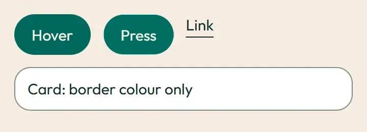
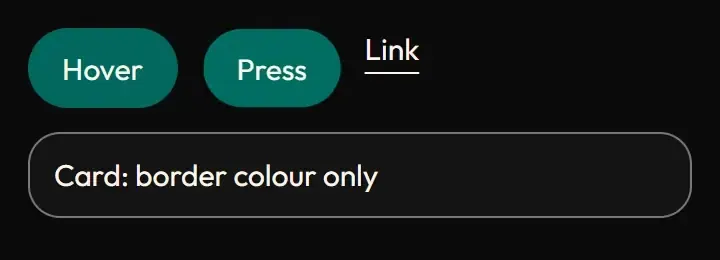
Live demo
Section titled “Live demo”The page below is the real demo.html from the kit. Use its “Toggle dark” button for the dark theme.
Current rule (v2.0.1, 2026-11-13): Hover colours update immediately; press uses only transform, with token timing. Easing teaching controls are native buttons and run at the actual slow-token duration (240 ms by default), with a zero-duration reduced-motion state. The site MotionTokens.astro 480 ms issue remains owned by the site lane (DSA-033). Supersedes the retained implementation/timing claims below; see docs/current-rules.md#cr-motion-01 and motion-flow.
The rule for pointer feedback on product chrome: hover and active change colour (120 ms) and nothing else; pressing a button sinks it to 0.98. Cards, rows, tabs and links follow the colour-only rule. The Space Works mark’s box-open is the one deliberate exception (see box-open).
Open demo.html in a browser (it links ../../tokens/tokens.css) and use “Toggle dark” to check both themes.
| File | What it is |
|---|---|
hover-press.css |
The button transition and press rule verbatim from styles/motion.css, plus the colour-only hover classes the app writes per component (.sw-hover, .sw-card-hover, .sw-row-hover, .sw-link-hover) and a small example skin. |
demo.html |
A standalone page with the live animation in light and dark, replayable. |
react/ |
Copies of the real app files (see react/README.md for the imports to replace). |
previews/ |
Animated WebP and GIF previews, light and dark (regenerated by scripts/make-previews.mjs). |
Where the app uses it
Section titled “Where the app uses it”- Buttons and tabs: every
desk-button*,desk-tabanddesk-nav-item(styles/motion.css), sidebar items (components/shell/SidebarItem.tsxwithmotion-safe:active:scale). - Cards, tabs, rows and links:
features/landing/SpaceCard.tsx,features/hub/hub.css,features/hub/featuresPage/features.css,features/docs/docs.css(nav links, pager, TOC),features/discover/spaces/spaces.css,components/layouts/SettingsNav.tsx,features/staff/SettingsSectionNav.tsx. - Hover opacity:
features/staff/eventProgramme/AnalyticsColumns.tsx(bars to 80 %).
The control answers the pointer without moving the page: colour tells you what is under the cursor, the 0.98 sink tells you the press registered. Because nothing translates, scales or lifts on hover, dense staff screens never jitter and layouts never shift.
Timing, easing and distance
Section titled “Timing, easing and distance”Current rule (v2.0.1, 2026-11-13): The retained table/snippet below records the original app copy. Use the current executable files and the complete flow recipe for decision 399; see current rules.
| Part | Value |
|---|---|
| Colour, background, border | --sw-dur-fast 120 ms, --sw-ease-standard |
| Press | transform: scale(0.98) on :active (not disabled), same 120 ms |
| Focus ring | untouched, never animated |
Trigger
Section titled “Trigger”Hover, :active. Press only runs under prefers-reduced-motion: no-preference.
Reduced motion
Section titled “Reduced motion”Colour still changes (the duration is 0): the state is shown, only the easing is removed. The press sink is not applied.
Dark theme
Section titled “Dark theme”Hover fills are the dark-family tokens (--color-hover, --color-accent-hover); the rule is the same.
Do and don’t
Section titled “Do and don’t”- Do change colour only on hover.
- Do keep focus rings out of the transition.
- Do not translate, scale, lift or add a shadow on hover.
- Do not animate on touch beyond the colour of the pressed state.
Copy-paste usage
Section titled “Copy-paste usage”Current rule (v2.0.1, 2026-11-13): The retained table/snippet below records the original app copy. Use the current executable files and the complete flow recipe for decision 399; see current rules.
<link rel="stylesheet" href="../../tokens/tokens.css"><link rel="stylesheet" href="hover-press.css"><button class="desk-button-primary">Save</button><a class="sw-link-hover sw-hover" href="#">Read more</a>Every other animation in the product, and the rules behind them: ../../docs/motion.md. Index of the kit: ../README.md.
Flow contract (decision 399)
Section titled “Flow contract (decision 399)”Hover colours update immediately; press uses only transform, with token timing. Easing teaching controls are native buttons and run at the actual slow-token duration (240 ms by default), with a zero-duration reduced-motion state. The site MotionTokens.astro 480 ms issue remains owned by the site lane (DSA-033).
Complete rules, sequencing, keyboard and verification. The demo includes real static posters and explicit image Play/Pause controls.
Local token steps for batch 1B
Section titled “Local token steps for batch 1B”These aliases are local additions; global tokens are unchanged. Promote through the token batch when adopted.
| Local custom property | Definition |
|---|---|
--sw-collapse-exit |
calc(var(--sw-dur-base) * .75) |
--sw-demo-ease |
var(--sw-ease-standard) |
Source
Section titled “Source”Copied from motion/hover-press/ on every build: the stylesheet, demo.html, react/ copies of the app files and the previews/.