Overlays: dialog, drawer, sheet, menu, scrim
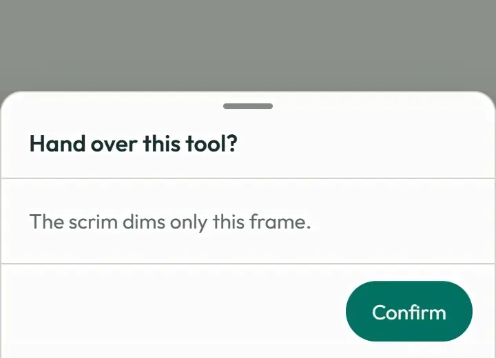
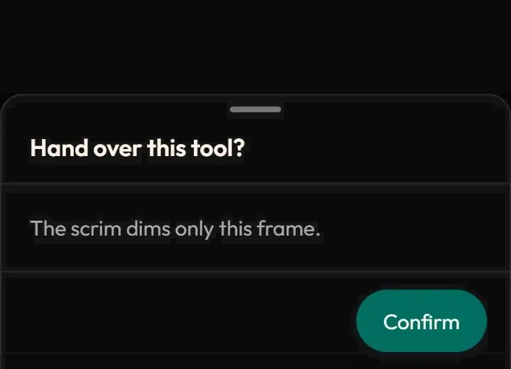
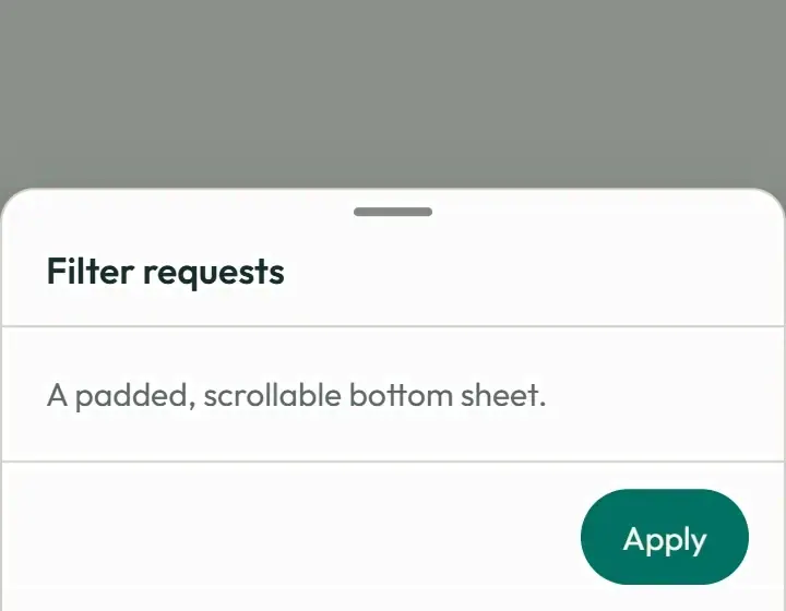
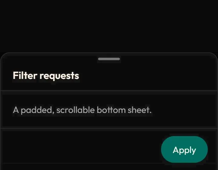
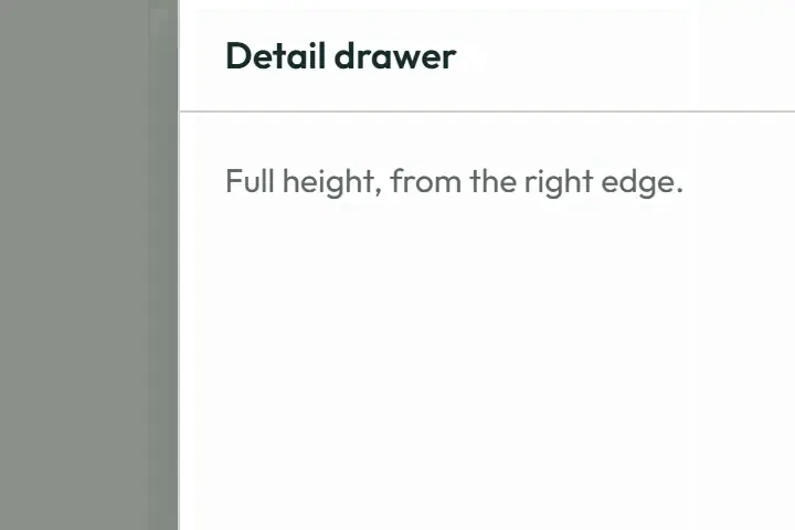
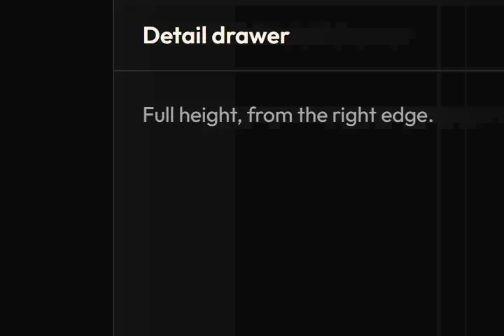
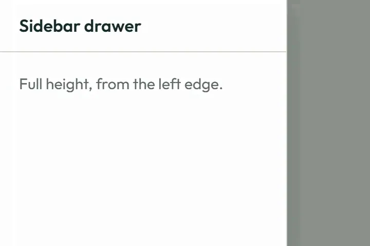
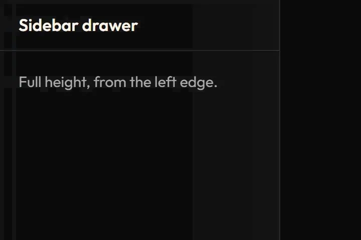
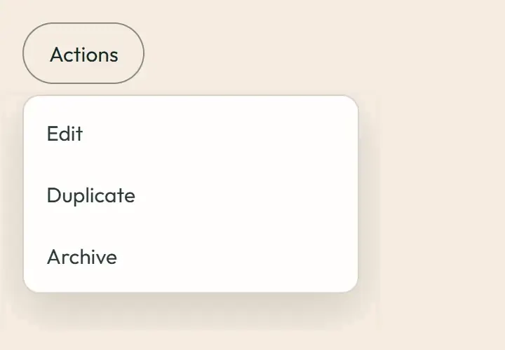
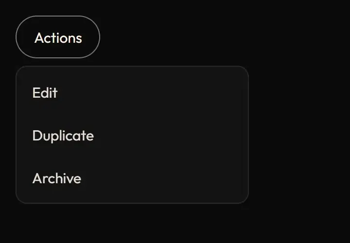




Live demo
Section titled “Live demo”The page below is the real demo.html from the kit. Use its “Toggle dark” button for the dark theme.
Current rule (v2.0.1, 2026-11-13): The portable controller and React demo now ship document background inertness, scroll lock, focus containment, Escape and focus restore. Requests are exclusive: the active layer exits before the latest replacement opens. Reopening the closing layer retargets the same transitions from their current values. Dialog/scrim exit is base × .75 (135 ms), drawer exit base (180 ms), menu exit fast × .75 (90 ms). Menu triggers remain non-modal; an actual modal makes the external demo controls inert, and its internal Switch action demonstrates replacement. Supersedes the retained implementation/timing claims below; see docs/current-rules.md#cr-motion-01 and motion-flow.
One set of enter and exit animations for every layer that appears over the page: the scrim (fade), the dialog (pop), the phone bottom sheet (rise), side drawers (slide from their edge) and anchored menus and popovers (drop 4 px). Layers carry data-state="open|closed"; a presence hook keeps a layer mounted for its exit and makes it inert while it closes.
Open demo.html in a browser (it links ../../tokens/tokens.css) and use “Toggle dark” to check both themes.
| File | What it is |
|---|---|
overlays.css |
The sw-fx-fade, sw-fx-pop, sw-fx-drawer, sw-fx-menu rules and every keyframe, verbatim from the app. |
demo.html |
A standalone page with the live animation in light and dark, replayable. |
overlays.js |
Shared demo controller: waits for the actual exit animation, then opens the latest requested layer. Also used by the React demo. |
react/OverlaysDemo.tsx |
A reusable React demo with the same frame, token skins and exclusive layer controller. |
react/ |
Copies of the real app files (see react/README.md for the imports to replace). |
previews/ |
Animated WebP and GIF previews, light and dark (regenerated by scripts/make-previews.mjs). |
Where the app uses it
Section titled “Where the app uses it”- Fade (scrim): behind every dialog and drawer (
components/ui/Modal.tsx,DetailDrawer.tsx, the docs drawer scrim infeatures/docs/docs.css). - Pop (dialog):
components/ui/Modal.tsx,components/layouts/FilterPopover.tsx,features/presence/PresenceCheckInSheet.tsx. On phones (under 640 px) the same class becomes the bottom sheet (sw-sheet-in/out). - Drawer:
components/ui/DetailDrawer.tsx(right edge),components/shell/SidebarDrawer.tsxandfeatures/docs/DocsLayout.tsx(left edge,data-edge="left"). - Menu:
components/ui/OverflowMenu.tsx, the user menu, popovers;data-aboveflips the 4 px offset when the menu opens upward. - Hook:
lib/motion/usePresence.tskeeps the layer mounted until its exit finishes. Tooltips do not animate (they are native or instant).
A layer that appears from just in front (dialog), from the edge it docks to (drawer, sheet) or from its trigger (menu) tells the person where it came from and where it goes when closed. Exits are shorter than entrances so closing never makes anyone wait. Focus lands on something that visibly appeared.
Timing, easing and distance
Section titled “Timing, easing and distance”Current rule (v2.0.1, 2026-11-13): The retained table/snippet below records the original app copy. Use the current executable files and the complete flow recipe for decision 399; see current rules.
| Layer | In | Out | Distance |
|---|---|---|---|
| Fade (scrim) | --sw-dur-base 180 ms, standard |
--sw-dur-fast 120 ms, exit |
none |
| Pop (dialog) | 180 ms, enter | 120 ms, exit | scale --sw-pop-scale 0.98 |
| Sheet (phones) | 180 ms, enter | 120 ms, exit | translateY 2 x --sw-enter-y (16 px) |
| Drawer | --sw-dur-slow 240 ms, enter |
180 ms, exit | translateX --sw-slide-x (100 %), mirrored for data-edge="left" |
| Menu | 120 ms, enter | 120 ms, exit | translateY --sw-pop-offset 4 px |
Trigger
Section titled “Trigger”Set data-state="open" when the layer shows. To close, set data-state="closed", make the layer inert, and remove it on animationend (or after the exit time plus 80 ms). Without animation support the layer unmounts at once.
The complete demo uses one active layer and a pending request. Opening a dialog, sheet, either drawer or menu first closes the current layer; its exit finishes before the requested layer appears. Rapid requests replace the pending request. Escape and Close clear it. Reduced motion, including a preference change during an exit, finishes immediately.
sw-ov-frame owns the containing block, paint boundary and stacking context. Its backdrop covers only that frame and never changes page scroll or layout. Panels use the panel, ink, line, focus and scrim tokens in both themes. The sheet has rounded top corners, a drag handle and safe-area footer padding; its body scrolls while the header and actions remain visible. Drawers fill the frame height. The menu is positioned from the Actions button and clamped inside the frame, including after resizing.
Focus enters each layer without scrolling the page. Tab cycles inside a dialog, sheet or drawer; menu items support arrow keys, Home, End, Enter and Space. Escape, a scrim click or Close restores the opener. The handle is decorative; this template does not implement drag-to-dismiss.
Reduced motion
Section titled “Reduced motion”All of it sits inside @media (prefers-reduced-motion: no-preference); the app also zeroes every duration under reduced motion (styles/motion.css) and the JS hooks skip the exit wait, so layers unmount at once. The layer appears and disappears instantly; the information (it opened, it closed) is carried by focus and content.
Dark theme
Section titled “Dark theme”Colour-neutral. The scrim and panel colours come from tokens (--color-scrim, --color-panel), so dark uses the black family and --color-line borders instead of shadows.
Do and don’t
Section titled “Do and don’t”- Do give every layer a closed state and an exit.
- Do make a closing layer inert so it cannot take focus.
- Do keep exits shorter than entrances.
- Do not unmount a layer instantly when animations are available.
- Do not slide or scale on kiosk and TV screens (the tokens zero the distances; only the fade remains).
- Do not animate layout properties.
Copy-paste usage
Section titled “Copy-paste usage”Current rule (v2.0.1, 2026-11-13): The retained table/snippet below records the original app copy. Use the current executable files and the complete flow recipe for decision 399; see current rules.
<link rel="stylesheet" href="../../tokens/tokens.css"><link rel="stylesheet" href="overlays.css"><div class="sw-fx-fade" data-state="open"> <!-- scrim --> <div class="sw-fx-pop" data-state="open" role="dialog" aria-modal="true">…</div></div><aside class="sw-fx-drawer" data-edge="left" data-state="open">…</aside><ul class="sw-fx-menu" data-state="open" role="menu">…</ul>Close by setting data-state="closed" and inert, then remove the node on animationend (see demo.html).
For a complete styled example, copy demo.html, overlays.css, overlays.js and the shared ../demo.css, keeping the tokens link. Initialise the controller on the wrapper containing its controls, status and frame:
// Load overlays.js as a classic script (or import it once for its side effect).const cleanup = SwOverlays.initOverlays(document.querySelector('[data-overlays-demo]'));// Call cleanup() when the host view unmounts.For React, render <OverlaysDemo /> from react/OverlaysDemo.tsx and load the tokens and ../demo.css once. Each instance uses unique accessible IDs. The adjacent app reference components retain the app’s portal and Tailwind integration; the kit adapter deliberately contains its layers in its own frame.
Every other animation in the product, and the rules behind them: ../../docs/motion.md. Index of the kit: ../README.md.
Flow contract (decision 399)
Section titled “Flow contract (decision 399)”The portable controller and React demo now ship document background inertness, scroll lock, focus containment, Escape and focus restore. Requests are exclusive: the active layer exits before the latest replacement opens. Reopening the closing layer retargets the same transitions from their current values. Dialog/scrim exit is base × .75 (135 ms), drawer exit base (180 ms), menu exit fast × .75 (90 ms). Menu triggers remain non-modal; an actual modal makes the external demo controls inert, and its internal Switch action demonstrates replacement.
Complete rules, sequencing, keyboard and verification. The demo includes real static posters and explicit image Play/Pause controls.
Local token steps for batch 1B
Section titled “Local token steps for batch 1B”These aliases are local additions; global tokens are unchanged. Promote through the token batch when adopted.
| Local custom property | Definition |
|---|---|
--sw-menu-exit |
calc(var(--sw-dur-fast) * .75) |
--sw-overlay-exit |
calc(var(--sw-dur-base) * .75) |
Source
Section titled “Source”Copied from motion/overlays/ on every build: the stylesheet, demo.html, react/ copies of the app files and the previews/.