Feedback: stamp, result, confetti
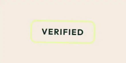
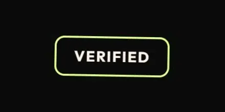
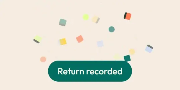
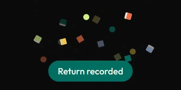


Live demo
Section titled “Live demo”The page below is the real demo.html from the kit. Use its “Toggle dark” button for the dark theme.
Current rule (v2.0.1, 2026-11-13): Feedback is caused by a completed action. The demo initial Verified label is still, active replays are ignored, confetti cannot overlap, and status is announced without moving focus. Bursts remove themselves after actual animation completion. All durations/easings are token-derived; decorative success moments do not block input. Supersedes the retained implementation/timing claims below; see docs/current-rules.md#cr-motion-01 and motion-flow.
How the product confirms something worked. A valid card check lands with one stamp; a result panel arrives with a small scale-in; a pass tears in from above; the workshop logbook opens like a cover; a completed return fires one confetti burst (only with interface effects on). Errors do not bounce or shake: they appear.
Open demo.html in a browser (it links ../../tokens/tokens.css) and use “Toggle dark” to check both themes.
| File | What it is |
|---|---|
feedback.css |
sw-verify-stamp (card verify), sw-confetti-* (return burst), sw-result-arrive, sw-pass-tear, sw-logbook-open, copied unchanged. |
demo.html |
A standalone page with the live animation in light and dark, replayable. |
react/ |
Copies of the real app files (see react/README.md for the imports to replace). |
previews/ |
Animated WebP and GIF previews, light and dark (regenerated by scripts/make-previews.mjs). |
Where the app uses it
Section titled “Where the app uses it”- Stamp:
features/cards/CardVerifyPage.tsx,cardVerify.css(valid card check). - Confetti:
components/delight/ReturnConfetti.tsxinsideSuccessCard.tsxafter a return is confirmed. - Result, pass, logbook:
components/delight/delight.cssonResultPanel/PassState.tsx/WorkshopLogbook.tsx. - The primary success feedback everywhere else is a status toast (see toast).
A confirmed result should feel confirmed, once, without delaying anyone. The stamp echoes a physical handover; the confetti is a rare celebration of a completed return. None of it carries information the text does not already carry.
Timing, easing and distance
Section titled “Timing, easing and distance”Current rule (v2.0.1, 2026-11-13): The retained table/snippet below records the original app copy. Use the current executable files and the complete flow recipe for decision 399; see current rules.
| Animation | Duration | Easing |
|---|---|---|
sw-verify-stamp |
420 ms, once | cubic-bezier(0.32,0.72,0,1); scale 1.35 to 0.96 to 1, rotate -8 deg to 1 deg to 0 |
sw-confetti-burst |
1100 ms, per piece delay 0, 30, 60, 90 ms | cubic-bezier(0.2,0.7,0.3,1); 16 pieces in a fixed fan |
sw-result-arrive |
360 ms | ease-out; scale .96 to 1 |
sw-pass-tear |
360 ms | ease-out; translateY -8 px to 0 |
sw-logbook-open |
360 ms | ease-out; rotateY -8 deg to 0 (perspective 600 px) |
Trigger
Section titled “Trigger”Mount of the result. Confetti is gated: interface effects on, motion allowed, and never on kiosk, scanner, checkout or payment paths. The stamp is also gated by effects on.
Reduced motion
Section titled “Reduced motion”Everything is off: the stamp is inside no-preference, the delight classes set animation: none, confetti is display: none. The text and colour of the result carry the meaning.
Dark theme
Section titled “Dark theme”Confetti colours are brand tokens (--color-accent, --color-emphasis, --color-success, --color-warn, --color-info); on a citron or yellow panel two of them swap for the panel’s ink so pieces never vanish. The stamp follows the result colours.
Do and don’t
Section titled “Do and don’t”- Do keep it once and under half a second (the burst is the one longer piece).
- Do make it decorative and
aria-hidden. - Do not use confetti in staff, kiosk, scanner, checkout or payment flows.
- Do not animate validation errors (they appear, they do not bounce).
- Do not add sound.
Copy-paste usage
Section titled “Copy-paste usage”Current rule (v2.0.1, 2026-11-13): The retained table/snippet below records the original app copy. Use the current executable files and the complete flow recipe for decision 399; see current rules.
<link rel="stylesheet" href="../../tokens/tokens.css"><link rel="stylesheet" href="feedback.css"><span class="sw-verify-stamp">Verified</span><div class="sw-delight-result">…result…</div>Confetti: demo.html builds the 16 pieces (.sw-confetti-piece with --dx, --dy, --spin, --piece) exactly as ReturnConfetti.tsx does.
Every other animation in the product, and the rules behind them: ../../docs/motion.md. Index of the kit: ../README.md.
Flow contract (decision 399)
Section titled “Flow contract (decision 399)”Feedback is caused by a completed action. The demo initial Verified label is still, active replays are ignored, confetti cannot overlap, and status is announced without moving focus. Bursts remove themselves after actual animation completion. All durations/easings are token-derived; decorative success moments do not block input.
Complete rules, sequencing, keyboard and verification. The demo includes real static posters and explicit image Play/Pause controls.
Local token steps for batch 1B
Section titled “Local token steps for batch 1B”These aliases are local additions; global tokens are unchanged. Promote through the token batch when adopted.
| Local custom property | Definition |
|---|---|
--sw-local-duration-1100 |
calc(var(--sw-dur-slow) * 4.58333333) |
--sw-local-duration-360 |
calc(var(--sw-dur-slow) * 1.50000000) |
--sw-local-duration-4000 |
calc(var(--sw-dur-slow) * 16.66666667) |
--sw-local-duration-420 |
calc(var(--sw-dur-slow) * 1.75000000) |
Source
Section titled “Source”Copied from motion/feedback/ on every build: the stylesheet, demo.html, react/ copies of the app files and the previews/.