Search field
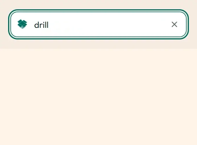
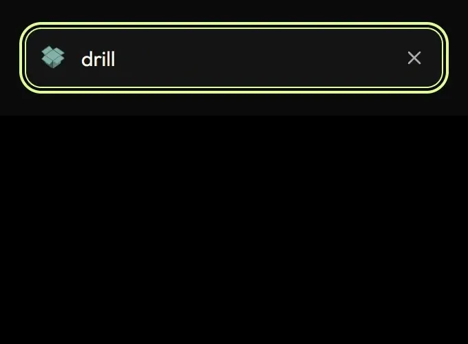
Live demo
Section titled “Live demo”The page below is the real demo.html from the kit. Use its “Toggle dark” button for the dark theme.
Current rule (v2.0.1, 2026-11-13): The field always occupies the reserved slot; width no longer animates. Suggestions are a plain, non-selectable list with a separate result-count status; typing does not restart row animations. Clear is a native keyboard-reachable button and Escape returns focus to the input. Loading state is aria-busy. Focus/loading transitions retarget from current values. Supersedes the retained implementation/timing claims below; see docs/current-rules.md#cr-motion-01 and motion-flow.
One search input for the whole product: focus eases the border to the focus colour and nudges the magnifier, a running query swaps the magnifier for the box-open spinner, the clear button fades in with the text, Escape clears, and suggestion lists rise in with a short stagger.
Open demo.html in a browser (it links ../../tokens/tokens.css) and use “Toggle dark” to check both themes.
| File | What it is |
|---|---|
search.css |
The field’s motion CSS, the app’s real values, plus the base field styles the app gets from .desk-input. Tokens only. |
search.js |
About 40 lines of vanilla JS: clear button, Escape-to-clear, shortcut-chip state and SwSearch.setLoading. |
demo.html |
A standalone page: field with suggestions, loading simulation, grow-on-focus slot, light and dark. |
react/ |
Copies of the real app files, SearchField.tsx and SearchField.css. |
previews/ |
Animated WebP and GIF previews (focus, typing, loading, results, clear), light and dark. Regenerated by scripts/make-previews.mjs. |
Where the app uses it
Section titled “Where the app uses it”components/ui/SearchField.tsx is the only search input; the guard test SearchField.guard.test.ts fails if a raw <input type="search"> appears anywhere else. It is used by:
components/ui/FilterBar.tsx, which serves/spaces(features/discover/spaces/SpacesToolbar.tsx), the landing hero (features/landing/LandingHero.tsx) and the organization directory.- The command palettes:
features/docs/DocsSearchPalette.tsx(borderless,bare) andfeatures/staff/CommandPalette.tsx. - Help (
features/help/HelpIndex.tsx), features (features/hub/FeaturesPage.tsx), the hub docs search, the settings hub and its section nav, the member directory, makerspace discovery, public inventory, the hackathon galleries and judging list, event and booking discovery, the guest-pass desk, the report hub, platform search and limits. - Every staff picker and filter:
features/staff/AsyncSearchPicker.tsx(shows the loading swap and the animated dropdown), the member, organization, space, product and machine pickers, adapter logs, roster filters, the card designer’s font, icon and “preview as” pickers.
Search is the most repeated gesture in the console and on the public pages. One component means one feel: the field answers focus at once, shows when a query is running without moving anything, and resetting is one tap or one key. It never steals focus and never changes layout (the optional grow uses a reserved slot).
Timing, easing and distance
Section titled “Timing, easing and distance”Current rule (v2.0.1, 2026-11-13): The retained table/snippet below records the original app copy. Use the current executable files and the complete flow recipe for decision 399; see current rules.
| Part | Value |
|---|---|
| Border to focus colour | --sw-dur-fast 120 ms, --sw-ease-standard |
Magnifier colour to accent-ink, 2 px nudge |
--sw-dur-base 180 ms, --sw-ease-enter |
| Shortcut chip (for example Ctrl K) | opacity, 120 ms; out on focus or text, back on blur |
| Loading swap | magnifier opacity 120 ms; the 16 px mono BoxSpinner fades in 120 ms |
| Clear button | opacity 0 to 1 and scale 0.9 to 1, 120 ms, --sw-ease-enter |
| Dropdown | opacity and translateY(4px) to 0, --sw-dur-base, --sw-ease-enter; first six rows stagger 20 ms; “No results” fades in |
| Optional grow | width 72 % to 100 % of its slot, --sw-dur-slow 240 ms |
Command palettes keep their existing overlay pop (overlays/); only the field and its list use this family.
Trigger
Section titled “Trigger”:focus-within on .sw-search (focus, shortcut chip, border, magnifier); the data-loading attribute on .sw-search-icon (a query in flight); the clear button is rendered only while the field has text; Escape clears a non-empty field and keeps focus (off for fields where Escape closes a popup); .sw-search-pop and .sw-search-item (with --sw-i) are put on a suggestion list when it mounts.
Reduced motion
Section titled “Reduced motion”Colour changes only: no nudge, no scale, no rise, no stagger, no width change. The spinner swap stays because it is the loader rule (the box spinner still shows its open still).
Dark theme
Section titled “Dark theme”Colour-neutral: every colour is a token. The focus border is Citron in dark and teal in light, the magnifier turns to accent-ink. On a filled surface (the teal public-inventory and /spaces bars) the magnifier and clear button keep the on-fill colour (fixedIcon).
Do and don’t
Section titled “Do and don’t”- Do give the field a visible or
aria-labelname; the component adds the clear button’s own label. - Do keep the slot’s width fixed when using the grow, so neighbours never shift.
- Do keep focus in the field when clearing.
- Do not use hover-only states: the clear button is always visible when there is text.
- Do not animate layout properties (the field never changes height; the list is absolutely positioned).
- Do not swap the spinner for text; the box-open loader is the only loading mark.
Copy-paste usage
Section titled “Copy-paste usage”Current rule (v2.0.1, 2026-11-13): The retained table/snippet below records the original app copy. Use the current executable files and the complete flow recipe for decision 399; see current rules.
<link rel="stylesheet" href="tokens.css"><link rel="stylesheet" href="box-open.css"><link rel="stylesheet" href="search.css"><div class="sw-search" id="s"> <span class="sw-search-icon"><svg class="sw-search-glyph">…magnifier…</svg></span> <input class="sw-search-input" type="search" aria-label="Search tools" placeholder="Search tools"> <kbd class="sw-search-kbd" aria-hidden="true">Ctrl K</kbd></div><script src="search.js"></script><script>SwSearch.init(document.getElementById('s'), { spinner: '<span class="sw-box loop mono">…box markup…</span>' });SwSearch.setLoading(document.getElementById('s'), true);</script>In React: <SearchField aria-label="Search tools" value={q} onChange={e => setQ(e.target.value)} loading={isFetching} shortcut="Ctrl K" />; give a suggestion list the sw-search-pop class and each row className="sw-search-item" style={searchItemStyle(index)}.
Every other animation in the product, and the rules behind them: ../../docs/motion.md. Index of the kit: ../README.md.
Flow contract (decision 399)
Section titled “Flow contract (decision 399)”The field always occupies the reserved slot; width no longer animates. Suggestions are a plain, non-selectable list with a separate result-count status; typing does not restart row animations. Clear is a native keyboard-reachable button and Escape returns focus to the input. Loading state is aria-busy. Focus/loading transitions retarget from current values.
Complete rules, sequencing, keyboard and verification. The demo includes real static posters and explicit image Play/Pause controls.
Local token steps for batch 1B
Section titled “Local token steps for batch 1B”These aliases are local additions; global tokens are unchanged. Promote through the token batch when adopted.
| Local custom property | Definition |
|---|---|
--sw-local-duration-20 |
calc(var(--sw-dur-fast) * 0.16666667) |
Note, 2026-11-13 (v2.1.0): import
SearchField.cssfrom your root stylesheet.SearchField.tsxno longer imports./SearchField.css. That file opens@layer components; imported from a component it can load before the app’s Tailwind stylesheet, which putscomponentsbelowbaseand strips padding and colour from every button. Import it from the root stylesheet after@import "tailwindcss"(for example@import "./components/ui/SearchField.css";).
Source
Section titled “Source”Copied from motion/search/ on every build: the stylesheet, demo.html, react/ copies of the app files and the previews/.