Box-open loader
The box from the logo opens flap by flap, holds open, folds shut and repeats. It is drawn from the logo’s own paths, so it is on-brand in both themes. Use it everywhere something loads; never a generic spinner.
Light
Page loader, 72px
Inline, 16 / 20 / 24px
Mono, in a button (takes the text colour)
Logo: folds shut, then opens, on hover or keyboard focus (2200 ms)
Dark
Page loader, 72px
Inline, 16 / 20 / 24px
Mono, in a button (takes the text colour)
Logo: folds shut, then opens, on hover or keyboard focus (2200 ms)
Under prefers-reduced-motion: reduce every demo above shows the still, open logo. Touch devices never start the hover cycle.
The Space Works loading animation. The box from the logo opens flap by flap, holds open, folds shut and repeats. It is drawn from the logo’s own paths, so it is always on-brand in both themes.
Open demo.html in a browser to see every variant. Use the “Toggle dark” button to switch themes.
| File | What it is |
|---|---|
box-open.css |
All animation CSS: theme colours, keyframes, the loop cycle, the mono variant and the reduced-motion rule. |
box-open-markup.html |
The SVG markup to put inside the container: one <svg class="lt"> for light and one <svg class="dk"> for dark. |
demo.html |
A standalone page with the page loader, the inline spinner sizes and the button (mono) variant. |
react/ |
The React components used by the SpaceWorks app (LogoLoader, BoxSpinner, BoxArt, and brand/ with the logo hover cycle: AnimatedLogoMark, LogoBoxOverlay, animatedLogo.css), plus the generators in boxOpen/ and the logo path masters they read. |
Usage without React
Section titled “Usage without React”<link rel="stylesheet" href="box-open.css">
<div role="status" aria-label="Loading"> <div class="sw-box loop" aria-hidden="true" style="width:78px;height:72px"> <!-- paste box-open-markup.html here --> </div></div>- The aspect ratio is fixed at 136 : 126, so the width is the height × 136 / 126.
- The dark artwork shows when
<html>has the classdark. - Add
mono(class="sw-box loop mono") to draw it in the surrounding text colour, for example inside a button. It uses the one-colour master geometry. Set--sw-groundto the button background so all four shut panels remain distinct even with cream text; ReactBoxArtreads the opaque host background and updates on theme changes.
The logo opens on hover and focus
Section titled “The logo opens on hover and focus”The same artwork plays once (sw-box hov, 2200 ms) over the Space Works mark whenever it is hovered or keyboard-focused, everywhere it appears. It starts on the resting (open) logo, folds shut (600 ms, the loader’s fold), then opens (1600 ms, the splash opening) back to the resting logo: no hold, no snap at either end.
- In the app every placement uses
components/brand/AnimatedLogoMark.tsx; a guard test fails if the mark is drawn any other way. - Without React: on pointer-enter (not
pointerType === "touch") orfocusinthat matches:focus-visibleon the logo’s link, mount<div class="sw-box hov" style="position:absolute;inset:0">+ the markup over the logo’s symbol and hide the static symbol paths; remove both onanimationendofsw-boxh-w. Leaving mid-way lets the cycle finish; entering while it runs does not restart it. - Skip it entirely when
prefers-reduced-motion: reducematches (the still mark shows). Touch never starts it. - Add
g-darkorg-lightto force the artwork for a surface that is always dark or light; otherwise it followshtml.dark. - Set
--sw-groundon the container to the colour behind the mark when it is not the page colour (#FFF4E8light,#000dark): moving flaps are outlined in it, like the gaps in the logo. The React overlay reads it from the first opaque background up the tree. - The
hovCSS is inbox-open.css(generated with the loop; the splash only carriesonce). It never loops outside the loader, tenant logos never animate, and the box never changes size.
Full rules, and every other animation in the product: ../../docs/motion.md.
When to use which
Section titled “When to use which”| Use | Component | Height |
|---|---|---|
| A whole page or panel is loading | LogoLoader |
72px (default), centred |
| Buttons, table rows, fields, inline status | BoxSpinner |
16–24px (20px default) |
| Inside a filled button | BoxSpinner mono |
the button’s text size |
| A skeleton placeholder | BoxArt |
matches the placeholder |
Use the box loader everywhere something loads. Don’t use a generic spinner.
Motion
Section titled “Motion”- Opening (one-shot, on the cold-start splash): 1600 ms.
- Loader cycle (open, hold, fold shut, repeat): 4400 ms.
- Opening: the top-right flap lifts first, then bottom-left, then top-left and bottom-right together.
- Folding shut is staggered in the reverse order, each flap over half the fold: top-left and bottom-right first, then bottom-left, then top-right. Folding all four together made neighbouring flaps pass through each other.
- Flap transforms are sampled per frame and played with
steps(1, end). Browsers glitch when they interpolate between twomatrix()values near edge-on, so flap matrices are never interpolated; only opacity is. - Reduced motion: under
prefers-reduced-motion: reduceevery animation stops and the still, open logo shows.
Known-good states
Section titled “Known-good states”These are checked frame by frame (see “Checking the frames” below); a change that breaks one is a bug.
- Rest (the start and end of hover, the end of opening, the loader hold): the static product logo.
It uses
symbolgeometry in light andsymbol-reversedgeometry with the approved full-colour flap palette in dark. Nothing extra is drawn: no cap, no outline, no wall. Explicit one-colour marks stay mono. - Shut (opening start, loader closed hold, middle of hover): one solid cube with four distinct lid quarters.
Top-left and bottom-right are green (
#006E63); top-right and bottom-left are orange (#FF7447), in both themes, exactly as those flaps are when open. All four remain visible. No hole or central slot. - Open (rest): the same two orange and two green flaps, on the logo’s original paths.
- In between:
- Every flap keeps its own solid colour on both sides through the full fold. No reverse-face recolouring or shading towards a different hue. SW-389 supersedes the earlier one-orange-lid reading of SW-381.
- The reversed (dark) artwork cuts its side faces short under the front flaps, so a cream cap (the light master’s full faces) shows behind them from the first frame anything moves. That is what fixed the black holes.
- Moving flaps are outlined in the ground colour so a flap never melts into the face behind it: from the first moving frame in dark (with the cap), faded in over the first 12 degrees in light.
- Flaps are painted in depth order. The top-right flap is drawn twice (
.z0under the others,.z1on top) and swaps layer only while it overlaps nothing.
Checking the frames
Section titled “Checking the frames”node scripts/check-box-frames.mjs (from the repo root; optional locally, needs Microsoft Edge like
make-previews.mjs) renders exact frames of box-open.css and box-open-markup.html in light and dark,
for hov, loop, once, the fixed grounds, mono and forced colours in both themes. It fails on a hole,
a shut lid without two orange and two green regions in the expected positions (four regions for mono),
a shut frame that differs from a reference box drawn from the geometry, or a resting
frame that differs from the static logo. --strips <dir> also writes frame strips. In the app the same rules run
as unit tests (frontend/src/components/boxOpen/boxOpen.frames.test.ts).
Accessibility
Section titled “Accessibility”- The wrapper has
role="status"and anaria-label(default “Loading”), with matching visually hidden text. - The artwork is
aria-hiddenand never focusable. - In a busy button, set
aria-busy="true"on the button.
Source of truth
Section titled “Source of truth”The generators live in the SpaceWorks app at frontend/src/components/boxOpen/. Its boxOpen.sync.test.ts
keeps the copy inlined in index.html (the splash) in step with them. The files here are generated from that
code for SpaceWorks 0.12.0 (Design System v2.0.1): box-open.css is boxOpenCss(), boxMonoCss() and
boxGroundCss(); box-open-markup.html is boxOpenSvg(). Regenerate them after any change to the generators
or the logo masters, never by hand. From the app’s frontend/ directory, run:
$env:UPDATE_SPLASH = '1'$env:SW_BOX_DESIGN_DIR = 'C:\Users\shaan\Music\SpaceWorks\SpaceWorks-Design'npx vitest run src/components/boxOpen/boxOpen.sync.test.ts --pool=forks --maxWorkers=1This exports the exact generated CSS and SVG, refreshes every embedded demo symbol and copies the React
sources. The regular dark static mark uses brand/animatedLogo.css to apply that same flap palette;
AnimatedLogoMark keeps explicit oneColour marks separate. Previews and guidelines are rebuilt by the
release orchestrator after all design lanes finish.
The React components use Lingui (t) for the label and Tailwind utility classes for layout. Swap those for
your own i18n and CSS if you use them outside the app.
Previews
Section titled “Previews”Rendered from the real box-open.css and box-open-markup.html (frame-exact, 30 fps, 2x), so they always show
the current colours. Each has a .gif twin in previews/. The resting open logo is previews/logo-open-light.png
and previews/logo-open-dark.png.
| Light | Dark | |
|---|---|---|
| Page loader, 72px loop |  Download original |
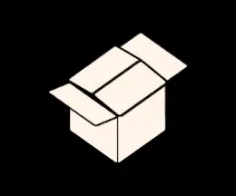 Download original |
| Inline spinner, 20px row |  Download original |
 Download original |
| Mono button “Saving” |  Download original |
 Download original |
Logo hover: fold, then open (.sw-box.hov, 2200 ms) |
 Download original |
 Download original |

Rebuild with node scripts/make-previews.mjs and verify freshness with node scripts/check-previews.mjs
(both from the repo root; see tokens/README.md).
Current animation (SW-412)
Section titled “Current animation (SW-412)”13 November 2026 — correction to the historical SW-389 descriptions above. The light coloured mark and black-and-white marks are separate animation families. This section takes precedence over the earlier four-visible-quarters and coloured-reversed descriptions; those descriptions remain as release history.
- Coloured light mark: opposite flaps retain their own colours on both faces. Top-right and bottom-left are orange; top-left and bottom-right are green. Shut, the two full-width orange outer flaps meet at the centre seam, entirely covering the green inner pair. The stretched overlap and widened outer hinges from SW-381 close the seam without holes. The panels are no longer shortened into four visible quarters.
- Opening: top-right orange turns first, then bottom-left orange, top-left green, bottom-right green.
Turns occupy separate intervals so adjacent panels cannot pass through each other. A single damped settle
peaks at about 3.2 degrees, returns to zero, and ends on the static
symbolmaster. No arcs, stars, ticks, sparkles or burst group exist in the coloured SVG. Closing samples the opening in exact reverse. - Black-and-white: reversed/dark, explicit mono and forced colours retain the v2.0.0 geometry and choreography. Dark is cream on black; neither orange nor green is painted in any black-and-white frame. The v2.0.0 reversed cap keeps the side faces solid while the flaps move. Mono keeps the released light geometry, current-colour fills and face strengths. Forced colours uses the released theme geometry, with Canvas/CanvasText for the user’s palette.
- Budgets unchanged: once 1600 ms; hover 600 ms fold + 1600 ms open = 2200 ms; loop 4400 ms. The loop opens over 0–1584 ms, holds to 2728 ms, folds to 3696 ms, then holds closed to 4400 ms. Hover finishes after pointer exit. Reduced motion shows the corresponding static open logo.
- Sampling unchanged: 96 once, 132 hover, 160 loop intervals, with stepped matrices and synchronized layer changes. The settle is one small excursion, rather than a repeated spring oscillation.
Opening windows (once, before CSS sample quantization):
| Motion | Once interval |
|---|---|
| Top-right orange | 64–352 ms |
| Bottom-left orange | 368–656 ms |
| Top-left green | 672–960 ms |
| Bottom-right green | 976–1264 ms |
| Damped settle | 1280–1568 ms |
| Static rest | 1568–1600 ms and afterwards |
Eight-frame proof times (ms; used by render-412.mjs in the release handover):
| State | Once | Hover | Loop |
|---|---|---|---|
| Closed | 0 | 600 | 0 |
| Orange A lifting | 208 | 808 | 206 |
| Orange pair open | 668 | 1268 | 661 |
| Green rising | 816 | 1416 | 808 |
| Green out | 1284 | 1884 | 1266 |
| Settle | 1360 | 1960 | 1346 |
| Settle | 1472 | 2072 | 1458 |
| Rest | 1605 | 2205 | 2200 |
The first two SVGs (lt, dk) and v200Geometry.ts, v200Css.ts, v200Markup.ts preserve the released
baseline; only a third SVG (colour) receives SW-412 keyframes. Light non-mono hosts show colour;
black-and-white hosts select the original SVGs. No SW-412 keyframe selector targets lt or dk.
The static reversed product mark also returns to its cream master; no rest-to-hover colour jump remains.
App snapshot tests reconstruct the entire v2.0.0 CSS export and full baseline markup, normalize line endings,
and compare SHA-256 hashes against the actual tag. CSS: 1c746ec8c1892f2b7748b1de8e4dd4d8fc2f69c11c95b82751b68b71537d2a57.
Full baseline SVG: 0e85ea78c2ecb5b9433a83b391c738359322525ba209cfa1b4eeb8dc27ee7b32.
Reversed SVG: 41b9b15f8e1c9fbae5a330b2e27f5e6250225091ee07f2b3f9c843f39decd1fa.
Current hashes (SW-412, 13 November 2026): the black-and-white marks no longer draw the v2.0.0 sparkle stars and burst rays (owner: no confetti); everything else is unchanged. Full baseline SVG now
2f9a0590d907b6849f46188ae5e9d7829983a8fd820294a37bd8eb499204ecf4, reversed SVG3b4621988a5cb3db25e6ddb488caacd623f27ec48259a644a5232c2d01d78a34.
node scripts/check-box-frames.mjs retains the Edge checks of the actual CSS cascade/compositor.
node scripts/check-box-frames.mjs --raster additionally works without Edge: 1955 emitted step frames,
body-hole and forbidden-colour checks, the eight-phase sequence, static-rest rasters, and v2.0.0 hashes.
The raster mode checks SVG paths and emitted matrices; it does not replace browser compositing QA.
Previews and the brand PDF are rebuilt by the release orchestrator, after all lanes finish.
Source
Section titled “Source”The loader files are copied from motion/box-open/ on every build: box-open.css, box-open-markup.html and a standalone demo.html.